Design Skills: Design Systems Your AI Coding Tool Can Follow
What design skills are, what is inside one, a tour of all eight skills and how to install one with the shadcn CLI so Claude Code, Cursor and Codex build every page in one consistent style.
AI coding tools have become very good at writing interface code. Ask Claude Code, Cursor or Codex for a pricing page and you get a working React component in seconds, with a grid, cards, a toggle and a button. What you usually do not get is a page that looks like it belongs to your product.
The colors are close but not quite yours. The corners are rounder than the rest of the app. The heading font is the default one. The next page you ask for picks a slightly different shade of gray and a different card style, and after a week of prompting your app looks like it was designed by five different people.
That is the problem Design Skills solve. A design skill is a single file that gives your AI assistant a complete design system: colors for light and dark mode, fonts, radius, the exact classes each component needs, layout rules and a list of things to avoid. Your assistant reads it before every UI task and builds in that style every time. In this post we explain what a design skill is, what is inside one, walk through all eight skills that ship today and show how to install one with a single shadcn CLI command.
Why AI generated UI looks generic
A language model has seen millions of interfaces. When you ask it for a page without any guidance, it does the reasonable thing and picks the most common answer: neutral grays, medium radius, a safe sans serif, cards with a light shadow. That average is exactly why so many AI built apps look the same.
The second problem is memory. Each prompt is a fresh start. Even if you spent an hour describing your brand in one conversation, the next session begins from zero. You end up repeating the same instructions, or fixing the same styling details by hand after every generation:
- The primary color is a hex value in one file and a Tailwind color in another.
- One page uses
rounded-lgcards, the next usesrounded-2xl. - Headings switch between weights and tracking from section to section.
- Dark mode works on the pages you checked and breaks on the ones you did not.
- New components fall back to the default look of the library instead of yours.
None of these are bugs the assistant can see. The code compiles, the page renders, the tests pass. The assistant simply has no shared source of truth for how things should look. A human designer would hand over a brief and a design system. An AI assistant needs the same thing, written in a way it can follow.
What is a design skill?
A design skill is a Markdown file that describes one complete design system in plain language and exact code. AI coding tools already read instruction files from your repository: Claude Code loads skills from .claude/skills, Cursor reads project rules from .cursor/rules, and Codex and many other agents read AGENTS.md. A design skill uses those same mechanisms, so there is no plugin to install and nothing new to learn.
Because the skill lives in your repository, it travels with your code. Everyone on the team, and every AI tool they use, gets the same rules. You can open it, read it, edit it and review changes to it in a pull request like any other file.
It is also different from a theme. A theme only changes colors. A skill also tells your assistant how to use them: which component gets which shape, how a featured pricing card stands out, how dense a table should be, what the hero should feel like and which kit blocks to start from. That extra layer of intent is what keeps generated screens consistent.
What is inside a skill
Every skill follows the same structure, so your assistant always knows where to look.
Setup
The skill starts with the theme for globals.css: every shadcn/ui color variable for :root and .dark, plus the radius. It includes the next/font code for the heading and body fonts, and an accent or mono font when the design uses one. It also states the default theme, because some skills are designed dark first and others light first.
Visual language
A short description of how the design uses color, shape, typography, depth and layout. This is the part a designer would explain in a kickoff meeting. For example: "Paper cream and warm black, no accent color. Sections flip between dark and cream bands. Headlines are condensed uppercase at very large sizes." It gives your assistant the reasoning behind the tokens, so it can make good decisions in places the rules do not cover.
Component classes
shadcn/ui components ship with neutral defaults. The skill lists the exact className values that make them match the design: buttons, cards, inputs, badges, tabs, menus and dialogs. It goes further with a variant table that picks one shape per component, for example square switches, underline tabs and thin progress bars, and a "Component details" table with classes for smaller parts like sliders, checkboxes, radios, avatars, tooltips, skeletons, alerts and toggles. That is how a progress bar in Crayon gets a thick ink outline while the same component in Eclipse gets a violet gradient.
Effects
Some looks depend on a few special surfaces: a glowing light behind the hero, a glass navigation capsule, a footer with the brand name set huge, a featured pricing card with a colored fill. The skill lists these with their exact classes, so your assistant can reproduce the signature parts of the design instead of approximating them.
Do and don't
Short rules the assistant checks before it finishes. "Keep one accent color per screen." "Do not center section titles." "Do not hardcode hex colors, use the theme tokens." "Do not edit files in components/ui." These rules are what stop the design from drifting after twenty prompts.
Blocks to start from
Finally, the skill names the Shadcn UI Kit blocks that fit the design, such as a navbar, a hero, a feature grid, pricing, testimonials and a footer. Your assistant installs them and restyles them with the skill instead of writing every section from scratch.
The eight design skills
There are eight skills today, each a complete and distinct design system. Every one has a live preview with three views: a full marketing page, an application dashboard and a components page with buttons, forms, sliders, tabs, tables and more. You can switch between light and dark mode in each preview before you install anything.
Eclipse
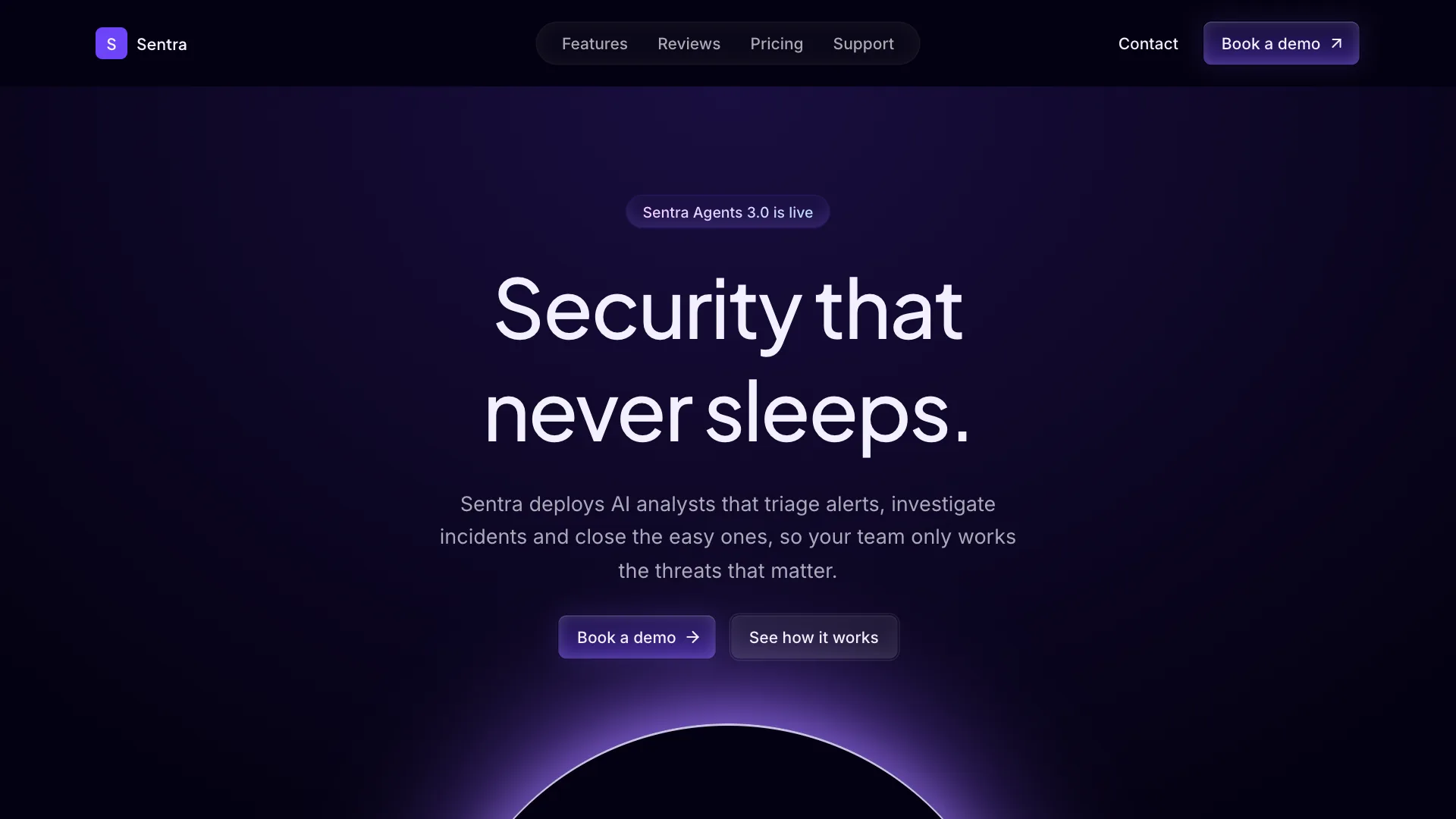
Eclipse is a dark violet system for AI products and agencies. It uses an almost black purple canvas, glassy gradient buttons with a soft inner light, gradient eyebrow labels, hairline grids and a glowing eclipse behind the hero. Headings are set in Plus Jakarta Sans and body text in Inter. It feels technical, calm and premium, and fits AI agents, B2B SaaS and automation tools.
Clay
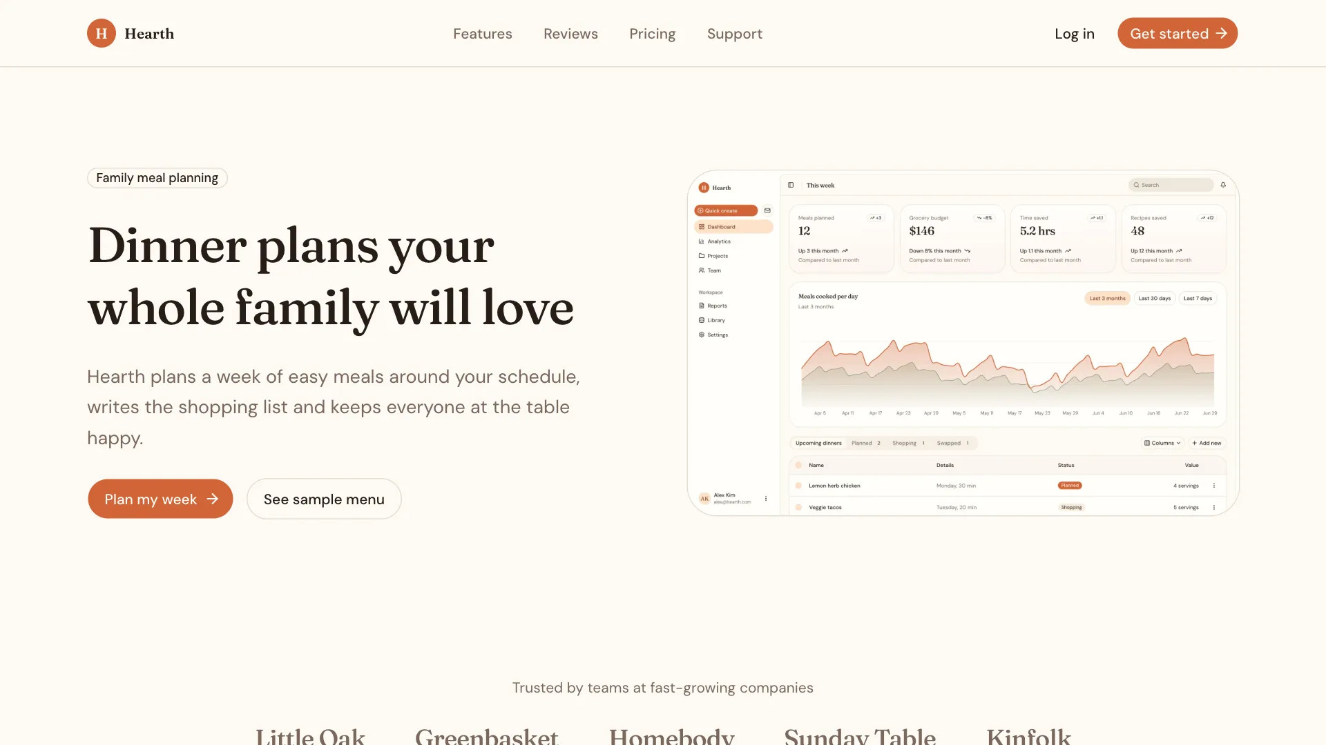
Clay is a warm, light system for consumer products. Cream surfaces, a terracotta brand color, generous rounded corners and a Fraunces serif heading give it a personal voice, while DM Sans keeps the body text easy to read. Inputs are filled, tabs are pills and progress bars are thick and soft. It is a good match for wellness, education, marketplaces and any product that should feel friendly without looking childish.
Nebula
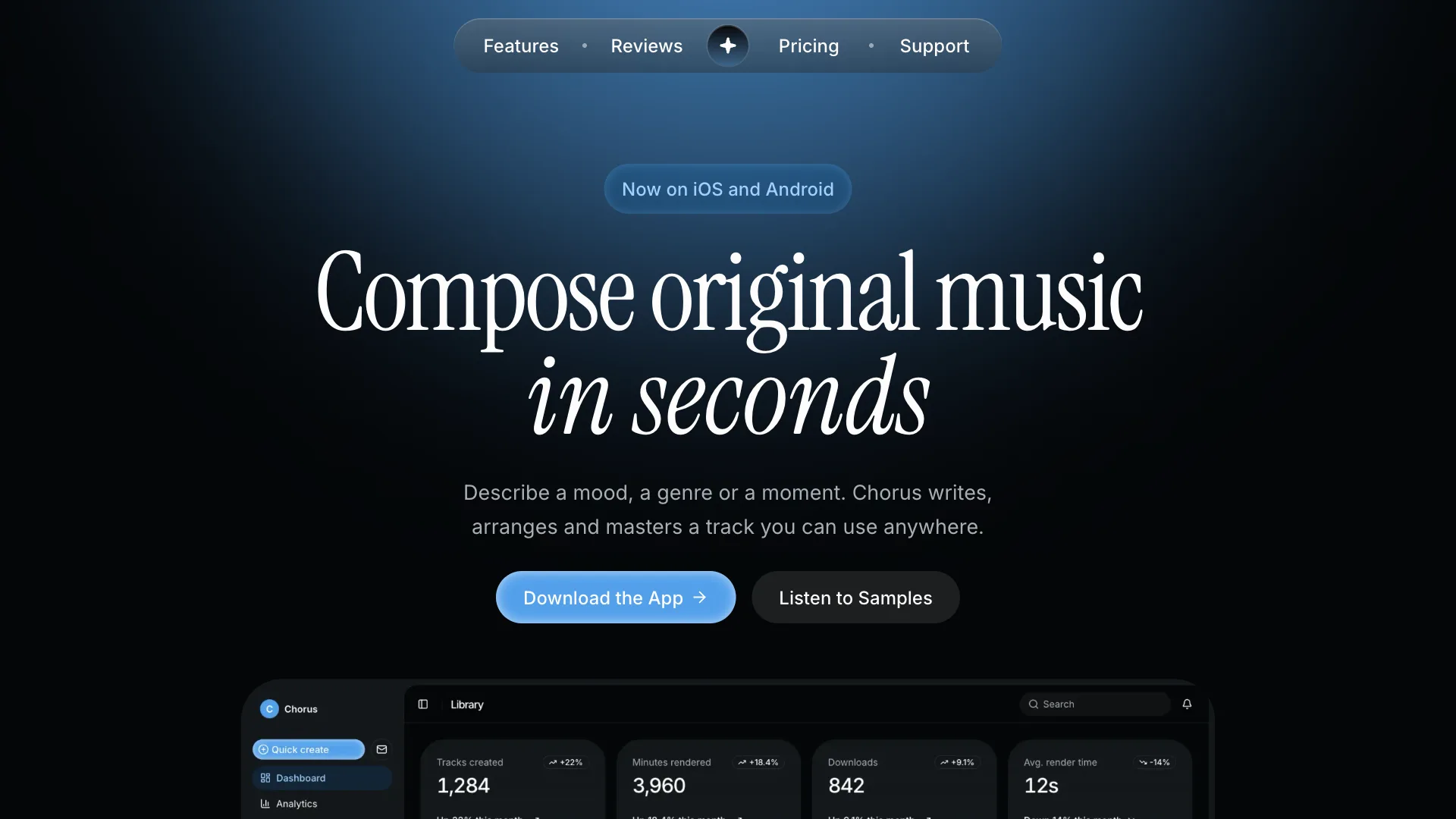
Nebula is a dark creative system built around a single sky blue light source on blue black surfaces. It has capsule navigation, glossy pill buttons and large headlines that mix Inter with an Instrument Serif accent. Sliders and focus states glow softly. It feels cinematic and quiet, like a product shot at night, and suits AI creative tools, mobile app sites and consumer launches.
Ember
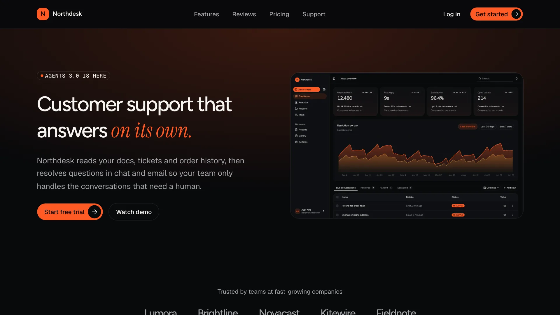
Ember is a dark first system for AI products: graphite surfaces, one ember orange, pill buttons and soft rounded panels. Its signature is a single italic serif word inside every big headline, set in Instrument Serif next to Figtree. Inputs and tabs use underlines, and numbers and labels use Geist Mono. It is premium and calm with energy where it counts, and works well for SaaS landing pages, revenue tools and startups.
Monolith
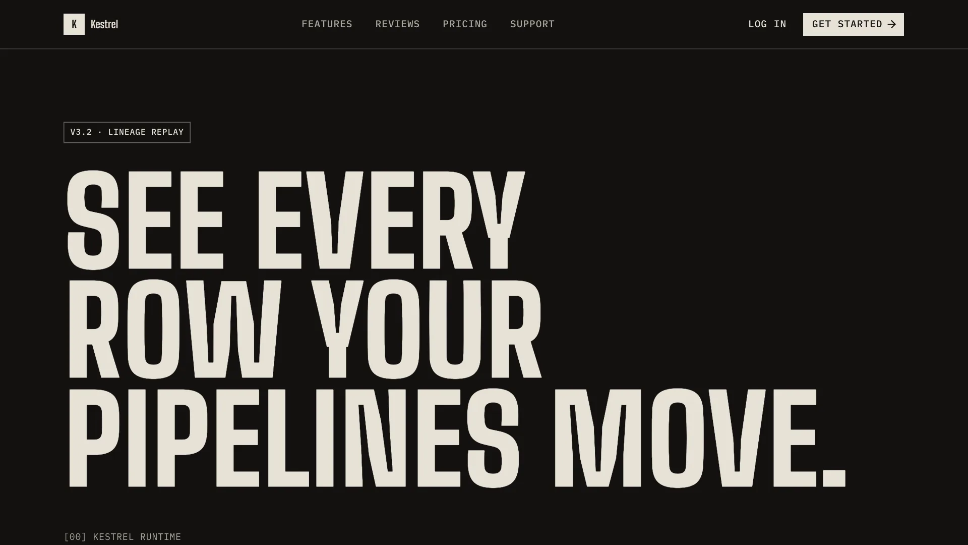
Monolith is an editorial, brutalist system for developer and infrastructure products. It uses warm black and paper cream, huge condensed uppercase headlines in Big Shoulders, IBM Plex Mono labels, square buttons and hairline grids. The radius is zero everywhere, sections flip between dark and cream bands like pages of a printed manual, and focused inputs simply darken their border instead of showing a ring. It is built for developer tools, data platforms and technical brands.
Verdant
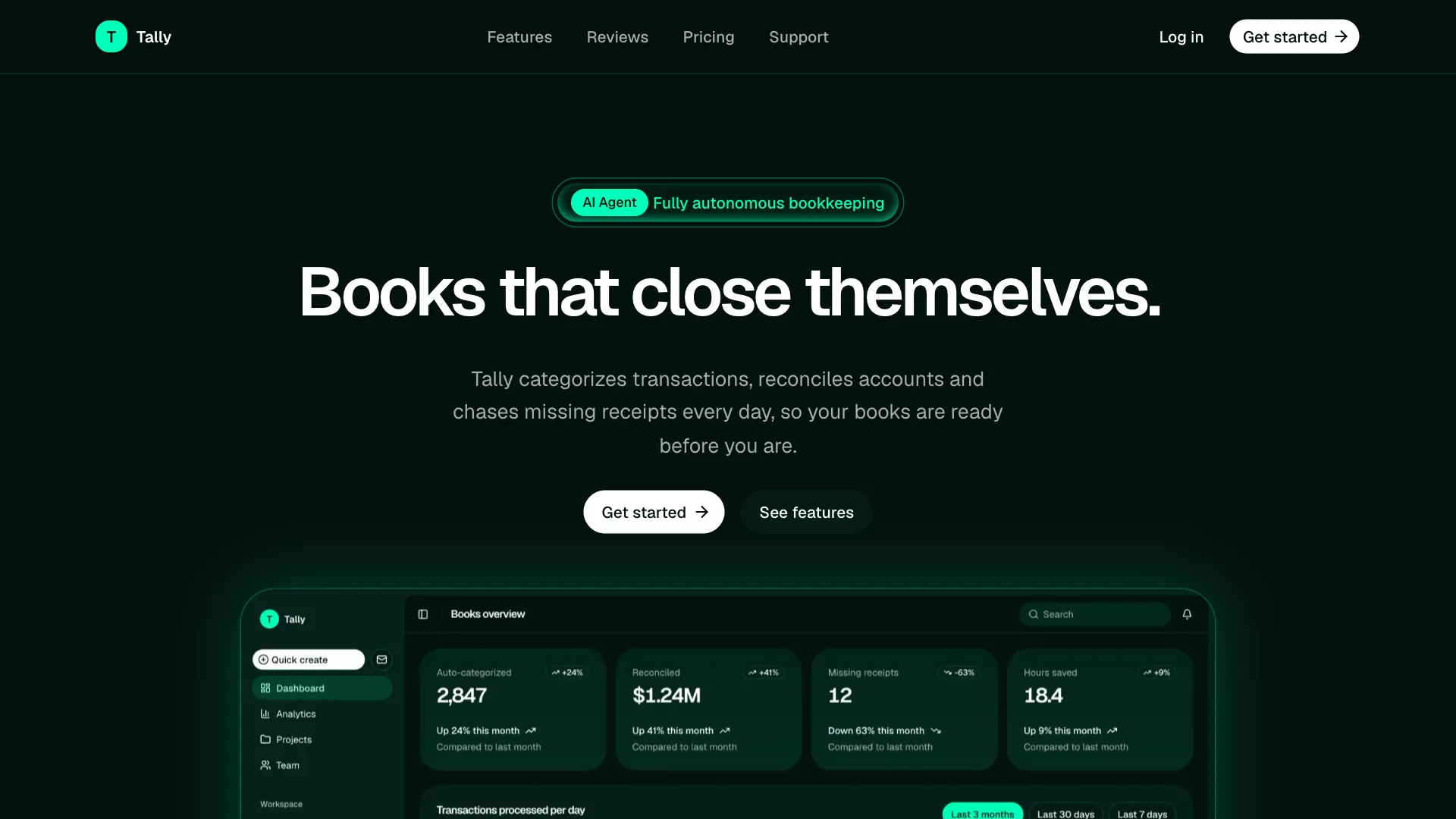
Verdant is a deep green system for AI agents and automation. A green black canvas, one neon mint signal color, white pill buttons, glowing double pill labels and soft mint light rising from below make it feel alive and always on. Everything is set in Geist and Geist Mono. It suits AI agents, sales and finance tools and waitlist pages.
Stellar
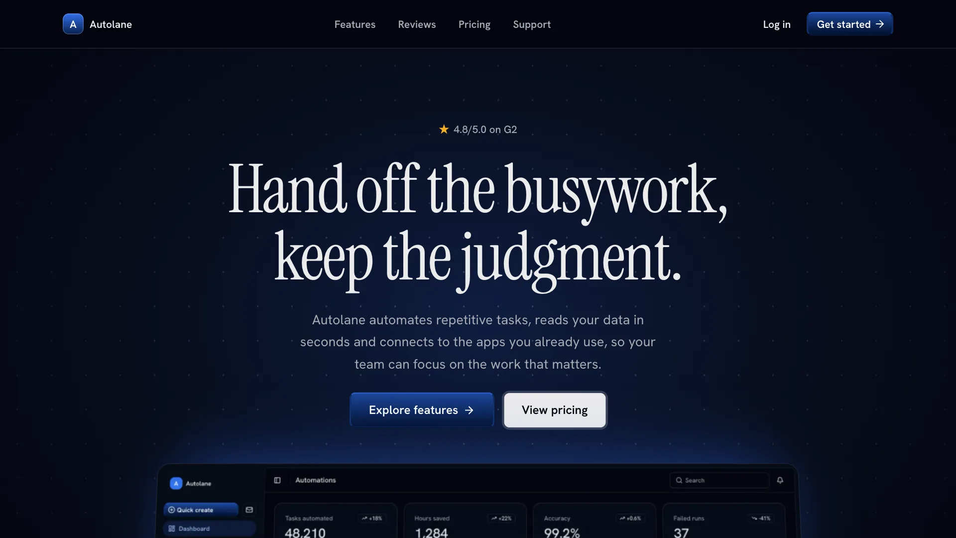
Stellar is a dark system for AI automation and SaaS. A near black navy canvas lit like a night sky, light serif headlines in Instrument Serif, royal blue gradient buttons with a bright top edge and quiet navy cards give it a calm, premium and slightly cinematic look. Body text uses Hanken Grotesk. It fits workflow tools, data products and SaaS startups.
Crayon
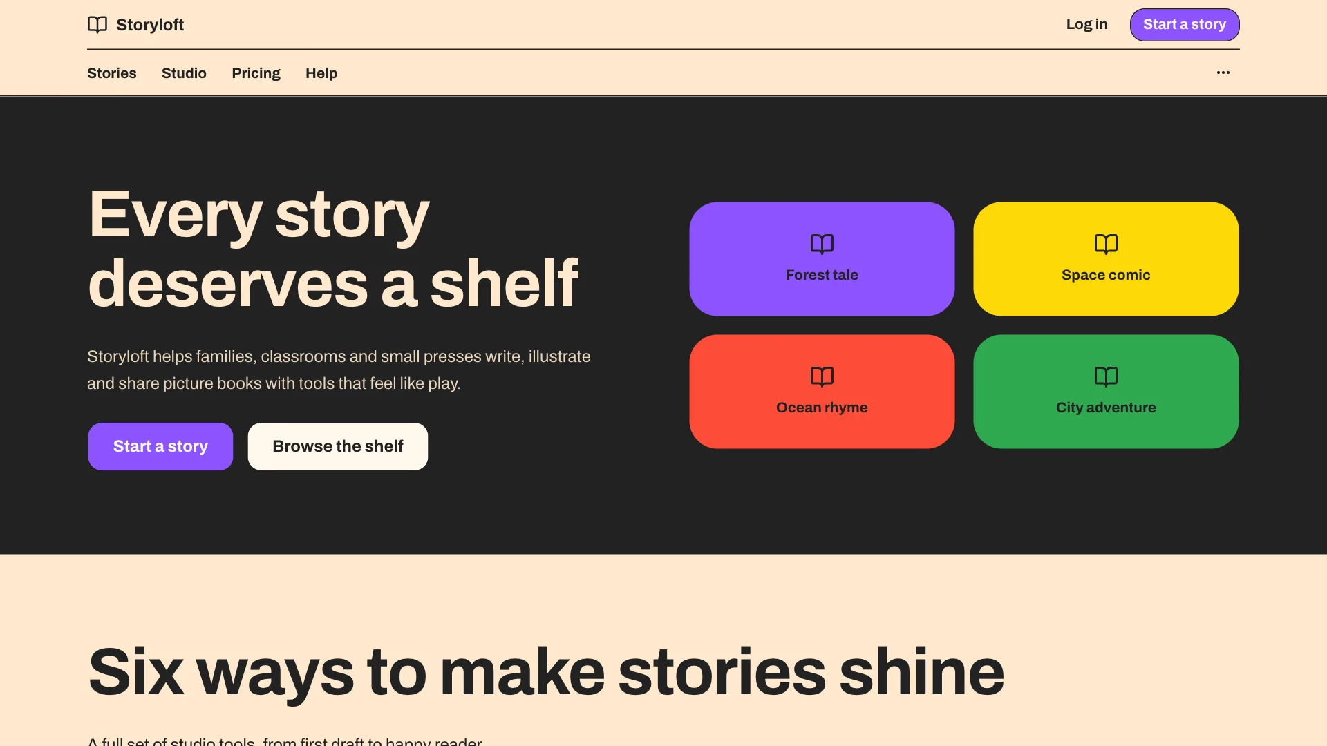
Crayon is the playful one. A warm cream canvas, crisp 1px ink outlines, big rounded panels, chunky sticker buttons and full width bands of purple, yellow and red make it feel like a picture book turned into an interface. Everything is set in Archivo. Switches, sliders and progress bars all get ink outlines and saturated fills. It is made for kids and family apps, education, creative tools and bookshops.
How to install a skill
Skills install with the regular shadcn CLI from the @shadcnuikit registry. If you already install premium blocks from Shadcn UI Kit, the first step is done and you can go straight to step two.
1. Add the registry once
Create an API key in API Keys. It is the same key the Shadcn CLI and the MCP Server use. Add the registry to the registries field of your components.json:
{
  "registries": {
    "@shadcnuikit": {
      "url": "https://shadcnuikit.com/r/{name}.json",
      "headers": {
        "Authorization": "Bearer ${REGISTRY_TOKEN}"
      }
    }
  }
}
Then put the key in the .env file in your project root and keep it out of version control:
REGISTRY_TOKEN=your_api_key
2. Run one command
Pick a skill and run its command in your project root:
npx shadcn@latest add @shadcnuikit/clay-design
That one command does three things:
- Saves the skill file where your AI tool reads it, in this case
.claude/skills/clay-design/SKILL.md. - Applies the theme by writing the light and dark color tokens and the radius to
globals.css. - Sets up the fonts. In a Next.js project it adds the
next/font/googleimports and variables toapp/layout.tsx. In other frameworks the CLI installs the fonts from Fontsource.
The CLI lists every file it creates or changes before it writes them, so you can see exactly what happens. Your existing components and pages are not touched, and nothing in components/ui is edited.
3. Ask for UI
That is the whole setup. Now ask your assistant for what you need in plain words:
- Build a pricing page with three plans and a monthly and yearly toggle.
- Add a dashboard overview with stat cards, a revenue chart and a recent orders table.
- Restyle the settings page so it follows the design skill.
- Create an empty state for the projects page.
Your assistant reads the skill, installs the right kit blocks and styles them with the skill's tokens and classes.
Setup for each AI tool
Each tool reads its instructions from a different place, so every skill comes in three versions. The content is the same, only the file location and the header change.
Claude Code
npx shadcn@latest add @shadcnuikit/eclipse-design
The skill is saved in .claude/skills/eclipse-design/SKILL.md. Claude Code loads it automatically whenever your request is about UI, so there is nothing else to do.
Cursor
npx shadcn@latest add @shadcnuikit/eclipse-design-cursor
The skill is saved as a project rule in .cursor/rules/eclipse-design.mdc. Cursor applies it whenever the agent works on .tsx files.
Codex and other tools
npx shadcn@latest add @shadcnuikit/eclipse-design-agents
The skill is saved in docs/eclipse-design.md. Codex reads AGENTS.md from the project root, and the CLI does not edit that file, so add one line to it:
Follow the design system in docs/eclipse-design.md for every UI task.
The same file works with GitHub Copilot, Windsurf, Gemini CLI, Cline, Zed and any other tool that reads rule or instruction files. Point the tool's instructions to it, for example from .github/copilot-instructions.md or .windsurf/rules/.
Design skills and the MCP server
The skill tells your assistant how things should look. The MCP Server tells it what it can build with. When it is connected, your assistant can search the full Shadcn UI Kit catalog, including premium blocks, admin dashboards and web apps, read their code and install them directly.
Used together, the workflow becomes very short. You ask for a CRM dashboard. The assistant finds the right dashboard in the catalog through MCP, installs it, then restyles it with the rules from your skill. The result is a real, production ready screen in your design system instead of a generic draft. Both are included in the same plans, and the skill works without MCP too: in that case your assistant installs blocks with the shadcn CLI.
Tips for getting the best results
- Keep one skill per project. Two skills give your assistant conflicting tokens and rules. To switch, run the command for the new skill. It replaces the theme tokens and fonts. Then delete the old skill file.
- Start a new chat after installing. Most tools load skills and rules when a session starts, so a fresh conversation picks the skill up reliably.
- Ask for whole sections, not single properties. "Build a testimonials section" lets the assistant apply the full skill. "Make this card purple" bypasses it.
- Check both themes. Every skill defines light and dark tokens. Ask your assistant to check the page in both modes, or switch yourself before you ship.
- Edit the skill when your brand changes. The file is yours. Change a color, a rule or a font, commit it, and every future screen follows the new version.
- Mention the skill when restyling old code. For pages built before you added the skill, ask "Restyle this page so it follows the design skill" and the assistant brings it in line.
- Start from blocks. Blocks already have good structure, spacing and responsive behavior. The skill adds the look. That combination is faster and more reliable than generating everything from scratch.
Frequently asked questions
What is a design skill?
A design skill is a Markdown file that describes a complete design system: color tokens for light and dark mode, fonts, radius, component classes, layout rules, do and don't rules and the kit blocks that fit it. AI coding tools read the file and follow it whenever they build UI.
How is a design skill different from a theme?
A theme only changes colors. A skill also explains how to use them: which component gets which shape and variant, how the hero and featured cards look, what to avoid and which blocks to start from. That is what keeps screens consistent across many prompts.
Which AI tools does it work with?
Claude Code, Cursor and Codex each have their own install command. GitHub Copilot, Windsurf, Gemini CLI, Cline, Zed and any other tool that reads rule or instruction files can use the same Markdown file.
Do I need the shadcn CLI?
The CLI is the easiest way, because it also applies the theme and fonts for you. If your project does not use it, you can download the skill file from the skill page while signed in, or with curl and your API key, then ask your assistant to apply the theme and fonts from the file.
Will it break my existing project?
No. The skill updates the color variables in globals.css, adds fonts and saves one file. It never edits files in components/ui and leaves the rest of your code as it is. The CLI shows every change before it writes it.
Can I customize a skill?
Yes. After installing, the skill file and the theme are part of your project. Change the brand color, swap a font or add your own rules, and your assistant follows the edited version.
Which plan do I need?
Design skills are included in the Pro, Team and Enterprise plans, together with the MCP server and all premium blocks. The plans are a one time payment with lifetime updates, so new skills are included as they ship. The live previews are open to everyone, so you can try every skill in the browser before you decide.
Will there be more skills?
Yes. New skills are added regularly, and each one ships with the same three preview views and the same install command.
Try it
The fastest way to see the difference is to open the Design Skills page, switch between the live previews and pick the one that feels closest to your product. Install it with one command, start a new chat and ask your assistant for a page you have built before. Compare the two versions. The code will be similar, but the second one will look like it was designed on purpose.