Verdant design skill for AI agents
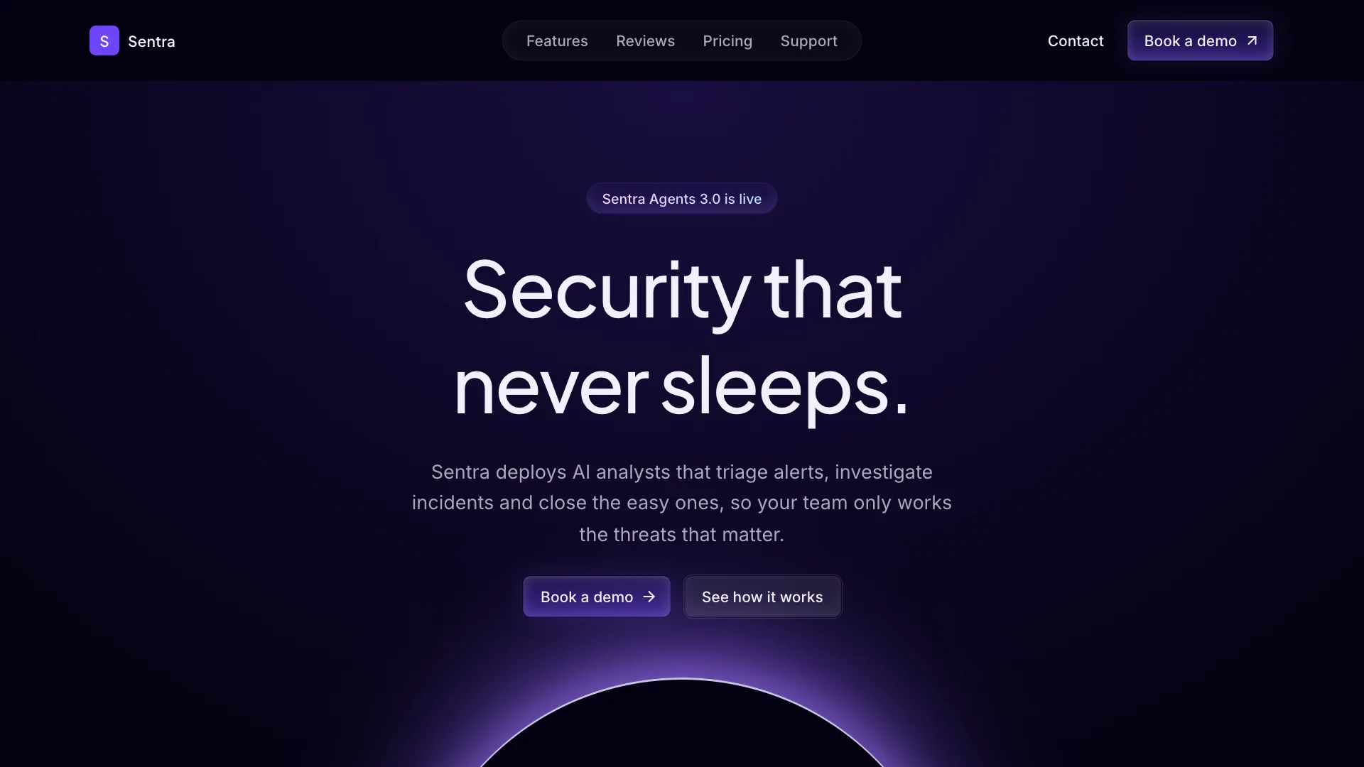
Verdant gives your AI assistant a living, always-on direction for AI agents and automation products. Pages sit on a deep green black, a single neon mint color marks every signal and soft mint light rises from the bottom of the hero and the closing panel.
Section labels are glowing double pills with a mint inner light. Primary actions are white pills, cards are deep green with a faint mint edge. Use it for agents, automations and tools that work while the user is away.
Visual language
- Color
- Deep green black background and deep green cards. Neon mint is the signal color for tags, toggles, active tabs, charts, glows and the connector lines. Light mint is used for text inside tinted pills. Primary buttons are white.
- Shape
- Cards and panels use about 30px corners. Buttons, inputs, labels and tabs are full pills. Section labels are double pills: an inner pill with a 4px gap to an outer outline.
- Typography
- Geist semibold for headlines with very tight tracking, 64px in the hero and 48px for sections. Geist medium for body text. Geist Mono for small floating labels and data.
- Depth
- Light comes from below: mint inner glows at the bottom edge of labels and the featured plan, and mint radial light behind the hero and the closing panel. No drop shadows.
- Layout
- Centered sections, each opened by a glowing double pill label. The footer ends with the brand name drawn in mint dots.
Component classes
Shadcn UI Kit components ship with large radii and soft shadows. The skill tells your assistant to pass these classes so every component matches Verdant.
| Component | className |
|---|---|
| heading | font-semibold tracking-tighter |
| button | rounded-full dark:data-[variant=default]:bg-foreground dark:data-[variant=default]:text-background dark:data-[variant=default]:hover:bg-foreground/90 data-[variant=secondary]:bg-secondary data-[variant=secondary]:hover:bg-primary/15 data-[variant=outline]:border-primary/20 data-[variant=outline]:bg-secondary dark:data-[variant=outline]:bg-secondary data-[variant=outline]:hover:border-primary/40 data-[variant=outline]:hover:bg-primary/15 dark:data-[variant=outline]:hover:bg-primary/15 |
| card | bg-card/80 rounded-4xl shadow-none ring-primary/12 dark:ring-primary/12 |
| input | rounded-full |
| badge | rounded-full |
| tabs | rounded-full data-active:bg-primary data-active:text-primary-foreground dark:data-active:bg-primary dark:data-active:text-primary-foreground dark:data-active:border-transparent data-active:hover:text-primary-foreground dark:data-active:hover:text-primary-foreground |
| menu | rounded-2xl **:data-[slot=accordion-trigger]:hover:no-underline **:data-[slot=accordion-trigger]:hover:text-primary |
Do
- Default to the dark theme and keep mint as the only accent.
- Use white for primary actions and mint for states.
- Use the double pill label above every section title.
- Start from Shadcn UI Kit blocks and restyle them with these tokens.
Don't
- Do not use mint for large text or body copy.
- Do not use square corners or drop shadows.
- Do not hardcode hex colors. Use the theme tokens.
- Do not edit files in components/ui.
Blocks it builds with
The skill points your assistant to these Shadcn UI Kit blocks first. It installs them with the shadcn CLI or the MCP server and restyles them to match.
- Top navigation
navbar1 - Agent hero
hero4 - Feature showcase
feature3 - Steps
how-it-works1 - Results
stats1 - Reviews
testimonial1 - Pricing
pricing3 - FAQ
faq1