Give your AI a design system it can follow
A design skill is one file with colors, fonts, component styles and layout rules. Add it to Claude Code, Cursor or Codex and every page it builds looks like it came from the same designer.
Live previews are free. Downloads are included in Pro, Team and Enterprise.
Build a landing page with the eclipse skill
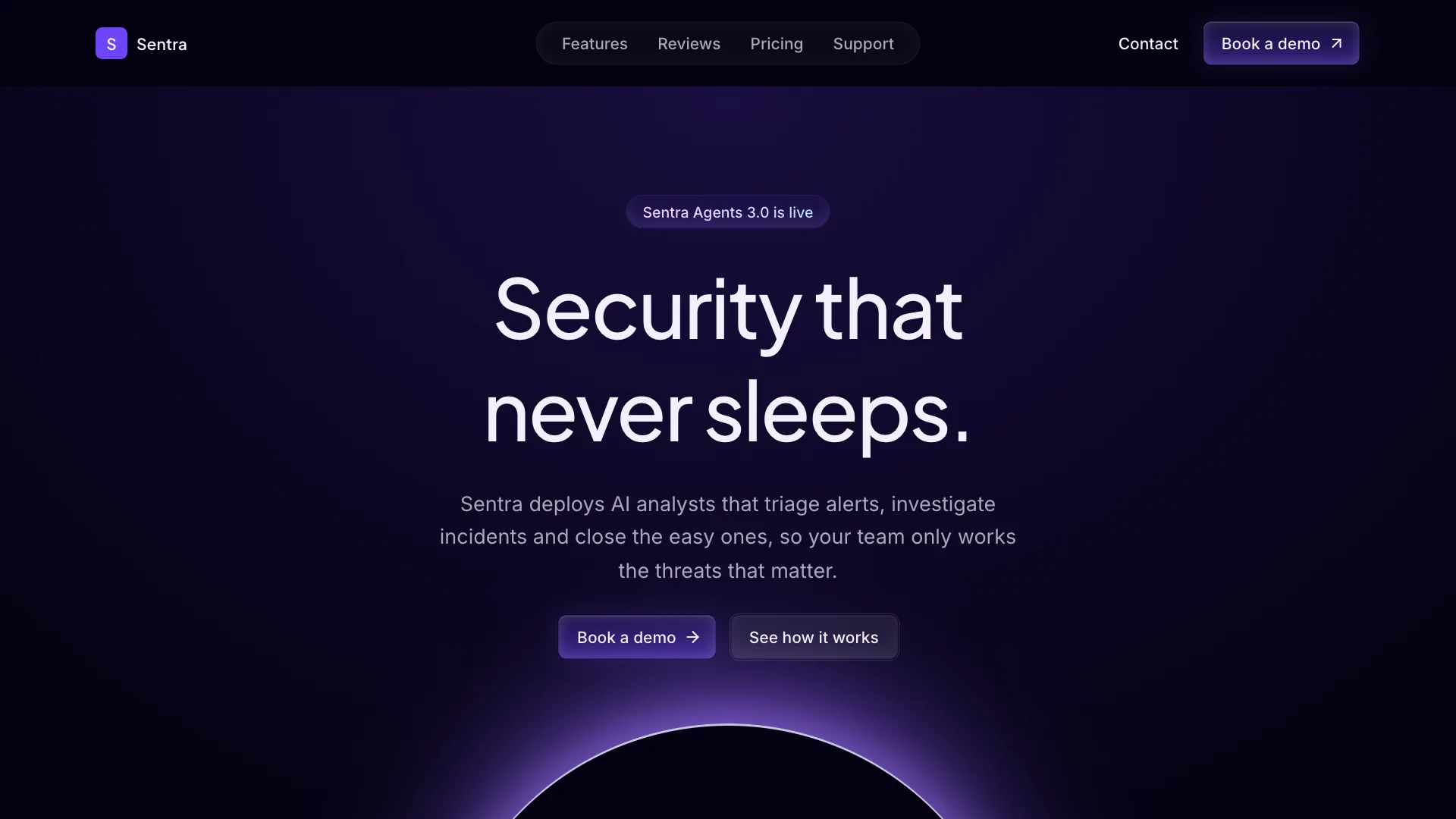
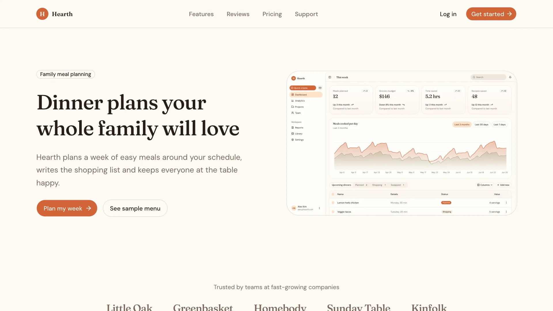
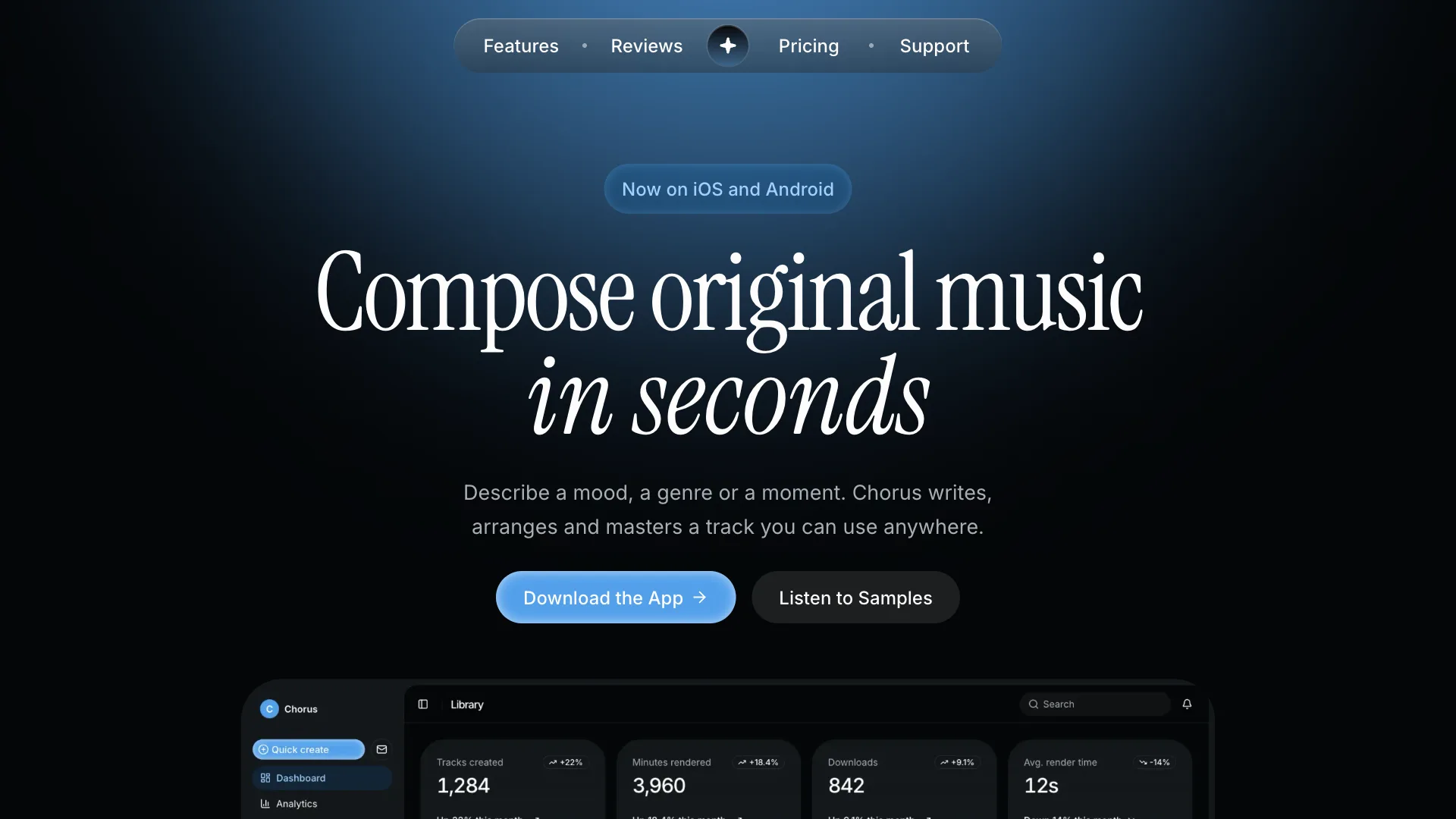
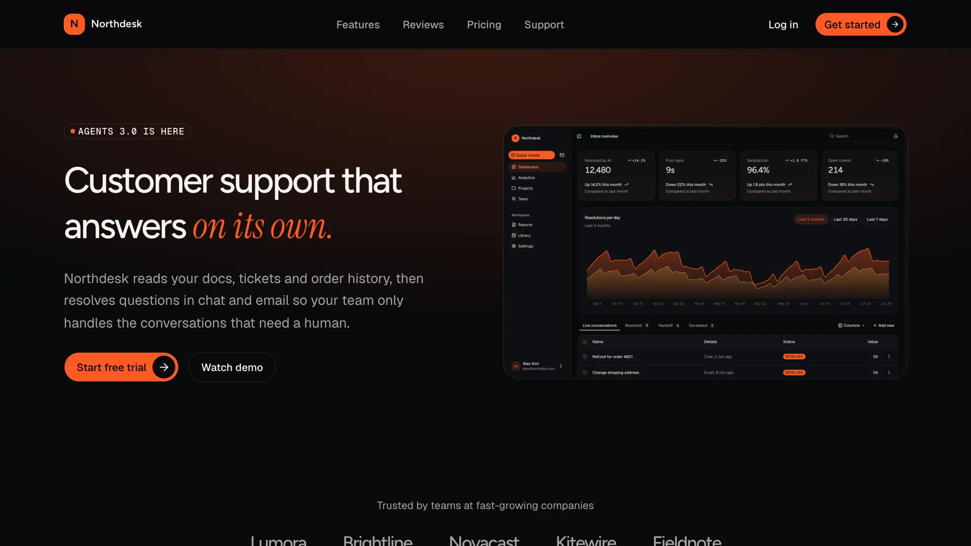
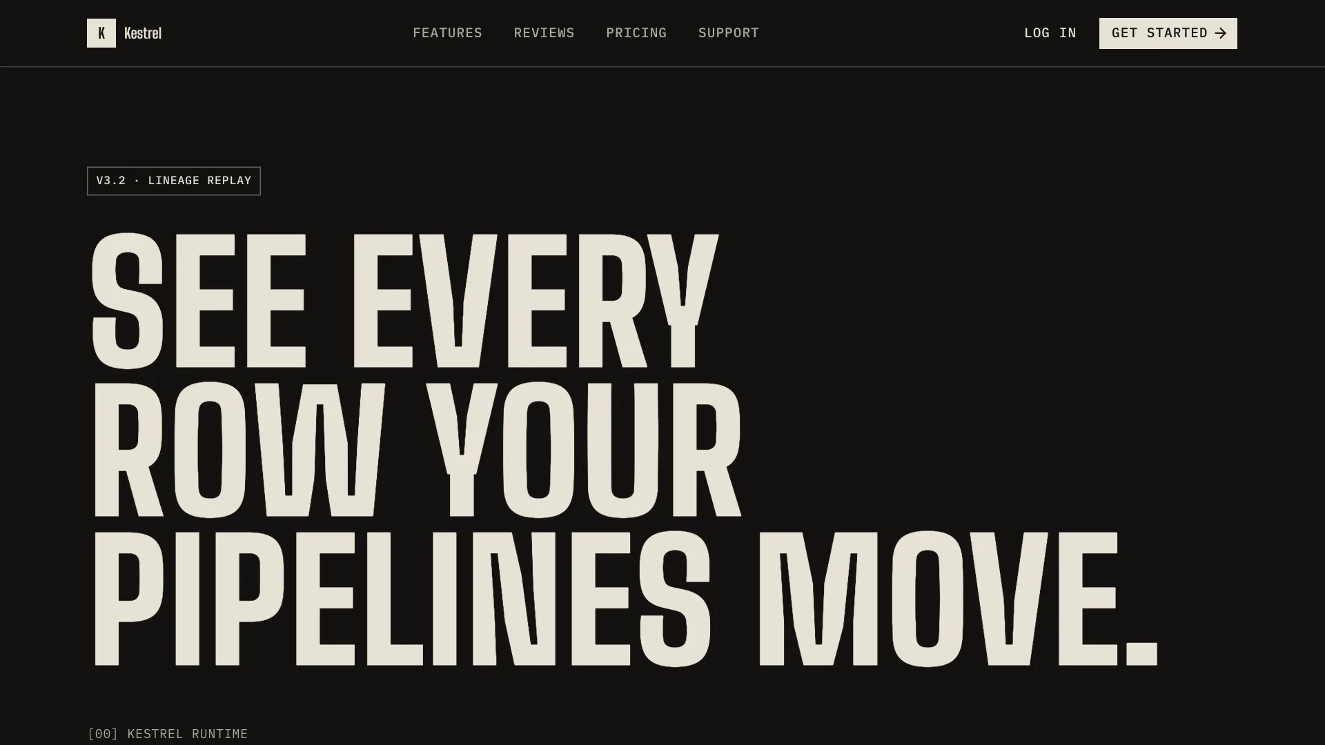
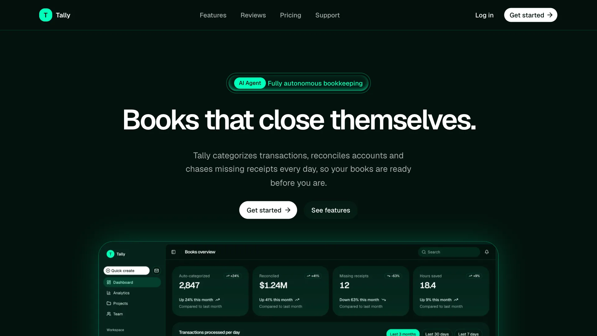
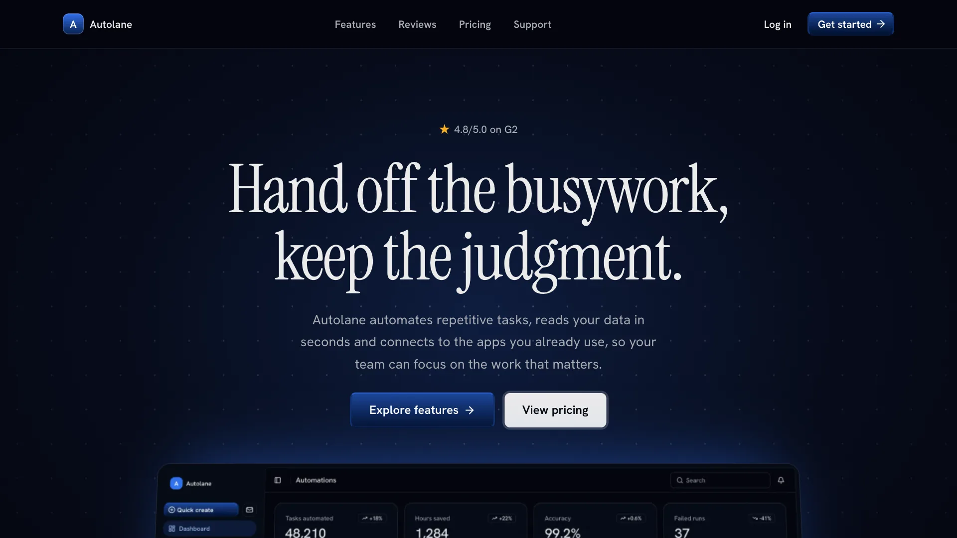
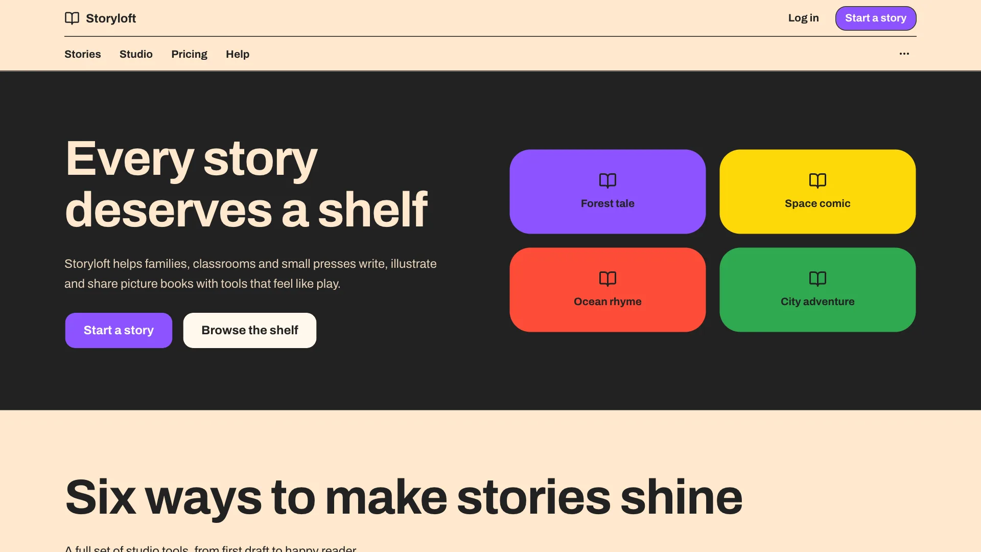
Works with
- Claude Code
- Cursor
- Codex
- Copilot
- Gemini CLI
- and more
Why design skills
AI writes good code, but it has no taste of its own
Without guidance, every prompt is a fresh guess at your style. A skill gives your assistant the same brief a designer would, so it gets the look right the first time.
Without a skill
- Every prompt starts from zero, so each page picks its own colors, radius and spacing.
- Screens fall back to the default gray look that every AI app shares.
- You fix the same styling details by hand after every generation.
With a design skill
- Your assistant reads the same tokens and rules before every UI task.
- Every page has a distinct look that works in light and dark mode.
- Screens are built from real kit blocks, so they stay consistent as you grow.
How it works
Set it up once, then just ask
It takes about a minute. After that you describe what you need and your assistant handles the styling.
- 1
Pick a skill
Open the live previews and choose the design system that fits your product. Every skill has marketing, app and component views.
○ Eclipse ● Clay ○ Nebula ○ Ember - 2
Install with one command
The shadcn CLI saves the skill where your tool reads it, applies the theme tokens to globals.css and adds the fonts.
$ npx shadcn@latest add @shadcnuikit/clay-design ✓ Updating fonts ✓ Created .claude/skills/clay-design/SKILL.md ✓ Updating app/globals.css - 3
Ask for UI
Ask for a page, a dashboard or a single component in plain words. Your assistant builds it in the style of the skill.
> Build a pricing page for Hearth
✓ Used the clay skill
✓ /pricing is ready
8 skills, more every month
Choose the look of your product
Each skill is a complete design system with its own colors, fonts and components. Open one to see live marketing, app and component previews in light and dark mode.
Eclipse
Deep violet AI system with glass buttons and an eclipse glow.
Clay
Warm, friendly system with soft shapes and a serif voice.
Nebula
Night-sky creative system with sky blue light and serif display type.
Ember
Dark AI product system with ember orange and a serif accent.
Monolith
Editorial brutalist system with condensed caps and cream bands.
Verdant
Deep green AI agent system with neon mint signals and lit outlines.
Stellar
Deep space AI system with royal blue buttons and serif headlines.
Crayon
Playful storybook system with crisp ink outlines and saturated color bands.
Inside a skill
One file, a whole design system
Plain Markdown you can read, edit and commit. It has everything a designer would hand over, written so an AI can follow it.
Color tokens
Every theme variable for light and dark mode, ready for globals.css.
Fonts and type scale
Heading and body fonts with the sizes, weights and tracking to use.
Component styles
Exact classes for buttons, inputs, cards, tabs, switches and more.
Layout rules
How sections, heroes, tables and dashboards are structured.
Do and don't
Clear rules that stop the assistant from drifting off style.
Blocks to start from
The Shadcn UI Kit blocks that fit the skill, by name.
8
Design skills
31
Theme tokens each
550+
Kit blocks
12+
Supported tools
---
name: clay-design
description: Clay design system for UI work. Use when building or changing pages, sections, dashboards or components so the result follows the Clay tokens, typography and component rules with Shadcn UI Kit blocks.
---

# Clay design skill

Clay is a warm system for consumer products: cream surfaces, a terracotta brand color, generous rounded corners and a serif heading voice. It feels personal and calm without looking childish.

Best for: Consumer apps, Wellness, Education, Marketplaces.

## When to use this skill

Apply this skill whenever you create or change UI in this project: pages, sections, dashboards, forms or single components. Every screen you build must follow the tokens and rules below.

## Overview

Clay gives your AI assistant a warm, human direction for products people use every day. Cream backgrounds replace pure white, corners are soft and generous, and a serif heading face adds personality to otherwise simple layouts.

Use it for apps that need to feel welcoming: health and wellness, learning, food, family and small marketplaces. The palette stays earthy and low contrast on surfaces, while text and actions keep strong contrast.

## Setup

Do these steps once. Skip any step that is already done.

1. Make sure shadcn/ui is set up with Tailwind CSS v4 and a `globals.css` that maps tokens with `@theme inline`.
Works with your tools
Use it with the AI tools you already know
Skills live in your repository, next to your code, in the format each tool already reads. Claude Code, Cursor and Codex have a one-line setup.
Claude Code
Save the skill in .claude/skills and Claude loads it whenever you ask for a page, section or component.
Cursor
Add the skill as a project rule so the agent applies the same tokens and component rules on every UI task.
Codex
Install the skill into docs, add one line to AGENTS.md and Codex follows it in the CLI, the IDE extension and the cloud.
Also works with
- Copilot
- Gemini CLI
- VS Code
- Windsurf
- Cline
- Zed
- OpenCode
- Lovable
- v0
FAQ
Questions and answers
Plans, setup and how skills fit into your project.
Let your AI handle the UI
Pick a skill, add one file and get screens that look like they came from the same designer. Included in every Pro, Team and Enterprise plan, together with the MCP server and all premium blocks.