About Shadcn Product Category Blocks
A product category section helps shoppers pick a department, collection or room before they browse individual products. These nine shadcn product category blocks range from category carousels and image tile grids to an editorial layout with a featured collection and full width promotional banners.
Like the rest of our shadcn blocks, they are built with React, TypeScript and Tailwind CSS on top of shadcn ui components such as Card, Carousel, Breadcrumb and Button. Most of them are server components that render a list of categories from a simple array, so you can point every tile to your own collection page and keep the shadcn components in sync with your theme.
Key Elements of a Product Category Section
- Representative images: one photo per category that shows what is inside, cropped to the same ratio.
- Readable names: the category name on or below the image, with a gradient overlay when the text sits on a photo.
- A link on every tile: the whole card should lead to the matching collection or listing page.
- Supporting details: item counts, a one line description or a label such as Collection.
- Navigation: a View All or See All Category link, a breadcrumb or carousel arrows when there are more categories than fit.
Where and Why to Use Product Category Blocks
A store homepage has to serve visitors who know what they want and visitors who are just looking. Category tiles give both groups a quick first step and show the breadth of the catalog without listing every product. Built from shadcn components and Tailwind CSS utilities, these sections fit between the hero and the product lists of any shadcn ui storefront.
- Store homepages: a category grid or carousel right under the hero as the main entry into the catalog.
- Department pages: subcategory tiles at the top of a large section such as Skin Care or Furniture.
- Campaign and membership promotions: a full width banner that pushes a collection or a loyalty offer.
- Lookbooks and editorial pages: split panels and model photos that introduce a new collection.
- Home and furniture stores: shop by room tiles such as Bedroom, Office or Living Room.
- Specialty retailers: categories by use case, such as cameras grouped by photography style.
Product Category Blocks in This Collection
- Product Category 1: Fits the top of a collection page, where a breadcrumb shows the current location and tall portrait tiles can be dragged through.
- Product Category 2: A compact strip for stores with many departments. The item count on each card tells shoppers how much they will find.
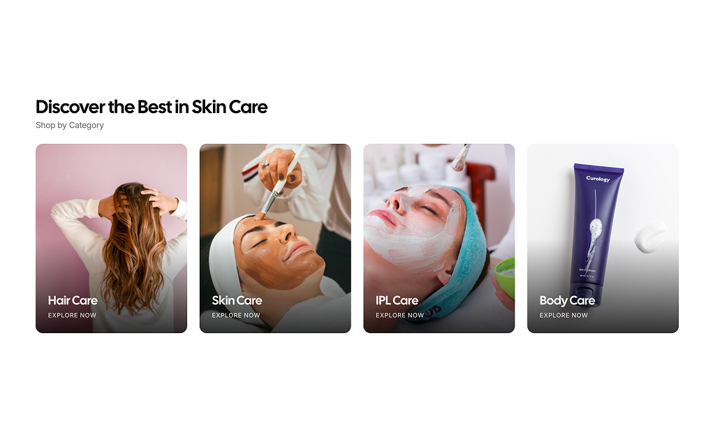
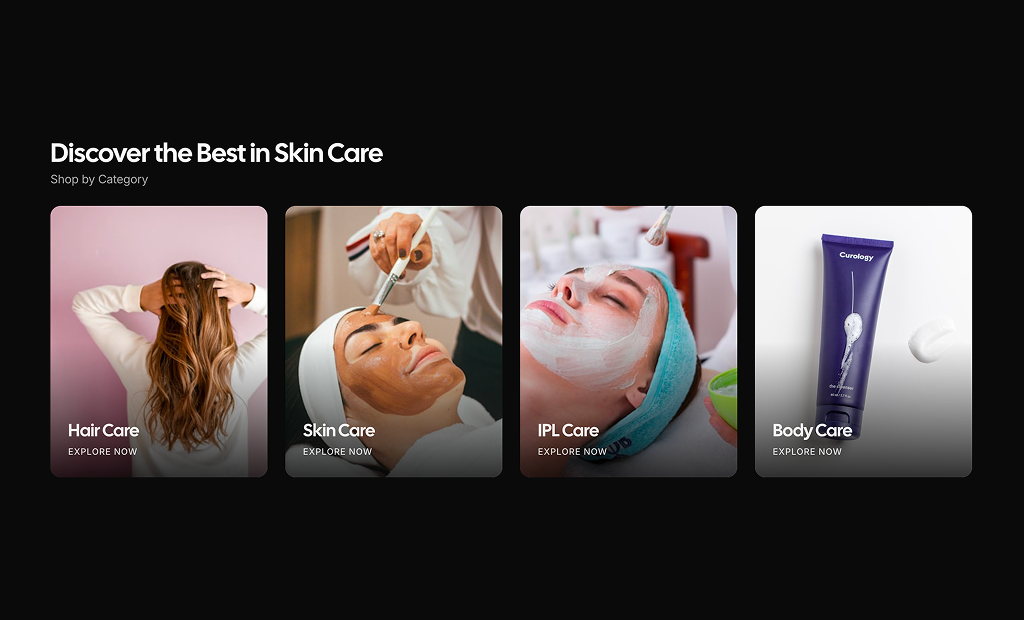
- Product Category 3: A four tile grid for beauty and lifestyle stores where the photos do most of the selling.
- Product Category 4: Good when categories need a sentence of context, for example grouping products by use case, with a single Explore More action for the full range.
- Product Category 5: Use it to promote one collection above the others while still linking two secondary categories.
- Product Category 6: A single image banner for a loyalty program or seasonal offer, placed between product sections.
- Product Category 7: Works for launches that deserve big typography, alternating image and color panels so two collections get equal weight.
- Product Category 8: Suits jewelry, fashion and other premium brands that want an editorial announcement with one call to action.
- Product Category 9: A shop by room grid where text-only cells break up the photos and keep the section light.
Similar Block Categories
- Product List: the listing a category tile should lead to.
- Store Navigation: expose the same categories in the header menu.
- Promo Sections: pair a category banner with a sale or offer.
- Hero Sections: the top of the homepage, right above the category tiles.
Accessibility
Every image has alt text from the data, such as “Hair Care category” or “Modern sofa in a living room”, and every tile is a real link, so the categories can be reached with the Tab key. Product Category 1 marks the current page in its breadcrumb, and the shadcn CarouselPrevious and CarouselNext buttons in Product Category 1 and 2 include screen reader labels and are disabled at either end. The gradient overlays in Product Category 3 and 5 keep white text readable on photos.
Some details are worth adjusting. Product Category 4 places an Explore Now button on each tile without a link or handler, so turn the tile or button into a link. Product Category 9 has text-only tiles that rely on a border alone, so check the contrast of that border. The hardcoded panel colors in Product Category 7 and the brown button in Product Category 8 do not follow the theme, so consider replacing them with theme tokens and checking contrast in dark mode.
Product Category FAQ
count in Product Category 2, description in 4 and 5, featured and label in Product Category 5 and the heading lines and cta in Product Category 7. Product Category 6 and Product Category 8 are written directly in the markup, so change the text and image URLs there.bg and text fields that hold the panel classes, set to a yellow and a near black arbitrary color in the sample. Replace them with theme tokens such as bg-primary text-primary-foreground or bg-muted text-foreground so the panels follow your light and dark theme. The reversed flag moves the image to the right.embla-carousel-react, and some blocks use lucide-react icons. Product Category 3 to 9 are server components with no client state.