Stellar design skill for AI agents
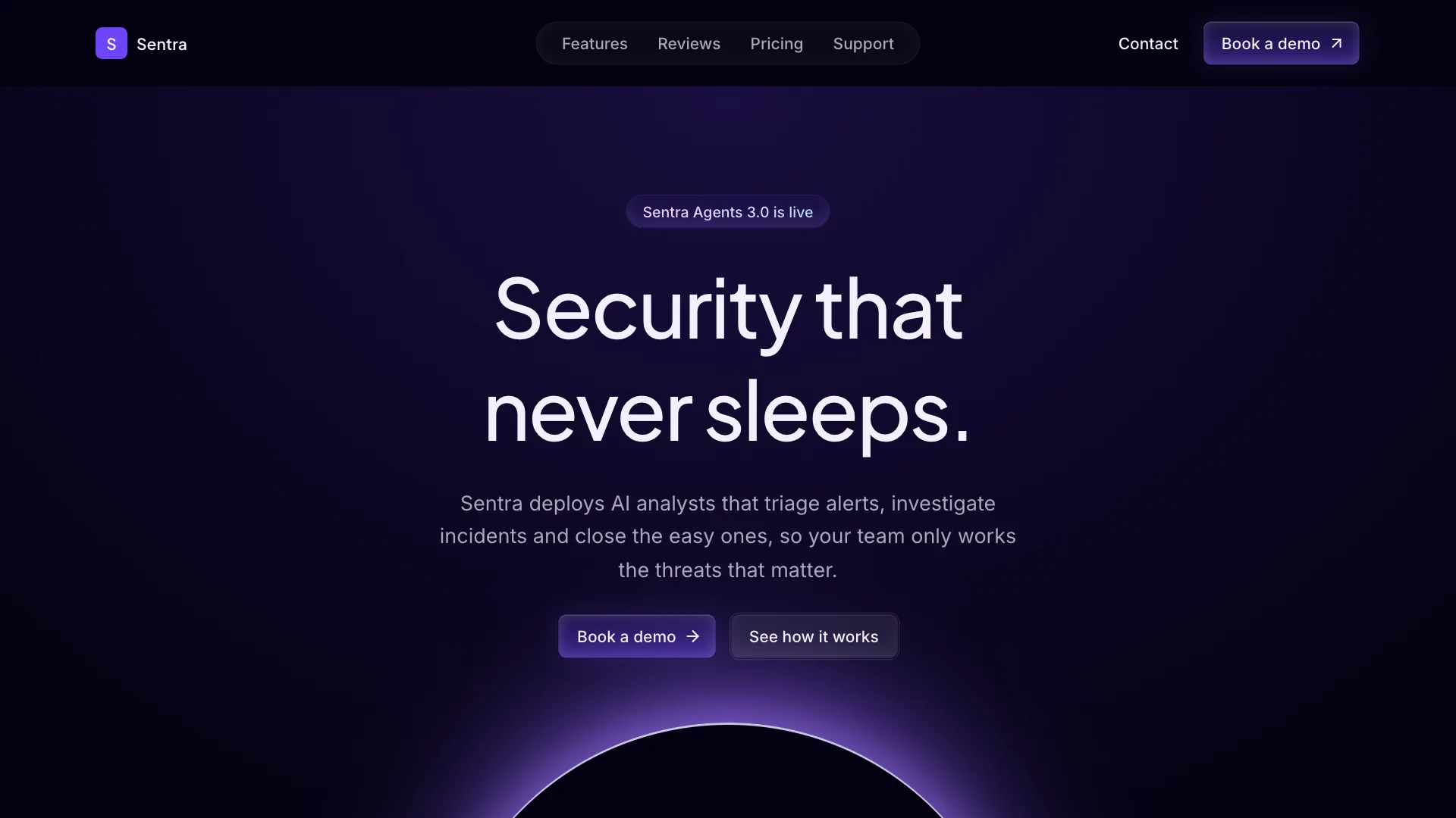
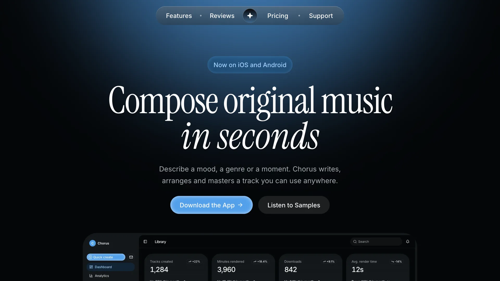
Stellar gives your AI assistant a calm, premium direction for AI and SaaS products. Pages sit on a near black navy that reads like a night sky, with a faint field of stars and blue light behind the hero.
Headlines are light serif, buttons are royal blue gradients with a bright top edge next to white secondary buttons, and cards are quiet navy panels lit along their top edge. Use it for automation tools, AI assistants and data products that want to feel trustworthy rather than loud.
Visual language
- Color
- Near black navy background and slightly lighter navy cards. Royal blue is the only accent: primary buttons, the featured plan, badges, charts and focus rings. Text is soft white, body copy a cool gray. Amber appears only for rating stars.
- Shape
- Buttons and inputs use 8px corners, badges 5px and cards 16px. Primary buttons have a 2px edge that is bright on top and dark at the bottom. White secondary buttons sit inside a faint 2px white halo.
- Typography
- Instrument Serif regular for the hero and section headlines, 90px in the hero and 52px for sections, never bold. Hanken Grotesk medium for card titles, numbers and footer headings, regular for body text and semibold on buttons.
- Depth
- Light comes from the sky: a soft blue radial glow and a sparse star field behind the hero, blue light behind the closing section and the featured plan. Cards have a 1px highlight along their top edge instead of drop shadows.
- Layout
- Centered hero with a small rating line above the headline and a tilted product panel below. Sections open with a centered serif title and no label. The page ends with a newsletter form and a four column footer.
Component classes
Shadcn UI Kit components ship with large radii and soft shadows. The skill tells your assistant to pass these classes so every component matches Stellar.
| Component | className |
|---|---|
| heading | font-medium tracking-normal |
| button | rounded-lg font-semibold data-[size=lg]:h-12 data-[size=lg]:px-6 data-[size=lg]:text-base data-[variant=default]:border-2 data-[variant=default]:border-t-[color-mix(in_oklab,var(--primary)_85%,black)] data-[variant=default]:border-x-[color-mix(in_oklab,var(--primary)_55%,black)] data-[variant=default]:border-b-[color-mix(in_oklab,var(--primary)_35%,black)] data-[variant=default]:bg-linear-to-b data-[variant=default]:from-[color-mix(in_oklab,var(--primary)_72%,black)] data-[variant=default]:to-[color-mix(in_oklab,var(--primary)_32%,black)] data-[variant=default]:text-primary-foreground data-[variant=default]:hover:brightness-125 data-[variant=secondary]:bg-card data-[variant=secondary]:text-foreground data-[variant=secondary]:ring-1 data-[variant=secondary]:ring-border data-[variant=secondary]:hover:bg-secondary dark:data-[variant=secondary]:bg-foreground dark:data-[variant=secondary]:text-background dark:data-[variant=secondary]:ring-2 dark:data-[variant=secondary]:ring-foreground/20 dark:data-[variant=secondary]:hover:bg-foreground/90 data-[variant=outline]:bg-card dark:data-[variant=outline]:bg-card data-[variant=outline]:hover:bg-secondary dark:data-[variant=outline]:hover:bg-secondary |
| card | bg-card rounded-2xl shadow-[inset_0_1px_0_color-mix(in_oklab,var(--foreground)_9%,transparent)] ring-border dark:ring-border |
| input | rounded-lg |
| badge | rounded-[5px] data-[variant=default]:bg-linear-to-b data-[variant=default]:from-primary data-[variant=default]:to-[color-mix(in_oklab,var(--primary)_40%,black)] |
| tabs | rounded-md |
| menu | rounded-xl |
Do
- Default to the dark theme and keep royal blue as the only accent.
- Pair one blue gradient button with one white button.
- Use serif for hero and section headlines only.
- Start from Shadcn UI Kit blocks and restyle them with these tokens.
Don't
- Do not use bold serif or serif for body text.
- Do not use flat blue buttons. Always use the gradient and the bright edge.
- Do not hardcode hex colors. Use the theme tokens.
- Do not edit files in components/ui.
Blocks it builds with
The skill points your assistant to these Shadcn UI Kit blocks first. It installs them with the shadcn CLI or the MCP server and restyles them to match.
- Top navigation
navbar1 - Centered hero
hero4 - Feature cards
feature3 - Steps
how-it-works1 - Reviews
testimonial1 - Pricing
pricing3 - Newsletter
newsletter1 - Footer
footer1