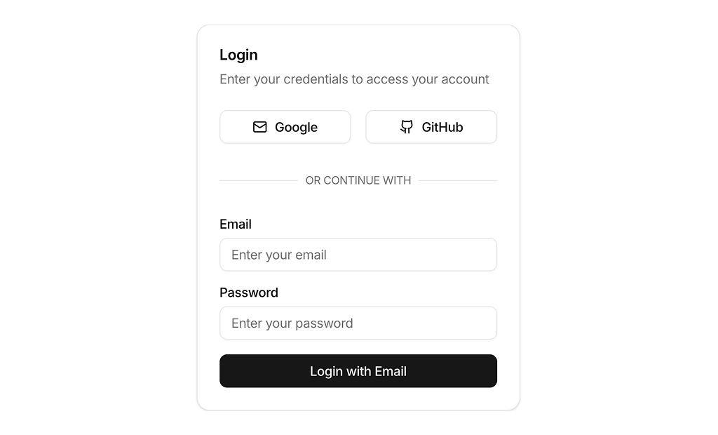
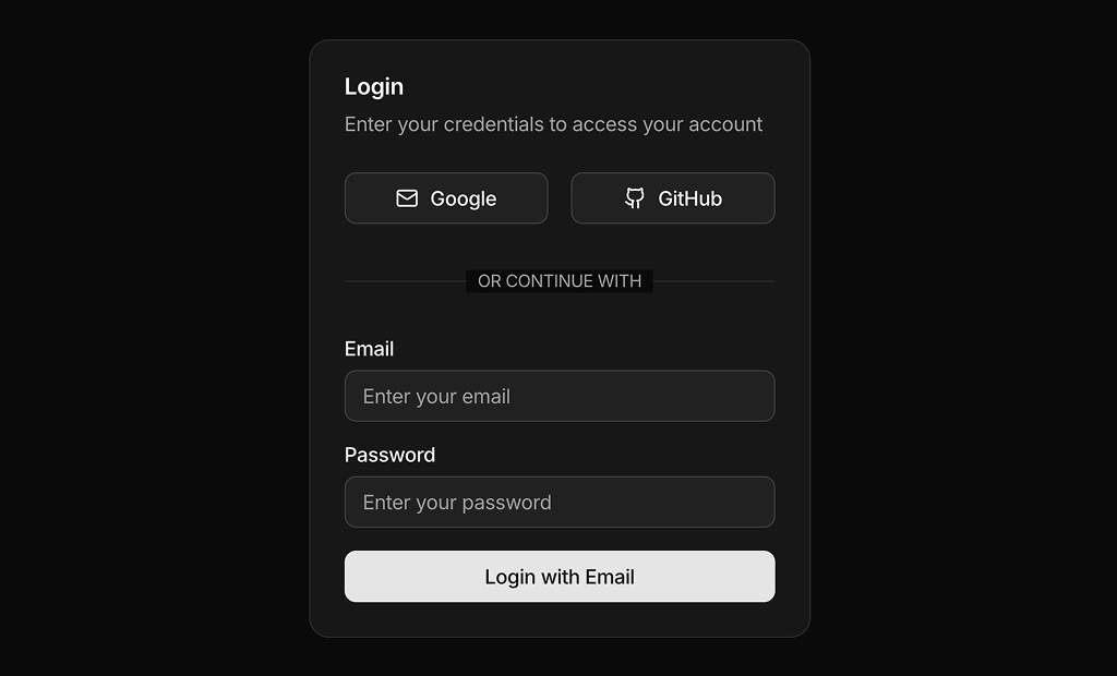
About Authentication Forms Examples
Authentication forms handle the core flows that gate access to your application: sign up, log in, password reset, and multi-factor checks. Because they sit at the entry point of the user journey, their design and implementation have a direct impact on conversion rates, perceived security, and overall brand trust. When these flows are built using shadcn ui components inside shadcn blocks and styled with tailwindcss, they inherit a consistent visual language for inputs, buttons, and helper text that aligns with the rest of your next.js product experience.
Technically, AuthenticationForms components are often composed from smaller react pieces such as labeled inputs, error messages, and third-party provider buttons. TypeScript interfaces and schemas define the shape of credentials and payloads, ensuring that validation logic is reliable and easy to share between client and server layers. In a next.js stack, the outer page and copy are typically rendered on the server for SEO benefits and fast first paint, while the inner form component manages local state, validation feedback, and submission status on the client. Using shadcn ui for primitives means that focus states, aria attributes, and error presentation follow accessibility best practices without custom wiring on every screen.
From a customization standpoint, AuthenticationForms are highly configurable: you might need variants for social logins, organization invites, or device-based approvals. By centralizing these patterns in a shared react and typescript module, teams can maintain a single source of truth for labels, error copy, and conditional fields while still allowing feature-specific tweaks through props and composition. Tailwindcss utilities help adapt the same base forms for marketing landing pages, embedded modals, or full-page layouts without accumulating one-off CSS. This balance of reusability, type safety, and visual consistency is what makes AuthenticationForms a critical part of a scalable component system.