About Team Sections Blocks
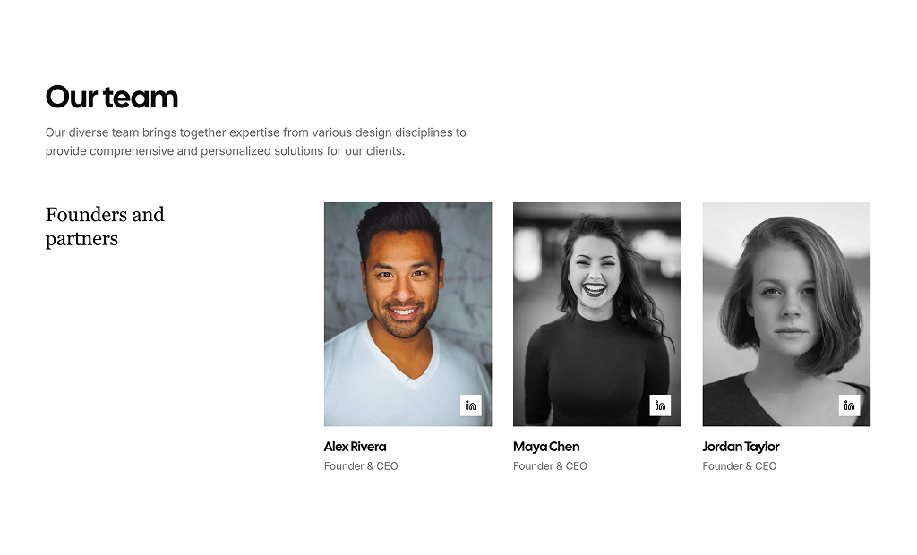
Team section blocks are shadcn blocks that present team members in a structured layout: photo, name, role, optional bio, and social links. Built with React and TypeScript, they use shadcn/ui Card and typography components styled with Tailwind CSS. Each block gives you a consistent way to show who’s behind the product or company without building the grid and hierarchy from scratch.
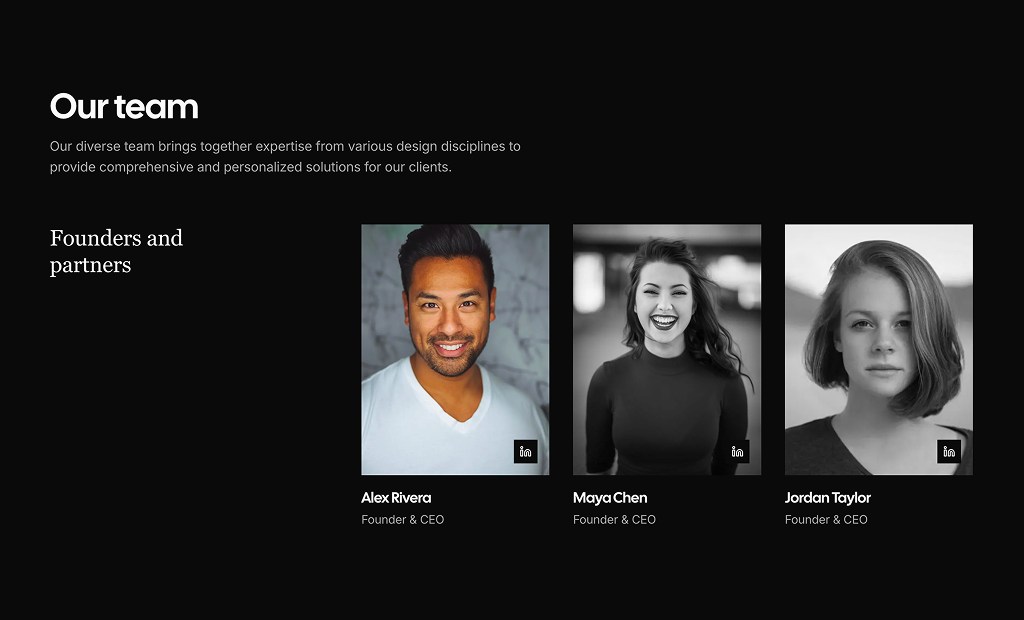
They fit about pages, company sites, landing pages, and anywhere you want to build trust through faces and roles. Use a single row, a grid, or mix with other shadcn blocks (e.g. testimonials, feature sections). They work in Next.js and other React apps and support light and dark themes.
All content is editable: images, names, titles, bios, and links live in your code. Tailwind controls layout, spacing, and card style so you can match your brand. You can add or remove members, change columns per breakpoint, or extend with extra fields while keeping the same shadcn UI base.