About Shadcn Shopping Cart Blocks
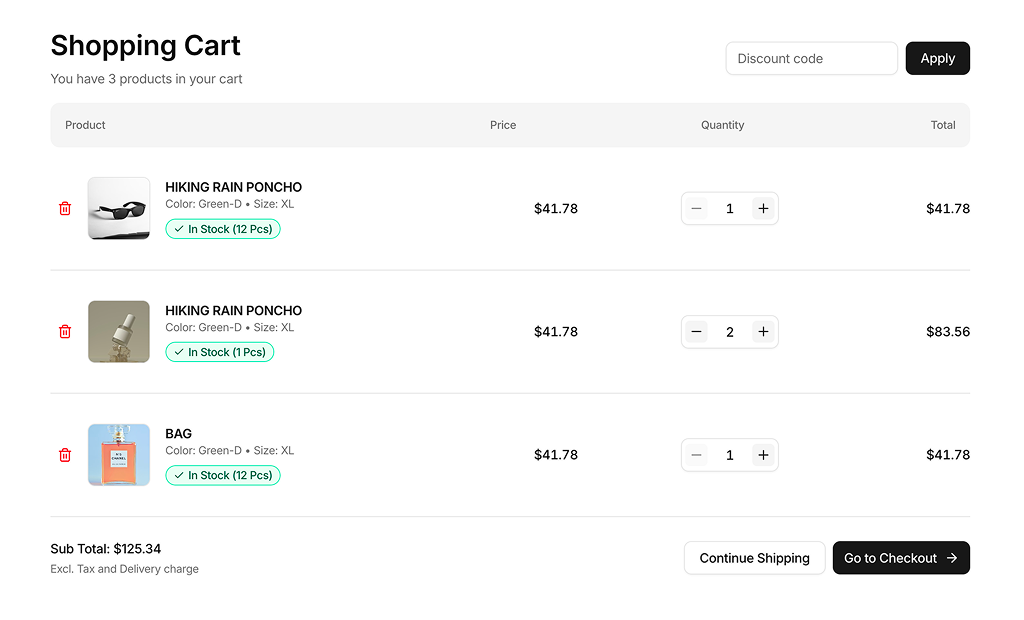
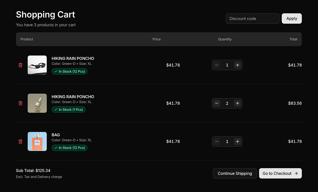
Shopping cart blocks are shadcn blocks that display the items a customer has added: product image, name, price, quantity controls, and an order summary with totals and a checkout button. Built with React and TypeScript, they use shadcn/ui Card, Input, and Button components styled with Tailwind CSS, giving you a complete cart layout you can drop into your store without rebuilding the structure.
They are for cart pages, slide-out cart drawers, and any step where customers review their order before checkout. Use them in Next.js ecommerce routes or React storefronts; they are fully responsive and work with the shadcn registry and CLI. Pair them with discount code fields, shipping estimates, or cross-sell sections to increase average order value.
Cart data, prices, and quantities live in your code or state management. Tailwind controls the layout, spacing, and summary placement. You can add remove buttons, saved-for-later lists, or promo banners; the underlying shadcn UI and TypeScript structure stay the same so you keep full control and theme support.