About Shadcn Charts Blocks
A dashboard chart turns a list of numbers into a shape people can read in seconds, such as a rising line, a tall bar or a large slice of a donut. These 70 shadcn chart blocks cover bar, line, area, donut, gauge, scatter, heatmap, funnel and status charts, each placed in a finished card with a title, a headline value and the controls the data needs.
Like the rest of our shadcn blocks, every card is written in React and TypeScript with Tailwind CSS and shadcn ui components such as Card, Tabs, Toggle Group, Select and Dropdown Menu. Most charts use the shadcn components for Recharts, so tooltips, legends and colors follow your theme in light and dark mode. The sample data covers SaaS revenue, payments, support, DevOps, health and investing, which you replace with your own.
Key Elements of a Dashboard Chart
- Title and period: a short name such as “Cash flow” and the range it covers, so nobody has to guess what the chart shows.
- Headline value: one total or rate in large type with its change, colored for good or bad news.
- The chart itself: readable axes, light grid lines and a tooltip that gives the exact value on hover.
- Series labels: a legend, colored dots or a list next to the chart that names every color.
- Controls: a range toggle, metric tabs or a select, only where switching views helps the reader.
- Context: a breakdown, target or comparison that explains the number, such as a budget line or last year’s values.
Where and Why to Use Chart Blocks
A dashboard is only as useful as the questions it answers at a glance. Chart cards put the trend, the split and the comparison right where people make decisions, without exporting data to a spreadsheet. Because they are regular shadcn components styled with Tailwind CSS, they sit next to your stat cards, tables and forms without extra design work.
- SaaS analytics: recurring revenue by plan, signups by source, activation funnels and subscription growth.
- Finance and payments: cash flow, payment volume, spend caps, budgets and portfolio value.
- Engineering and operations: uptime history, request volume, CI pipeline timing and cloud costs.
- Sales and CRM: deal outcomes, deal velocity by channel, weekly targets and channel splits.
- Support and success: ticket outcomes, busiest hours and onboarding health.
- Consumer apps: fitness goals, learning progress, review scores and watch time.
Charts Blocks in This Collection
The 70 charts are grouped by the type of chart they use. Each item says when the block is a good fit.
Bar Charts
- Chart 1: A simple starting point when you only need to compare two traffic sources month by month on a revenue overview.
- Chart 8: Fits finance dashboards that show actual revenue next to what was still expected for the same period.
- Chart 10: Works when a year over year comparison needs to read in a glance and a full chart would be too much.
- Chart 12: Lets one compact card cover two series, so users switch between them instead of reading two charts.
- Chart 14: Pairs a weekly chart with earnings, profit and expense progress, which suits a seller or creator payout page.
- Chart 16: Good for a narrow sidebar card that combines a monthly trend with the two latest money movements.
- Chart 17: The plainest stacked bar card in the set, ideal for usage or storage reports that need a legend.
- Chart 22: Built for infrastructure pages where a service summary stays visible and the traffic chart folds away.
- Chart 23: Suits revenue reports where finance teams need each stream's share of the month and its yearly change.
- Chart 25: Use it for year over year reviews where last year's bars are mirrored below the axis for a direct comparison.
- Chart 30: Fits a weekly payout or creator dashboard where people pick one metric and read the best day.
- Chart 31: Shows positive and negative money movement on one axis, which suits treasury and runway views.
- Chart 35: Good for finance pages where people click a month and read its incoming, outgoing and retained cash.
- Chart 36: Use it for budget tracking across teams, since the dashed budget line makes overspending obvious.
- Chart 44: Fits growth dashboards that compare acquisition channels by how many signups activate or drop off.
- Chart 45: Suits cloud and data teams that watch daily cost per workload against the monthly average.
- Chart 47: Good for support leads who switch between ticket volume and resolution share for any month.
- Chart 48: Fits engineering dashboards that track CI health per branch group over a full year.
- Chart 57: Works for media or creator platforms that need a weekly income headline and a per day breakdown.
- Chart 63: Use it when accountants want the same month end balances as a chart and as an exact table.
Line Charts
- Chart 2: A light card for fitness or habit apps that compares today with a typical day.
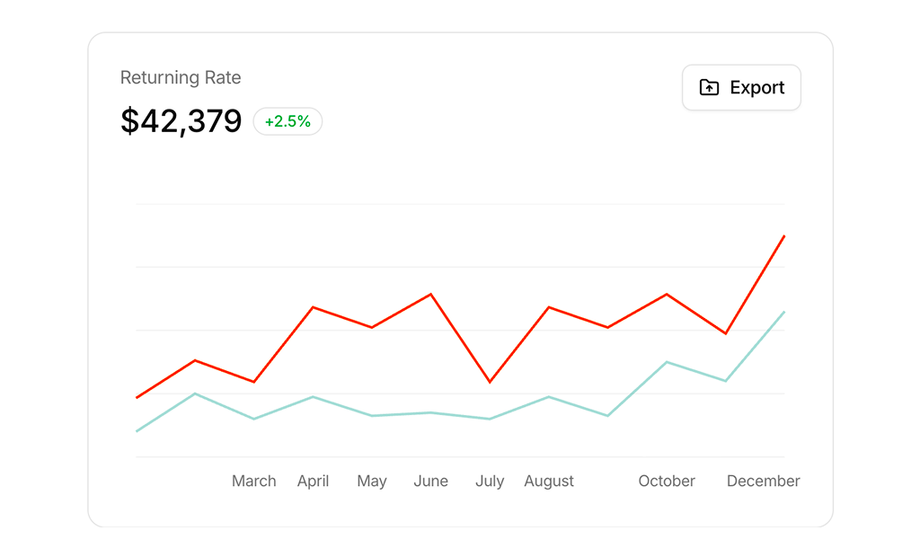
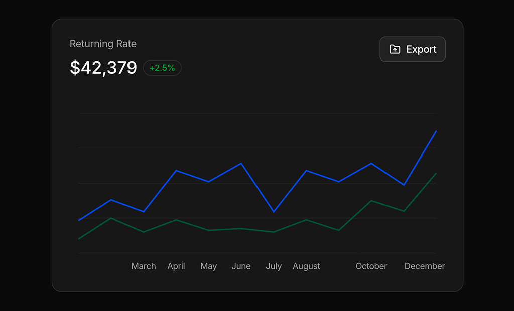
- Chart 3: Fits an e-commerce or SaaS overview that needs a headline rate, a trend and an export action.
- Chart 5: Suits fintech apps that show a currency pair's recent movement next to conversion actions.
- Chart 7: Use it for marketing dashboards where a campaign's bookings and visits change with the chosen period.
- Chart 18: Fits crypto wallets and payment apps that summarize money in, money out and withdrawals.
- Chart 21: Good for SaaS revenue pages where each pricing plan needs its own MRR trend and churn numbers.
- Chart 49: Use it to warn teams early when usage based costs are on track to pass a spending limit.
- Chart 50: Fits payment platforms that compare two payment methods and their fees, refunds and ticket size.
- Chart 51: Suits health and wellness apps where users choose which daily goals they want to follow.
- Chart 61: Good for product and app store dashboards that track average rating against last year.
- Chart 64: Use it on payment dashboards to show how this month is pacing against the whole of last month.
Area Charts
- Chart 9: A wide overview chart for project or traffic dashboards that adapts its range control to the card width.
- Chart 26: Fits annual revenue reviews where people compare two years and drill into a half or a quarter.
- Chart 38: Suits blogs, newsletters and creator tools that want growth plus the posts and sources behind it.
- Chart 41: Good for investing apps that show portfolio value and the holdings that make it up.
- Chart 42: Use it in CRM dashboards to see whether wins grow faster than losses over the year.
- Chart 52: Fits subscription businesses that compare subscribers, active users and cancellations with the period before.
- Chart 55: Suits brokerage and crypto apps where each asset needs a small trend line in a list.
- Chart 62: Use it for trading or token pages that need price, market cap and volume behind one set of controls.
- Chart 67: Fits fund and stock detail pages where users jump between short and long time ranges.
Combined Bar and Line Charts
- Chart 32: Use it to flag an unusual day in a metric and send someone to investigate it.
- Chart 33: Good for sales teams that check daily revenue against daily targets during the week.
- Chart 34: Fits retail and e-commerce dashboards that compare today's hourly sales with the same day last week.
- Chart 43: Suits email and newsletter tools that show delivery health and engagement on two separate axes.
Donut, Pie and Gauge Charts
- Chart 4: A classic traffic source donut for store or marketing overviews with an export action.
- Chart 6: Fits hotel and booking dashboards that need reservation status and weekly sales in one card.
- Chart 11: Lets users focus one month at a time, which suits compact project or efficiency widgets.
- Chart 13: Good for CRM home screens that show where leads come from with the exact count per source.
- Chart 15: Suits help desk widgets that need a completion rate plus ticket counts and response time.
- Chart 19: Use it for small summary cards where the share of each segment matters more than a trend.
- Chart 20: Fits healthcare and admin dashboards where slice labels make the split readable without hovering.
- Chart 53: Good for FinOps pages that slice the same invoice by service, environment or region.
- Chart 54: Use it in customer success dashboards to show how many go-lives are healthy per segment.
- Chart 56: Fits learning platforms that compare enrollments across a few course tracks.
- Chart 60: Suits IT and procurement dashboards that review software cost per category and per seat.
- Chart 66: Good for streaming and media apps that show which device people watch on most.
Heatmaps and Scatter Charts
- Chart 28: Use it on developer profiles or team pages to show activity and streaks across a whole year.
- Chart 59: Fits sales leadership reviews that compare channels by deal size and speed at the same time.
- Chart 65: Suits support managers planning shifts around the busiest days and hours.
Progress, Funnel and Timeline Cards
- Chart 24: Fits project management dashboards that need a lightweight roadmap next to project progress.
- Chart 27: Use it for onboarding and activation reviews where the biggest drop between steps matters most.
- Chart 37: Good for billing dashboards that show revenue mix by tier with renewals and overdue invoices.
- Chart 46: Suits product analytics pages that rank operating systems or browsers by active members.
- Chart 58: Fits DevOps dashboards that need to find the slowest stage of a CI pipeline.
- Chart 68: Use it for monthly growth reviews where each goal shows how close it is to target.
- Chart 69: Good for HR and learning tools that track a team's course progress and due dates.
- Chart 70: Fits sales dashboards that compare two channels head to head instead of plotting a trend.
Status and Uptime Charts
- Chart 29: Use it on a public or internal status page that covers several services at once.
- Chart 39: Fits developer platforms that want a compact status history with a readable incident detail.
- Chart 40: Good for monitoring a single endpoint with uptime, downtime and a list of past events.
Similar Block Categories
- Stat Cards: put a row of headline numbers above your charts for a quick summary.
- Tables: show the rows behind a chart when people need to sort, filter or read exact values.
- Dashboard Shell: the sidebar and header layout that holds your chart cards.
- Empty State: what to show in a chart card before there is any data to plot.
- Gantt Chart: a full project timeline when the roadmap in Chart 24 is not enough.
Accessibility
Most Recharts based blocks set the accessibilityLayer prop, which lets keyboard users move through the data points with the arrow keys and read them in the tooltip. Several non Recharts blocks go further: Chart 28 is a focusable grid with arrow key, Home and End navigation and a polite live region that reads the active day, Chart 29 and Chart 39 let you step through each service’s days with the arrow keys, Chart 25 exposes its goal gauge as a meter with aria-valuenow, and Chart 37, Chart 58 and Chart 70 describe their share bars with a role of img and an aria-label listing every segment. Progress bars carry aria-labels, and the newer icon buttons such as “Chart options” or “Previous month” have one too.
A few older cards use icon only buttons without a label, for example the refresh button in Chart 5, the download button in Chart 7 and the arrow button in Chart 19, so consider adding an aria-label before you ship them. The pulsing status dot in Chart 40 does not check for reduced motion, so you may want to add a motion-reduce variant. Since series are told apart by color, keep the text values and labels next to each chart rather than relying on the colors alone.
Charts FAQ
recharts package through the shadcn ChartContainer, ChartTooltip and ChartLegend components, and use lucide-react for icons. Chart 9, Chart 14 and Chart 16 also import the useIsMobile hook from hooks/use-mobile. Chart 24, 27, 28, 29, 37, 39, 40, 46, 58, 65, 68, 69 and 70 do not use Recharts at all and are built from Tailwind elements, SVG and shadcn components like Progress, Tooltip and Toggle Group.chartData array or a record of periods, plus a chartConfig object. The keys in chartConfig must match the data keys, because each series reads its color from a matching CSS variable like var(--color-desktop). Replace the arrays with your API response and keep the same field names, or rename both together.--chart-1 to --chart-5 tokens in your globals.css, so the charts follow your theme. Some blocks, such as Chart 25, Chart 30 and Chart 36, set a theme object with separate light and dark values in chartConfig to keep enough contrast in both modes. Change the tokens once and every chart updates.onSelect or onClick that builds a file from the same data array the chart uses, or links to your report page. Chart 63 already includes a table view for people who need the exact numbers.