Shadcn Dropdown Menu Examples
Profile dropdowns with upgrade, account, billing, notifications, and sign out. Use these shadcn/ui examples for header user menus.
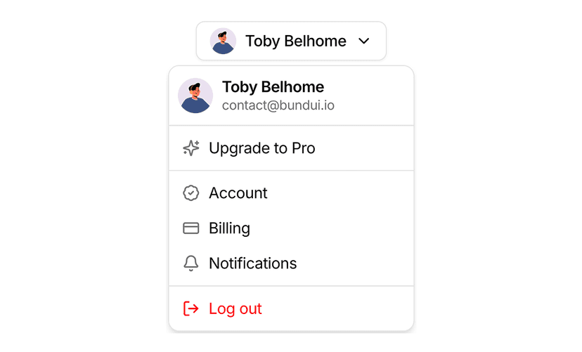
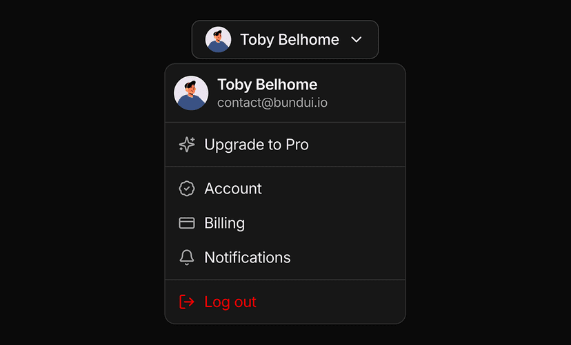
Shadcn Dropdown Menu Examples for App Navigation
Dropdown menu examples focus on user menus: account switchers, profile menus with avatars, workspace selectors and settings shortcuts. Built with the shadcn/ui dropdown menu, avatar and badge components, they slot into any navbar or sidebar.
What You Get With Dropdown Menu Examples
- Profile menus: Avatar triggers with name, email, plan badge and grouped actions like account, billing and sign out.
- Workspace switchers: Menus that list teams or organizations with the active item checked and a create action at the bottom.
- Keyboard shortcuts: Menu items with shortcut hints, icons, separators and destructive variants for delete actions.
- Nested submenus: Examples with sub menus for themes, languages and notification preferences.
- Accessible: Built on Radix UI or Base UI primitives with focus trapping, typeahead and arrow key navigation.
Menus That Fit Your Header
A user menu is one of the most reused pieces of an application. These examples give you tested layouts for the trigger, the header block and the action groups, so every app you build starts with a polished menu.
For the primitive itself see the dropdown menu component, and for full headers browse the navbar blocks.
Frequently Asked Questions
Yes. The examples render static user data. Pass in the session from your auth library and connect the sign out item to your handler.
Yes. They are built on shadcn/ui dropdown menu primitives with arrow key navigation, typeahead and escape to close.
Yes. The trigger is a regular button, so it works inside sidebars, toolbars or table rows with the same menu content.