About Shadcn Page Layouts Blocks
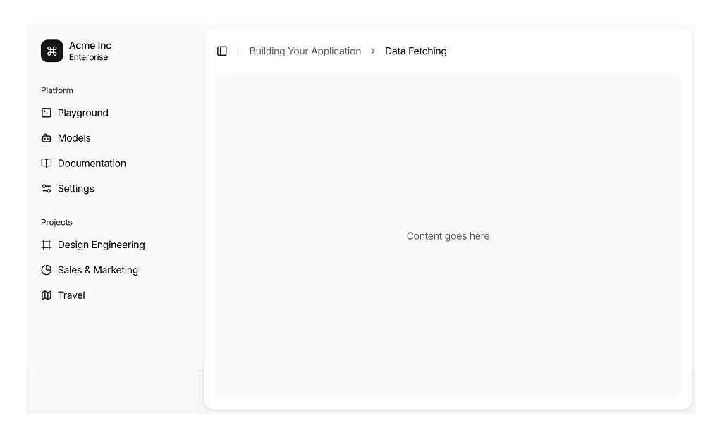
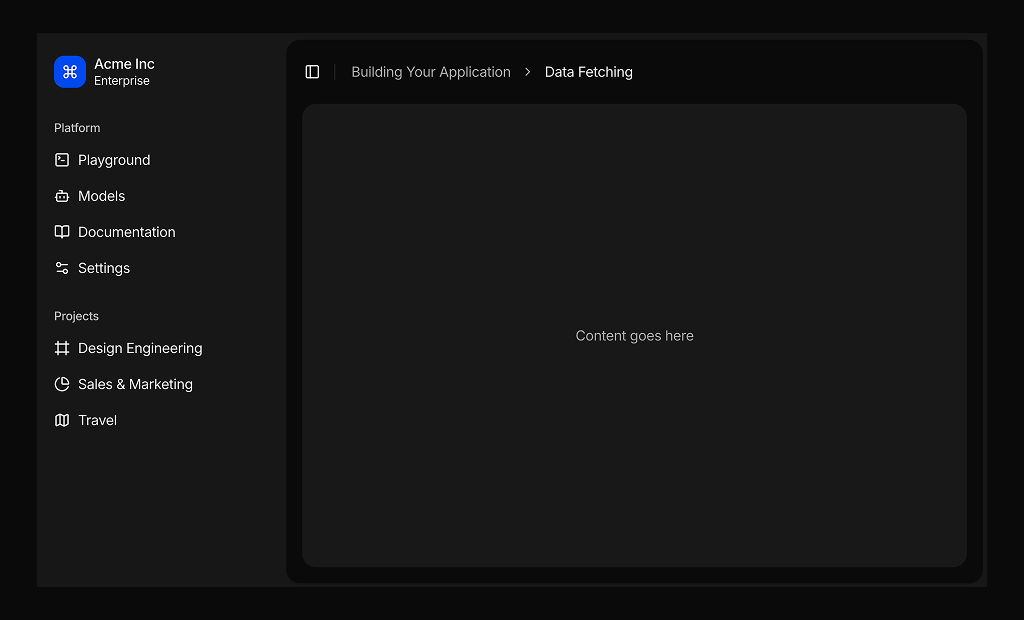
A page layout is the frame that every screen of your app shares: navigation, header and a content region. These three shadcn page layout blocks give you that frame ready made, one with an inset sidebar and breadcrumb, and two with a horizontal dropdown navigation that turns into a sidebar on phones.
Each layout is assembled from shadcn ui components such as Sidebar, NavigationMenu, Breadcrumb, DropdownMenu, Avatar and Toggle, written in React with TypeScript and styled with Tailwind CSS. The content area is left empty on purpose, so you can drop in tables, charts or forms from our other shadcn blocks without fighting existing markup.
Key Elements of a Page Layout
- Primary navigation: a sidebar or a header menu that stays in the same place on every page.
- Brand area: a logo or workspace name that links back to the start page.
- Location cue: a breadcrumb or an active state that tells users where they are.
- Utility actions: messages, notifications, theme and a user menu at the right edge of the header.
- Content region: a flexible area that grows with the page and keeps consistent padding.
Where and Why to Use Page Layout Blocks
Building the app frame is repetitive work that every product needs and few users notice when it is done well. Starting from a layout block gives you responsive navigation, a working mobile menu and a user dropdown on day one, and because it uses standard shadcn components the frame inherits your Tailwind CSS theme tokens automatically.
- Admin panels: a sidebar layout for apps with many sections and nested resources.
- Documentation style apps: breadcrumbs that show the path to the current page.
- Product suites: header dropdowns that group dashboards, apps and pages.
- Client portals: a clean top bar with a user menu and notification shortcuts.
- Prototypes: a realistic frame for testing page ideas before the final navigation is decided.
Page Layout Blocks in This Collection
- Page Layout 1: Choose it when your app has a growing list of areas and projects that need a permanent home on the left, and when users benefit from a breadcrumb trail.
- Page Layout 2: A good fit for products with a handful of main areas that want the full width for content, with a numbered notification badge to draw attention.
- Page Layout 3: The same top navigation with quieter dot indicators, an underline for the active menu and a place for a theme switch.
Similar Block Categories
- Sidebar Layouts: a full height sidebar variant of the same frame.
- Dashboard Shell: richer shells with search, inboxes, workspace switchers and more.
- Dashboard Dropdowns: replace the simple header buttons with full notification, account or language menus.
- Stat Cards: fill the empty content area with the first metrics of your dashboard.
Accessibility
The shadcn SidebarTrigger includes a screen reader label, the sidebar can be toggled with Cmd or Ctrl plus B, and on phones it opens as a sheet with focus management. The header navigation in Page Layout 2 and 3 uses the shadcn NavigationMenu, which supports arrow key navigation between triggers, and the theme toggle in Page Layout 3 updates its aria-label to describe the next mode.
The mail and bell icon buttons in the header have no text alternative, and the logo image uses an empty alt text inside a link. Consider adding aria-labels to those buttons and a descriptive alt or label to the logo link so screen reader users know where each control leads.
Page Layouts FAQ
navigationLinks array in app-sidebar.tsx. Its groups use a type of description, simple or icon, which controls how each dropdown renders its items.useIsMobile hook reports a narrow screen, and it lists the same navigation groups vertically in the shadcn mobile sheet.