Shadcn Chat UI Blocks

Chat UI blocks built with shadcn/ui: messengers with media messages, team and group chats, shared support inboxes, AI agent inboxes, CRM conversations and video call screens with participants and call controls.

Chat UI 1 Pro

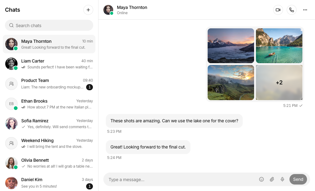
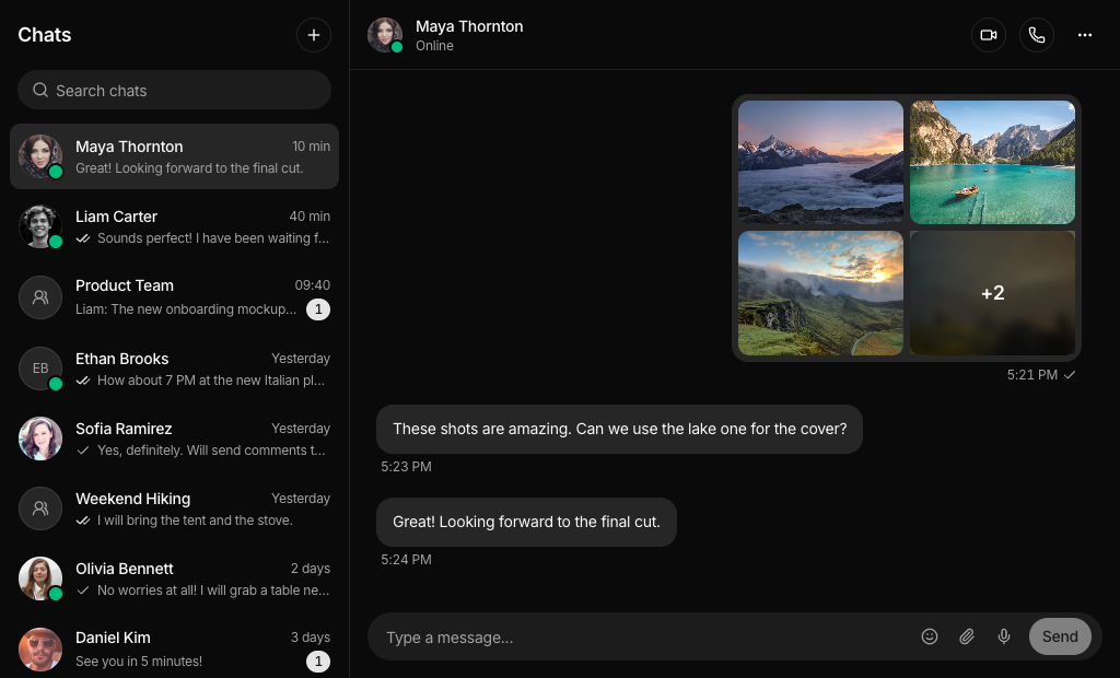
Two pane messenger with a searchable chat list showing unread badges and read checks, and a thread of text, video, file, voice and photo gallery messages with per message actions and a composer.

Chat UI 2 Pro

Three column messenger with your profile and online friends on the left, a searchable conversation with emoji reactions in the middle, and a contact panel listing shared files and links.

Chat UI 3 Pro

Team messenger with chats grouped into Team and Personal, a top tab bar, grouped message bubbles with avatars, an emoji picker and a profile panel with About and Files tabs.

Chat UI 4 Pro

Shared inbox with view and team inbox navigation, toggles for tasks and discussions, a timeline of linked emails, tag and assignment events, and an internal comment composer.

Chat UI 5 Pro

Support desk with an icon rail, collapsible inbox views by team and teammate, a ticket thread with a reply or internal note composer, quick replies and a collapsible details panel.

Chat UI 6 Pro

AI agent inbox with a workspace switcher, Open and Closed lists filtered by priority, an email draft card with an Approve and send button, and a details panel for contact and thread.

Chat UI 7 Pro

Video meeting with a speaker stage, a scrollable participant strip, camera, mic and screen share controls, a session notes tab, and a side panel with meeting chat and searchable participants.

Chat UI 8 Pro

Group messenger with a folder rail, pinned chats, mention highlights, photo and voice messages with transcripts, reaction chips showing who reacted, and a details panel with media, files and links.

Chat UI 9 Pro

Video call with a running timer, a pinned speaker above three video tiles, emoji reactions, call controls, a copyable meeting code, and a side panel with settings switches, AI summary and participants.

Chat UI 10 Pro

Omnichannel CRM chat with channel badges on avatars, tag chips with unread and starred filters, assignee, status and transfer menus, a composer that sends products, and a contact panel with notes.

About Shadcn UI Chat UI Blocks

A chat UI is the messaging screen of an app: a list of conversations, a thread of messages and a composer for replies, often with a panel that shows who is on the other side. These ten shadcn chat blocks cover personal and team messengers, shared support inboxes, an AI agent inbox, an omnichannel CRM chat and two video call screens.

Like the rest of our shadcn blocks, each screen is built with React, TypeScript and Tailwind CSS on top of shadcn ui components such as Avatar, Badge, Dropdown Menu, Input Group, Sheet and Tabs, plus the chat specific Bubble, Message and MessageScroller shadcn components. Every block runs on local state, so selecting a chat clears its unread count, sending adds a message and filters change the list as you click.

Key Elements of a Chat Interface

  • Conversation list: avatars, names, a preview of the last message, the time and an unread badge, with search on top.
  • Thread header: the contact or group name, presence or member count and actions such as call, video and details.
  • Message thread: bubbles grouped by sender, timestamps and read or delivery states that stay scrolled to the newest message.
  • Composer: a message field with send, attachment, emoji and voice buttons, or a reply and note switch for support teams.
  • Context panel: profile, shared files and links, ticket attributes or CRM data next to the conversation.

Where and Why to Use Chat UI Blocks

A chat screen has many moving parts: the list, the thread, the composer, responsive panes and dozens of small states. Building it from scratch takes weeks, and the details users notice, such as unread counts or a thread that jumps to the latest message, are easy to miss. These blocks give you that structure as shadcn components styled with Tailwind CSS, so you only connect your data and realtime layer.

  • Social and community apps: one to one and group chats with media, voice messages and reactions.
  • Team collaboration tools: grouped team chats, profiles and shared files inside a workspace.
  • Customer support help desks: shared inboxes with views, assignees, statuses and internal notes.
  • Sales and social commerce: answer leads from Messenger, WhatsApp, Instagram and web chat in one list.
  • AI assisted inboxes: review and approve replies that an AI agent drafts for you.
  • Video meetings: call screens with participants, call controls and an in-call chat.

Chat UI Blocks in This Collection

  • Chat UI 1: A good base for a consumer messenger where people send more than text. Use it when your app needs to play voice notes, open shared photos and offer file downloads right in the thread.
  • Chat UI 2: Fits social or creative communities where the user profile and friends who are online matter as much as the chat itself. Searching inside the open conversation is built in.
  • Chat UI 3: Suited to a studio or team workspace that separates team channels from direct messages and wants quick email, call and video actions on the profile.
  • Chat UI 4: Built for operations and success teams that triage customer emails together and discuss them in private comments before anyone replies.
  • Chat UI 5: A help desk layout for teams that work in tickets, snooze and close conversations and need lead data and recent page views while replying.
  • Chat UI 6: Use it when an AI agent writes outgoing emails and a person has to approve each one before it goes out.
  • Chat UI 7: A meeting room for reviews and workshops, where you switch between the call and shared session notes with action items.
  • Chat UI 8: A good match for busy group chats that need folders, pinning, mentions and searchable history, similar to popular desktop messengers.
  • Chat UI 9: Fits meeting products that add AI on top of the call, with noise and subtitle settings and a summary ready to share when the call ends.
  • Chat UI 10: Made for online stores and agencies that sell through chat, with lead tags, agent assignment and a way to send product photos to the customer.

Similar Block Categories

  • AI Chat: build an assistant conversation with model pickers and prompt inputs next to your human chat.
  • Mail App: the same list and reading pane pattern for email instead of chat.
  • Sidebar Layouts: wrap the chat screen in your app navigation.
  • Empty State: design the first run screen before a user has any conversations.
  • Event Calendar: schedule the calls and meetings that start in the chat.

Accessibility

Icon only buttons such as call, video, send, attach and back carry an aria-label, the selected conversation is marked with aria-current, and unread dots and read checks have labels like “Unread” and “Read”. Search fields and composers have aria-labels as well. Call controls in Chat UI 7 and 9 update their labels with the state, for example “Mute microphone” and “Unmute microphone”, and toggles such as star, thread search and reaction chips use aria-pressed. Every sheet has a title and description for screen readers, and in Chat UI 1 and 2 the message actions that appear on hover also appear when they receive keyboard focus.

Pressing Enter sends a message, and in the textarea composers of Chat UI 4, 5, 6 and 10 Shift and Enter adds a new line. In production, consider an aria-live region that announces incoming messages, and respect reduced motion settings for the reaction animation in Chat UI 9 and the jump to latest button.

Chat UI FAQ

A chat UI is the interface of a messaging screen: a list of conversations, a thread of messages and a composer for writing replies. Larger apps add a side panel with details about the contact, the group or the ticket.

They are complete messaging screens built with shadcn ui components and Tailwind CSS. Each block is a working React component with its own sample data, so you can drop a messenger, a support inbox or a video call screen into your app and replace the data with your own.

People spend long sessions in chat screens and judge them by how fast they can find a conversation, read the latest message and reply. Clear unread states, a composer that is always in reach and a thread that stays scrolled to the newest message reduce missed messages and slow replies.

A searchable conversation list with unread counts, a header that shows who you are talking to, a thread that groups messages by sender and time, a composer with attachments and emoji, and delivery or read states. Support and sales tools also need assignees, statuses and internal notes.

A messenger is for conversations between people who know each other, such as friends or teammates. A support inbox is shared by a team that answers customers, so it adds views, filters, assignees, statuses and internal notes that the customer never sees.

Chat UI 4, Chat UI 5 and Chat UI 10. Chat UI 4 is a shared inbox where teammates comment internally on emails, tasks and discussions. Chat UI 5 is a ticket desk with Open, Snoozed and Closed lists and a reply or note composer. Chat UI 10 fits social commerce teams that answer customers from several channels.

Chat UI 4 has an “Add internal comment” composer with a line that says which inbox can see it. Chat UI 5 switches its composer between Reply and Note, and notes appear as dashed bubbles labeled Internal note. Chat UI 10 keeps notes in the contact panel with an input to add new ones.

Yes, two. Chat UI 7 is a meeting with a large stage, a strip of participant tiles you click to put someone on stage, and a Document tab with session notes. Chat UI 9 shows a running call timer, three video tiles above the pinned speaker, emoji reactions and a copyable meeting code.

Chat UI 6 shows an email drafted by an AI agent that waits for an Approve and send click, after which a system message confirms the email was sent. Chat UI 9 has an AI summary card with key points and a Send by email button. Chat UI 10 has a Write with AI button that fills the composer with a suggested reply.

Chat UI 1 renders text, video, file, voice and photo gallery messages. Its voice player counts the seconds on a progress bar and its gallery opens a dialog with previous and next buttons. Chat UI 8 shows photos and voice messages with waveform bars and a toggle that reveals the transcript.

In Chat UI 2 a smile button next to each message opens five emoji, and the chosen one sits on the bubble until you click it again. In Chat UI 8 each reaction chip shows the avatars of the people who reacted, and clicking a chip adds or removes your own reaction. Chat UI 9 floats the chosen emoji on the video stage for under two seconds.

The threads use the MessageScroller component with autoScroll, so new messages scroll into view. Several blocks also render MessageScrollerButton, a floating button that jumps back to the end after you scroll up. The provider is keyed by the selected conversation, so switching chats starts a fresh thread.

Every block uses the Bubble and MessageScroller components, and most also use Message for avatar, header and footer layout. MessageScroller is built on the @shadcn/react package. Chat UI 1 adds the Attachment component for file cards. All blocks show feedback with sonner toasts, and Chat UI 1 to 4 format times with date-fns.
Conversations, contacts and messages live in a data.ts file next to each block and are copied into React state. The send functions append a message with a generated id to that state. Load the initial list from your API, call your send endpoint inside the send function and push incoming messages from your realtime channel into the same state.

In the messenger and inbox blocks the list fills the screen below the md breakpoint, and opening a conversation swaps it for the thread with a back arrow to return. Side panels with contact, ticket or meeting details are visible from the xl breakpoint and open in a sheet on smaller screens. Icon rails are hidden on phones, and Chat UI 4, 5 and 6 move their navigation into a sheet from the left.

No. All ten chat UI blocks are part of All Access, the one-time license that also unlocks every other block, admin dashboard and template with lifetime updates.
shadcn chat ui blocks
Unlock Premium Blocks & Sections
Premium blocks are part of All Access. One license unlocks the whole Shadcn UI Kit, so you can build complete pages and products instead of single sections.
  • 550+ blocks for landing pages, stores, dashboards and apps
  • 16 admin dashboards and 17 ready-made apps
  • 5 premium Next.js website templates
  • 560+ component variants and 70+ examples
  • Install with the shadcn CLI or from your AI editor through the MCP server
  • Lifetime updates, including every new block we release
Unlock Now

One-time payment, no subscription.