Shadcn Forms Examples
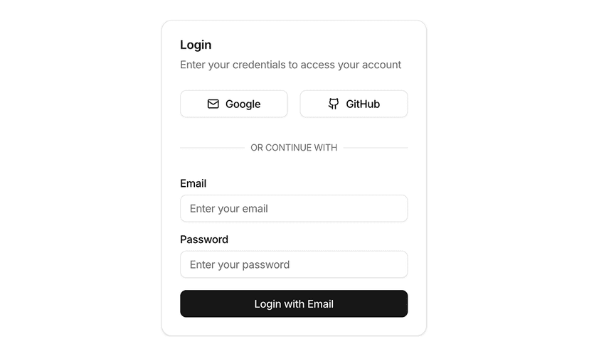
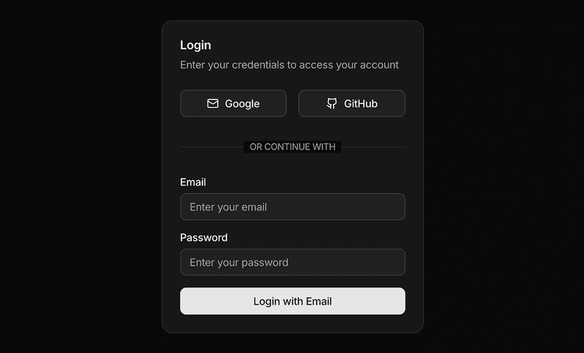
Login and signup forms with Google/GitHub options, email/password fields, and primary submit. Ready-to-use shadcn/ui auth patterns.
Shadcn Form Examples for Authentication and Onboarding
Form examples show complete, production style forms starting with authentication forms: sign in, sign up, forgot password, magic link and two factor screens. Each example combines shadcn/ui input, label, checkbox and button components with sensible spacing, validation states and social login options.
What You Get With Form Examples
- Authentication flows: Sign in, sign up and password reset layouts with social providers and remember me options.
- Validation ready: Field layouts include error, helper and disabled states so they plug into React Hook Form and Zod without redesign.
- Split and centered layouts: Centered cards, split screens with imagery and minimal full page forms for different brand styles.
- Accessible inputs: Labels, descriptions and error messages are linked to inputs for screen readers and keyboard users.
- Copy and paste ready: Each form is a single component with no external dependencies beyond shadcn/ui.
Forms Users Actually Finish
Good forms are short, clearly labeled and forgiving of mistakes. These examples follow those rules with consistent field spacing, obvious primary actions and inline feedback.
Explore the individual form components or the larger form layout blocks for settings and multi step flows.
Frequently Asked Questions
The examples focus on layout and states. They are structured to work with React Hook Form and Zod, so adding validation takes a few lines.
Yes. Social buttons are regular shadcn/ui buttons with icons. Add or remove providers to match your auth setup.
Yes. Split layouts collapse to a single column on mobile and centered cards stay readable on small screens.