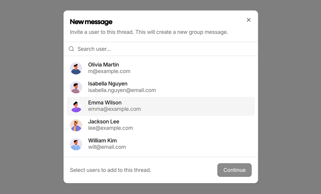
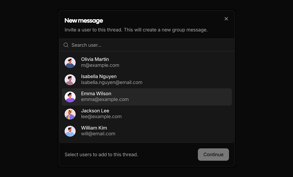
About Modal Dialogs Blocks
Modal dialog blocks are shadcn blocks that render content in a Dialog or Sheet: confirmations, short forms, or focused content. Built with React and TypeScript, they use shadcn/ui Dialog (and optionally Sheet) plus Button and form components, styled with Tailwind CSS. Each block gives you a ready-made modal pattern with overlay and focus management.
Use them for confirmations, login or signup in a popup, share or settings panels, or command palettes. They fit Next.js and React apps and work with any trigger (button, link, keyboard). They support light and dark themes and follow shadcn UI patterns for accessibility and animation.
Title, body, and actions are in your code. Tailwind controls size, padding, and layout. You can change content per use case, add steps, or switch to a side sheet; the Dialog/Sheet base and accessibility stay the same so you keep full control.