About Welcome Cards Examples
Welcome cards are high‑impact components that greet users at key entry points in your product, such as onboarding flows, empty states, or dashboard intros. They often combine a friendly headline, short explanatory copy, and one or two primary actions that guide users toward their first meaningful success. When built with shadcn ui primitives and enhanced with tailwindcss utilities, WelcomeCards feel visually aligned with other shadcn blocks while standing out enough to anchor the page in a next.js application.
Technically, a WelcomeCards component is a typed react building block that receives structured props for title, description, illustration, and actions such as buttons or links. TypeScript helps guarantee that the card always includes the essentials while allowing optional slots for supporting elements like checklists, tips, or featured links. Shadcn ui card and button components provide accessible defaults for layout and interaction, while tailwindcss utilities tune spacing, alignment, and responsive behavior so the same pattern works across hero sections and smaller in‑app placements.
In a next.js architecture, WelcomeCards are typically server‑rendered on landing and onboarding pages so that search engines can parse the introductory copy and calls to action. The same component can then be reused in authenticated dashboards as a client‑side island that adapts content based on user status or progress. By centralizing this pattern as a reusable react and typescript module that composes shadcn ui components, teams can evolve messaging, layout, and targeting logic from a single source of truth while maintaining a polished user experience.
Which Welcome Card Example Should You Pick?
Each of the three cards pairs the greeting with a different kind of content.
- Achievement: Welcome Card 1 celebrates a result with a large sales number, the monthly growth and a View Sales button. It suits sales and ecommerce dashboards.
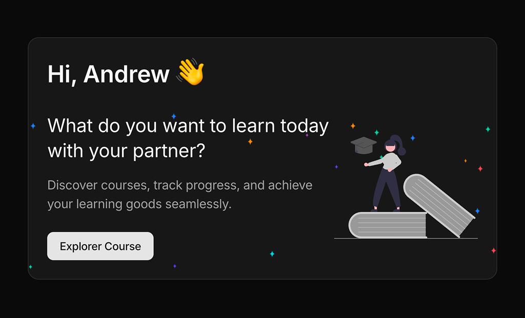
- Call to action: Welcome Card 2 greets the user and points them to courses with a button and an illustration, for learning or onboarding screens.
- Progress: Welcome Card 3 shows how much of a target is done with a small radial chart, for goal tracking and personal dashboards.