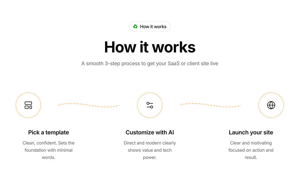
About How It Works Blocks
How it works section blocks are shadcn/ui components designed to walk visitors through a process or set of steps in a clear, visual way. Built with React and TypeScript, they use Tailwind CSS to present numbered steps, icons, and short descriptions that reduce friction and build confidence before a sign-up or purchase.
They are well-suited to SaaS landing pages, service sites, and product pages where users need a quick understanding of the journey ahead. A strong how-it-works section shortens the decision cycle, reduces support questions, and gives first-time visitors the clarity they need to act.
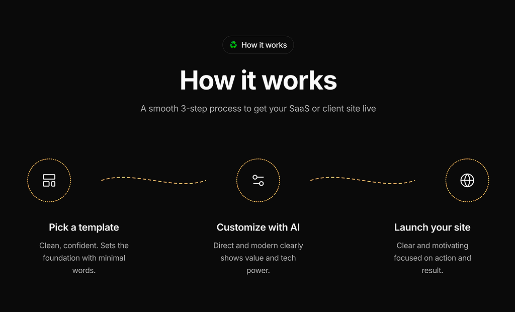
Each block is fully customizable. Step count, icons, labels, and layout are controlled in your own code. Variants include horizontal step flows with connecting lines, three-column icon grids, numbered list layouts with a central image, and vertical timelines. All blocks support light and dark themes through shadcn/ui theming and Tailwind utilities.