About Stat Cards Examples
Stat cards distill complex metrics into clear, focused snapshots that help users understand performance at a glance. Common in dashboards, reports, and overview pages, these components highlight values like revenue, active users, or uptime alongside concise labels and trend indicators. When styled with shadcn ui components and tailwindcss utilities, StatCards fit naturally into grid layouts and summary sections, complementing richer visualizations such as line charts within a next.js application.
Implementation‑wise, a StatCards component is a typed react building block that receives structured data for label, value, delta, and optional context like comparison period or unit. TypeScript interfaces enforce consistency for these fields, which is critical when the same component is reused across many pages and teams. Shadcn ui primitives such as cards, badges, and icons provide accessible, keyboard‑friendly building blocks, while tailwindcss controls layout density, color coding, and responsive stacking. This separation allows designers to iterate on hierarchy and color schemes without touching data logic.
In a next.js architecture, StatCards are often rendered in server components that receive pre‑aggregated data from APIs, ensuring that key metrics are immediately visible in HTML for both users and search engines. Client‑side enhancements can then update values in real time or animate transitions without impacting crawlability. By standardizing StatCards as reusable react and typescript modules that compose shadcn ui components, teams gain a scalable way to communicate business health across many parts of the product.
Which Stat Card Example Should You Pick?
The four cards differ in how much context they add around the numbers.
- Single KPI with a split: Stat Card 1 shows a Sales Overview total, the growth from last month and an Orders versus Visits breakdown with a two part bar.
- Metric grid: Stat Card 2 lists six website metrics in a grid under a conversion rate summary, for analytics overviews.
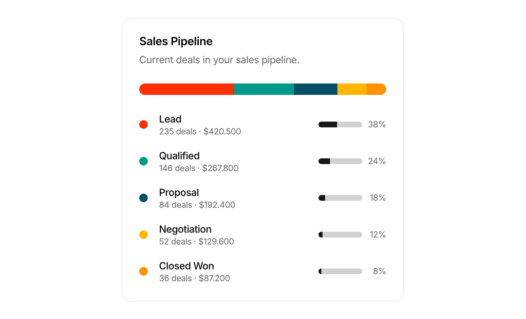
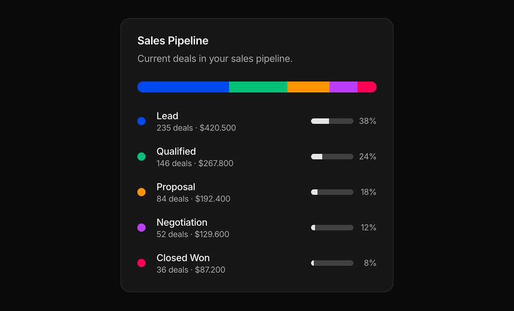
- Breakdown by stage: Stat Card 3 splits a sales pipeline into five stages with a segmented bar, tooltips and per stage progress bars, for CRM dashboards.
- KPI with chart: Stat Card 4 combines a total, a change badge, a stacked bar chart and two summary rows, for revenue and earnings widgets.