
Shadcn UI Design System
for Figma
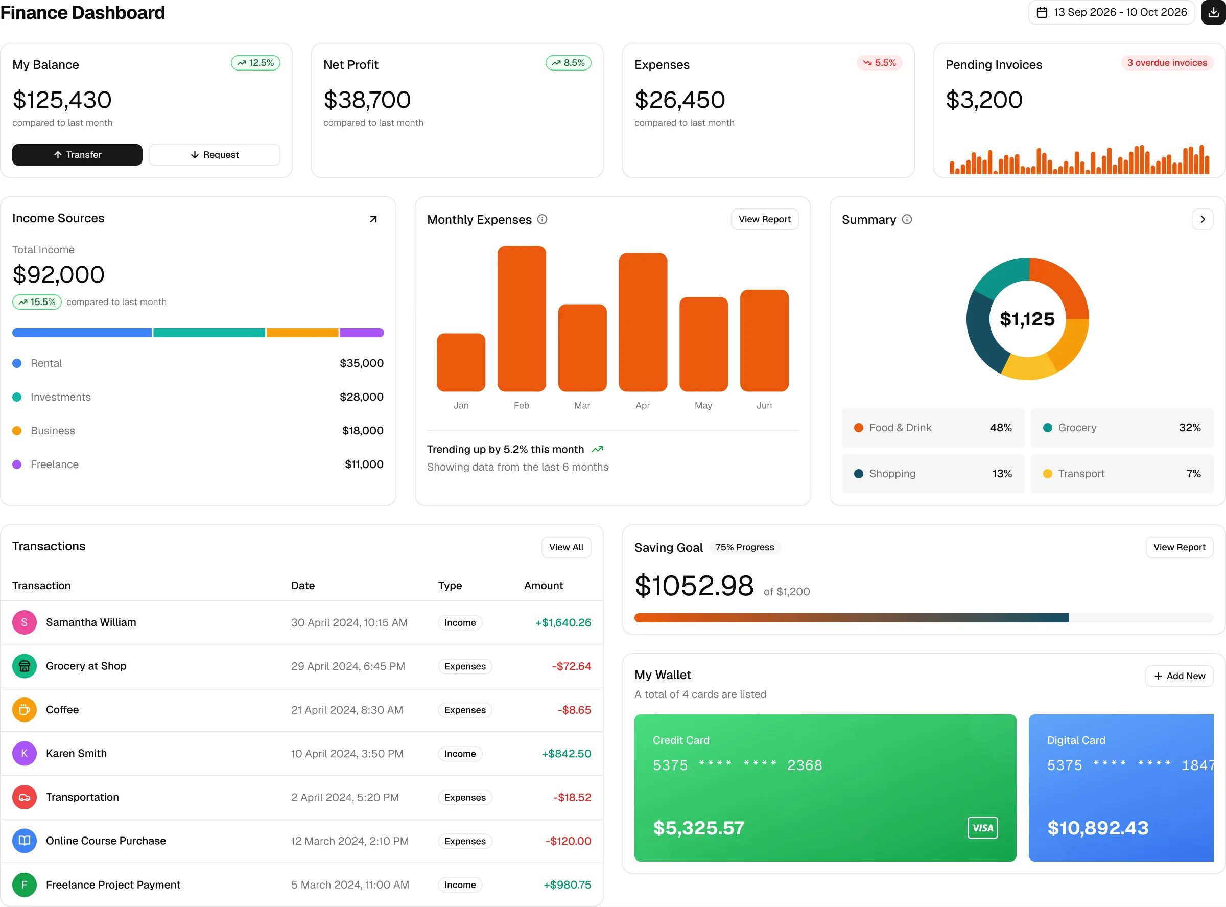
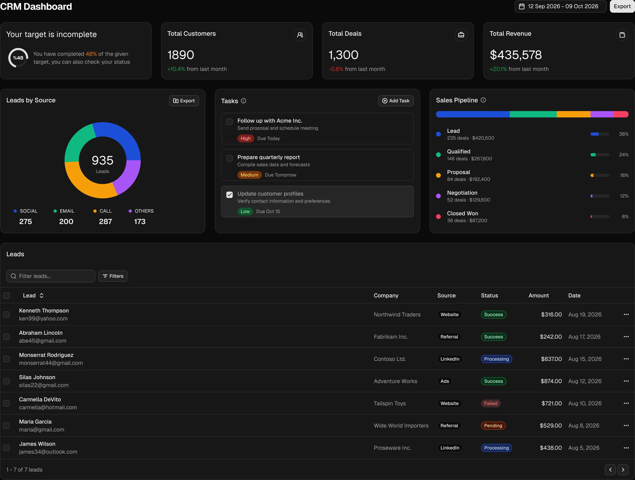
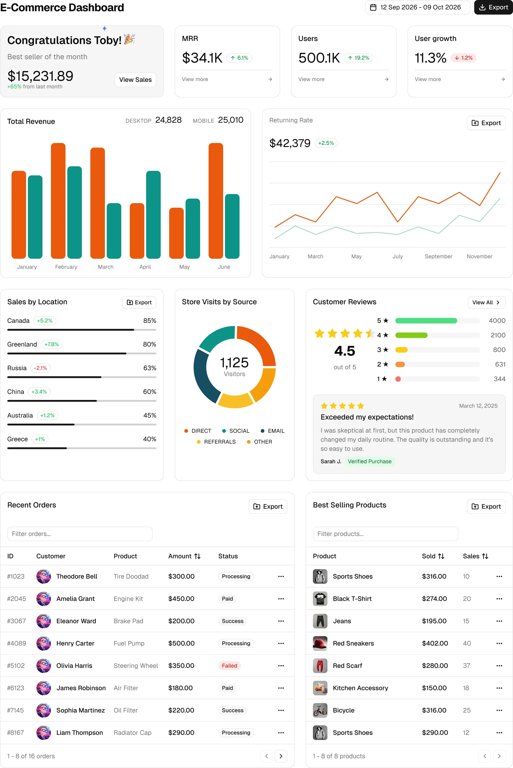
Design faster with 16 admin dashboards, 550+ blocks and 60 shadcn/ui components. Hand off Tailwind CSS v4 tokens your developers already use and ship the same screen in hours, not days.
- Admin dashboards
- 16
- Web apps
- 17
- AI apps
- 4
- Extra pages
- 30
- Blocks
- 550+
- Core shadcn/ui components
- 60
- Component and block variants
- 100s
- Chart types
- 6
- Icon libraries
- 5
A Design System, Not Just Screens
The screens sit on a complete shadcn/ui design system you can use for your own pages.
Full shadcn/ui component library
Buttons, inputs, tables, charts, sidebars and 60+ other components with every variant, size and state you get in code.
Tailwind CSS v4 variables
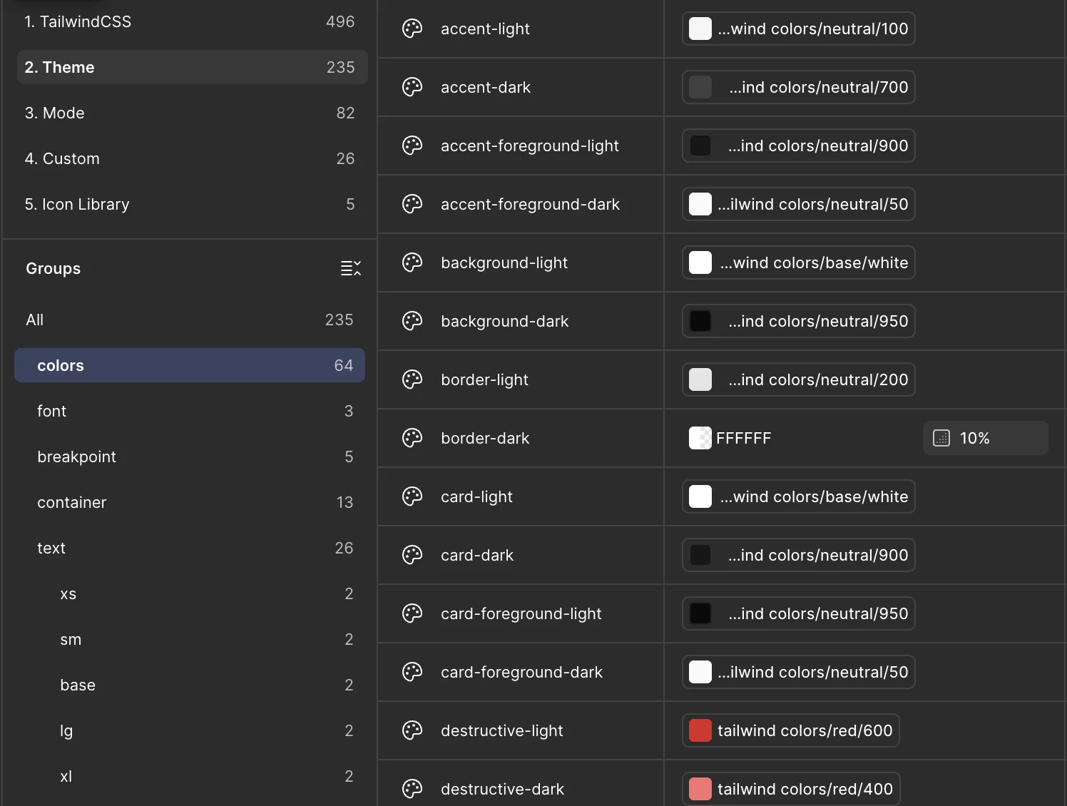
Colors, spacing, radius and typography live in variables that use the official shadcn token names, so handoff needs no translation.
Light and dark modes
Every screen switches theme through a variable mode. No duplicated frames, no hand-picked dark colors.
Desktop, tablet and mobile
Breakpoints follow the Tailwind classes in the code: stacked cards, hidden columns and drawers appear exactly where they do in the app.
Componentized screens
Cards, rows, list items and message bubbles are local components, so a change in one place updates every screen that uses it.
Five icon libraries
Lucide, Tabler, HugeIcons, Phosphor and Remix Icon as components you can swap from the properties panel.
Ready-made blocks
550+ marketing, ecommerce, application and dashboard blocks, each with desktop, tablet and mobile variants and a dark preview.
Charts from shared parts
Area, bar, line, pie, radar and radial charts built from the same grid, legend, tooltip and dot components.
Text and effect styles
Text styles for the full type scale plus shadow, inset shadow and blur styles that mirror the Tailwind utilities.
Everything You Need in One File
Components, slots, responsive screens, themes and tokens that match the code, so you can design new pages without starting from a blank frame.
 Components
Every Variant, Size and State
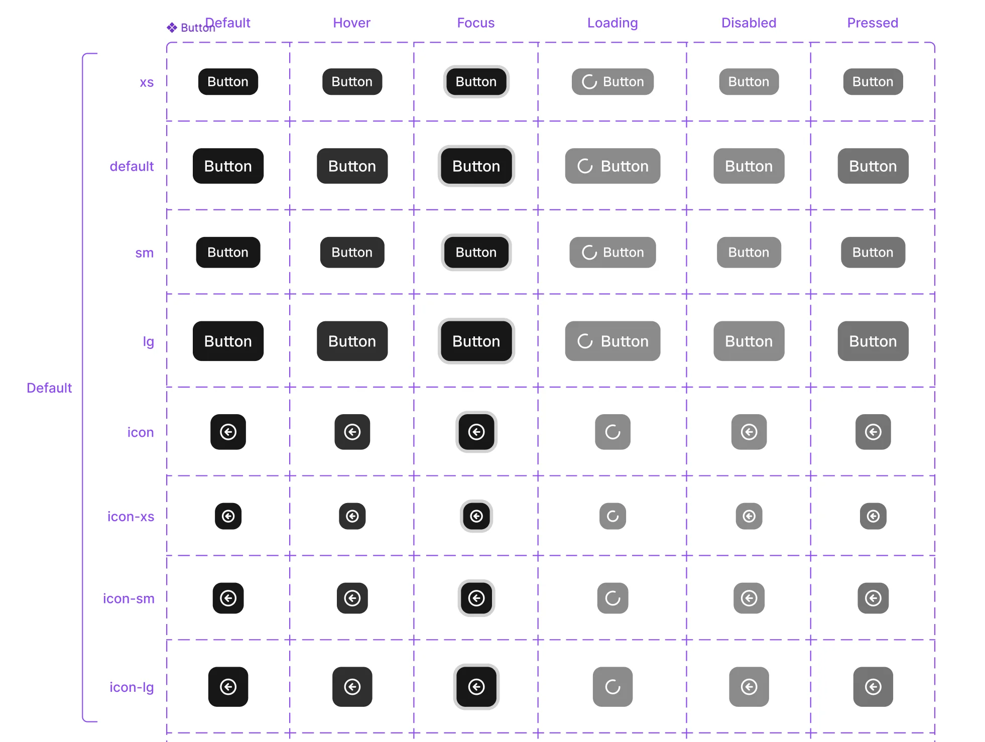
Components are built the way shadcn/ui ships them. A single Button covers six variants, eight sizes and six states, from hover and focus to loading and disabled.
- Switch variant, size and state from the properties panel
- Icons, labels and shortcuts exposed as component properties
- Newer components like Bubble, Attachment and Questionnaire included
- Slots
Slots for Your Own Content
Cards, dialogs and blocks come with slots. Drop any component, block or element of your own into a slot and it takes the padding, spacing and theme of its parent.
- Pick an instance from the slot and place it in seconds
- Swap slot content without detaching the parent component
- Mix kit components with your own design elements
- Responsive
Responsive From Desktop to Mobile
Screens are designed for every screen size. Columns stack, sidebars collapse and tables adapt at the same breakpoints the Tailwind classes use in the code.
- Desktop, tablet and mobile variants for every screen
- Breakpoints match sm, md and lg in the codebase
- Resize a frame to preview layouts between breakpoints
- Themes
Light and Dark From One Switch
Screens switch theme through a variable mode. Change the mode on a frame and every color updates, with no duplicated frames to keep in sync.
- Light and dark values for every color token
- Charts, badges and tables follow the active mode
- Your own theme colors carry over to both modes
 Style guide
Tokens With the Same Names as Your CSS
Colors, fonts, radius and shadows are variables and styles that mirror globals.css, with a light and dark value for every color.
- Color tokens from background and primary to chart and sidebar colors
- Font family, font weight and text styles for the whole type scale
- Radius, shadow, blur and breakpoint values in one place
Built From the Code, Not Next to It
Most Figma kits are drawn first and coded later, and the two drift apart. This file was rebuilt from the Next.js admin dashboard, so designers and developers look at the same thing.
Rebuilt from the codebase
Each screen was recreated from the Next.js source: same copy, same data, same component variants.
One theme, two tools
Change a variable in Figma and the matching CSS variable in globals.css. Design and code keep the same look.
Auto layout everywhere
Frames resize and reflow like the real layout, so you can test longer content without breaking the design.
From Mockup to Production in Three Steps
The Figma file and the Next.js dashboard share one structure, so a design turns into a page without a rebuild.
Design in Figma
Start from a dashboard or app screen and adjust it with the same components and variables.
Hand off without drift
Developers read the token and component names they already use. Nothing to guess or redraw.
Ship the same screen
Open the matching page in the Next.js admin dashboard and build on code that already looks like the design.
What are people saying about the Shadcn UI Kit?

Replying to @TobyBelhome
Absolutely love it, thank you very much, Toby, for great job!
5:32 PM · Feb 27, 2026
Read more on X
Replying to @TobyBelhome and @shadcn
🫡🫡 legend! Love the kit bro, thanks for constantly delivering!
10:50 PM · May 29, 2025
Read more on X


Replying to @TobyBelhome
The work you do is really great. Quality work 🥰🥰🥰
12:47 AM · Dec 7, 2025
Read more on X
Replying to @TobyBelhome
I just discovered you from one of my colleague, great work.
7:05 AM · Dec 7, 2025
Read more on X
Replying to @TobyBelhome and @shadcn
Your dashboard hit the sweet spot 🎯 between helpful and magnificent.
3:42 AM · Apr 15, 2025
Read more on X

Replying to @TobyBelhome and @shadcn
I use the shadcn ui kit pretty often and it's crazy what people build with it, good job 👏🏻
12:49 PM · Dec 7, 2024
Read more on X
Replying to @TobyBelhome and @shadcn
looks really clean ;)
10:31 AM · Dec 7, 2024
Read more on X
Replying to @TobyBelhome and @shadcn
Wow looks really cool
11:14 AM · Mar 6, 2025
Read more on X

Replying to @TobyBelhome and @shadcn
This looks neat.
8:52 PM · May 9, 2025
Read more on X

Replying to @TobyBelhome and @shadcn
The examples on your website are so good
12:18 AM · May 6, 2025
Read more on XReplying to @TobyBelhome
Absolutely love it, thank you very much, Toby, for great job!
5:32 PM · Feb 27, 2026
Read more on XReplying to @TobyBelhome and @shadcn
🫡🫡 legend! Love the kit bro, thanks for constantly delivering!
10:50 PM · May 29, 2025
Read more on XReplying to @TobyBelhome
The work you do is really great. Quality work 🥰🥰🥰
12:47 AM · Dec 7, 2025
Read more on XReplying to @TobyBelhome
I just discovered you from one of my colleague, great work.
7:05 AM · Dec 7, 2025
Read more on XReplying to @TobyBelhome and @shadcn
Your dashboard hit the sweet spot 🎯 between helpful and magnificent.
3:42 AM · Apr 15, 2025
Read more on XReplying to @TobyBelhome and @shadcn
I use the shadcn ui kit pretty often and it's crazy what people build with it, good job 👏🏻
12:49 PM · Dec 7, 2024
Read more on XReplying to @TobyBelhome and @shadcn
looks really clean ;)
10:31 AM · Dec 7, 2024
Read more on XReplying to @TobyBelhome and @shadcn
Wow looks really cool
11:14 AM · Mar 6, 2025
Read more on XReplying to @TobyBelhome and @shadcn
This looks neat.
8:52 PM · May 9, 2025
Read more on XReplying to @TobyBelhome and @shadcn
The examples on your website are so good
12:18 AM · May 6, 2025
Read more on XFrequently asked questions
Stop Redrawing What Is Already Built
Get the Figma file together with the Next.js admin dashboards, website templates, blocks and components. Pay once and get every future update.
Get All Access