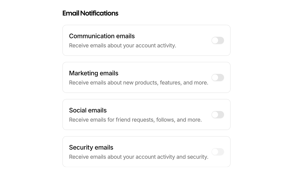
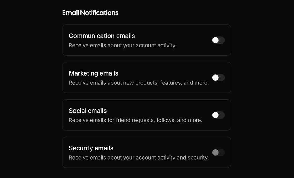
About Switch Cards Examples
Switch cards combine toggle switches with card layouts to present configuration options in a way that is both scannable and immediately interactive. Instead of hiding toggles deep inside form rows, these sections surface key settings as individual cards, each with its own title, description, and switch control. In a design system that uses shadcn ui and tailwindcss, SwitchCards align neatly with existing shadcn blocks such as settings panels, preference grids, and feature flags, making them easy to reuse across multiple areas of a next.js application.
Under the hood, a SwitchCards component is a react wrapper around strongly typed data that describes each setting: a stable identifier, label, summary, and default value. TypeScript ensures that each card receives consistent props, while shadcn ui primitives for cards and switches handle the details of focus states, keyboard interaction, and accessible labeling. Tailwindcss utilities can be applied to control the grid layout, spacing, and responsive behavior so that the same set of cards can appear as a single column on mobile and a multi-column layout on desktop without rewriting markup.
In a next.js architecture, SwitchCards are typically used on authenticated settings pages rather than public marketing routes, but the same components can be showcased as live examples in documentation or changelog entries. That documentation layer benefits from server rendering and clean HTML structure, while the in-app implementation hooks the switches into real configuration endpoints or feature flag services. By standardizing SwitchCards as reusable react and typescript modules backed by shadcn ui, teams can introduce new toggles and reorganize settings without fragmenting the user experience or the codebase.