About Project Management Charts Examples
Project management charts translate workload, progress, and delivery risk into visual formats that teams can understand quickly, such as burndown lines, cumulative flow diagrams, or throughput summaries. These components help stakeholders see whether plans are on track and where bottlenecks may emerge, making them essential in agile tools, portfolio dashboards, and resource planning views. When integrated with shadcn ui layouts and styled via tailwindcss, ProjectManagementCharts sit comfortably alongside TaskCards, StatCards, and other shadcn blocks in a next.js product.
Technically, a ProjectManagementCharts component is a typed react shell that coordinates data from project tracking systems with a charting implementation. TypeScript interfaces describe units like sprints, story points, cycle times, and work item states, providing a strong contract between backend metrics and frontend visualization. Shadcn ui primitives such as cards, segmented controls, and dropdowns are used to manage filters for team, timeframe, or workflow stage without cluttering the main chart. Tailwindcss then assists with responsive layout so complex project metrics remain readable on both desktop and mobile.
In a next.js environment, these charts often live in client components due to their interactive and frequently updated nature, while explanatory text and supporting KPIs can be server‑rendered for better SEO. Documentation and marketing pages can embed the same ProjectManagementCharts component with mocked data to illustrate capabilities using fully crawlable HTML. By defining this pattern as a reusable react and typescript module that leverages shadcn ui components, teams gain a consistent, extensible way to communicate project health and delivery performance across the organization.
Which Project Management Chart Should You Pick?
Project Management Chart 1 is an interactive donut chart. It shows project efficiency by month, and a month selector in the header highlights one segment and puts its value in the center. Use it to show how work is spread across periods.
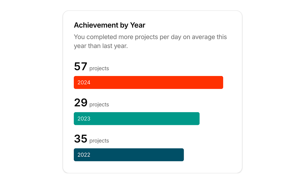
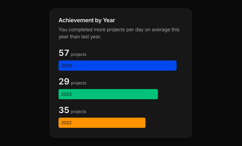
Project Management Chart 2 is a year over year comparison. It stacks three horizontal bars with project counts and a short summary line. Use it on a team or personal dashboard to show progress compared with earlier years.