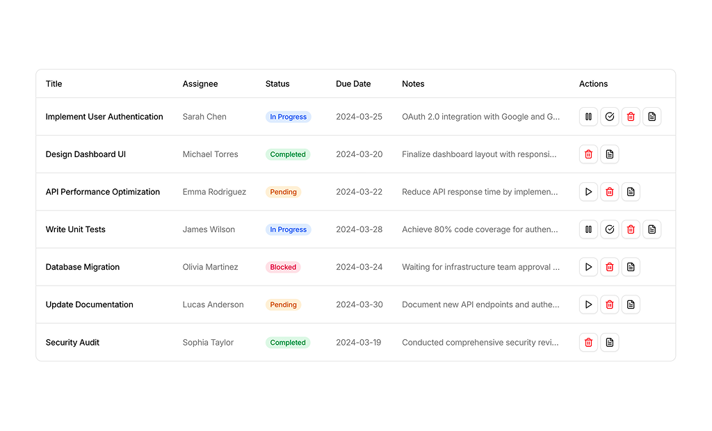
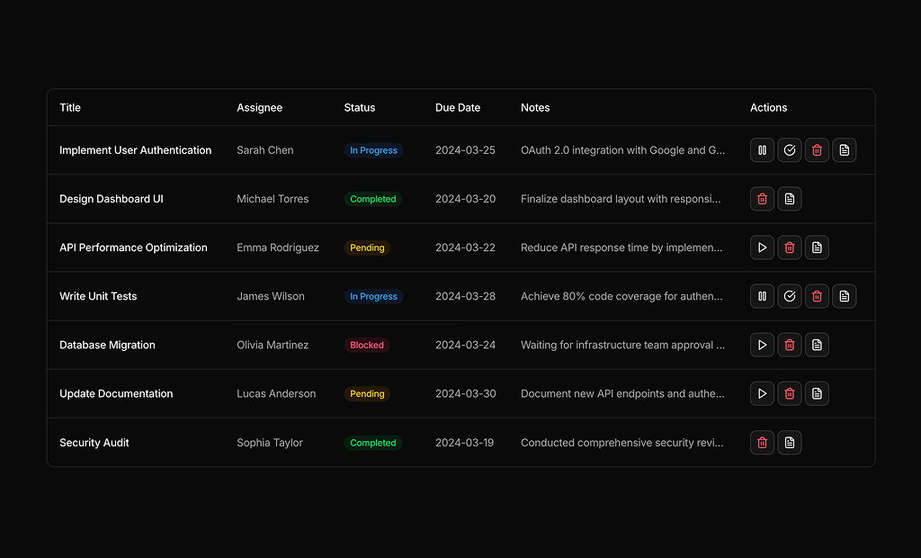
About Tables Blocks
Table blocks are shadcn blocks that display tabular data: headers, rows, and optional actions, badges, or tooltips. Built with React and TypeScript, they use shadcn/ui Table (and sometimes DataTable patterns) styled with Tailwind CSS. Each block gives you a consistent table layout so you can plug in data and sorting or filtering without rebuilding the structure.
They are for task lists, user or product tables, and any data grid in dashboards or admin panels. Use them in Next.js or React apps for list views, settings tables, or reports. They work with page and sidebar layouts and support light and dark themes so tables stay consistent with the rest of your shadcn UI.
Columns and row data come from your code or API. Tailwind controls spacing, borders, and density. You can add sort, filter, pagination, or row actions; the Table base and accessibility stay the same so you keep full control and can extend as needed.