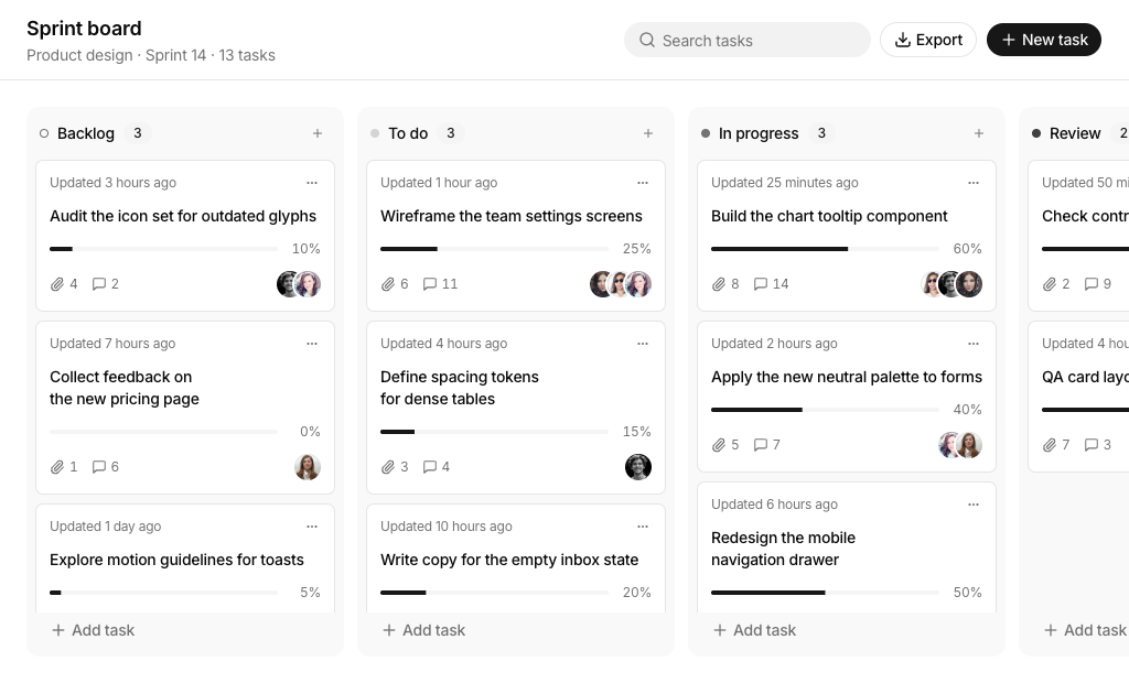
About Shadcn UI Kanban Board Blocks
A kanban board organizes work as cards in columns, one column per stage, so a team can see every task, who owns it and how far it has moved. These seven shadcn kanban blocks cover sprint boards, project boards with several views, a sales pipeline, a team workspace, a grouped task list and a board for AI agent prompts.
Like the rest of our shadcn blocks, each board is built with React, TypeScript and Tailwind CSS on top of shadcn ui components such as Dialog, Dropdown Menu, Select, Avatar and Badge, plus the Kibo UI Kanban component for drag and drop. Every block is fully interactive: cards can be created, edited, duplicated, moved and deleted, and the sample data sits in a separate data file that you replace with your own.
Key Elements of a Kanban Board
- Stage columns: one column per status with a name, a color or icon marker and a live card count.
- Informative cards: the title plus the details that matter for the process, such as assignees, due date, progress, deal value or tags.
- Drag and drop: moving a card between columns updates its status without opening a form.
- Quick add: a plus button in each column that opens the create dialog with that column already selected.
- Card actions: a menu to edit, move, duplicate or delete a card without dragging it.
- Search and filters: narrow the board by text, assignee, priority, channel or tag once it holds more than a few dozen cards.
Where and Why to Use Kanban Board Blocks
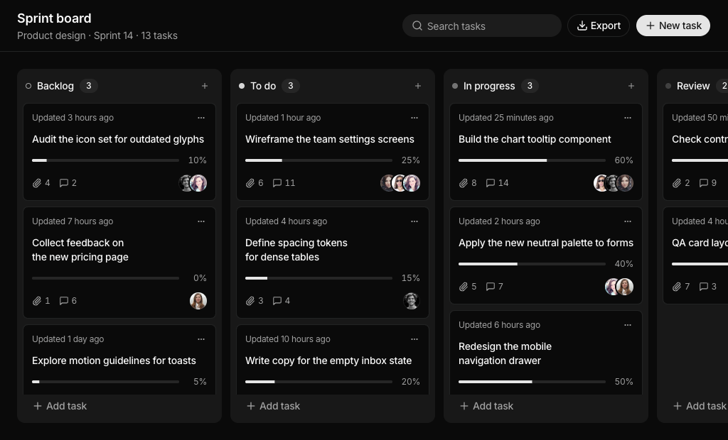
A kanban board is one of the most requested screens in project tools, CRMs and internal apps, and it is also one of the hardest to get right because drag and drop, filtering and editing all touch the same data. These blocks solve that wiring for you: filters keep hidden cards in place, dialogs share one form for create and edit, and moving a card to Done updates related fields where it makes sense. Because they use standard shadcn components and Tailwind CSS tokens, they match the rest of your shadcn ui app in light and dark mode.
- Project management apps: sprint boards and project boards with assignees, due dates and progress.
- CRM and sales tools: a pipeline where each stage shows how much revenue it holds.
- Team workspaces: a shared board with members, projects and tags in a sidebar.
- HR and onboarding: checklists that work better as rows with checkboxes than as cards.
- AI products: queues where prompts move from backlog to running to review.
- Admin dashboards: a board page inside an existing shadcn dashboard for support tickets, content or hiring.
Kanban Board Blocks in This Collection
- Kanban Board 1: A good fit for product and design sprints where every task has a completion percentage. The built in CSV export helps when the sprint report goes into a spreadsheet.
- Kanban Board 2: Choose it when the same project data needs a board, a list and a table. It also includes an invite dialog and a share button that copies the page link.
- Kanban Board 3: Built for sales teams that need to see revenue per stage, not just the number of deals. Overdue follow ups are highlighted so nothing slips.
- Kanban Board 4: Use it as the home screen of a team tool, where selecting a teammate or a project in the sidebar filters the board and cards carry tags and images.
- Kanban Board 5: Suits roadmap and planning work where priority and quarter matter and people want a timeline of what is due this week and next.
- Kanban Board 6: The right choice for checklists such as employee onboarding, where a compact row with a checkbox reads faster than a card.
- Kanban Board 7: Made for AI agent workflows. Prompts move through planning, running and review, and a model filter shows which tasks each model handles.
Similar Block Categories
- Todo App: when tasks only need a status and a list, not columns.
- Gantt Chart: plan the same tasks on a timeline with start and end dates.
- Tables: a sortable table view for boards that grow beyond what columns can show.
- Event Calendar: show due dates and meetings from the board on a calendar.
- Dashboard Shell: place the board inside a full app layout with navigation.
Accessibility
The Kanban component announces drag events to screen readers, for example when a card is picked up, dragged over a column or dropped, and every block adds the dnd-kit keyboard sensor so cards can be moved without a mouse. Icon buttons carry labels such as “Actions for” the task name and “Add task to” the column name, and the attachment, link and comment counts in Kanban Board 1 to 3 include screen reader text. The create and edit dialogs use labelled fields, and inner controls stop the event that would start a drag, so opening a menu never moves a card by accident.
Two spots are worth tightening before production. The search input in Kanban Board 6 has no accessible label, and some dialog fields in Kanban Board 6 and 7 use a visible label that is not linked to its select, so consider adding an aria-label or matching ids. In Kanban Board 5 a card is selected by clicking it, so consider exposing that selection to keyboard users as well.
Kanban Board FAQ
components/ui/kanban.tsx. It is built on @dnd-kit/core, @dnd-kit/sortable and @dnd-kit/utilities and renders the dragged card in a portal with tunnel-rat. Kanban Board 1 to Kanban Board 6 also use date-fns for due dates and relative times.data.ts file of each block as an array with an id and a name. Kanban Board 1, Kanban Board 3 and Kanban Board 7 add a dot class for the colored marker, and Kanban Board 6 calls them groups. Each card has a column field that must match one of these ids, so rename or add columns there and update the seed data.data.ts. The Kanban provider calls onDataChange with the reordered array after every drag, and the dialogs and card menus go through small functions such as saveDraft, moveTask and deleteTask. Call your API inside those handlers and replace the seed data with a fetch.duration, and when the timer ends the card moves to Review with a Completed label. Replace the timer in the useEffect with a call to your agent API to make it real.sprint-board.csv. The other boards do not export, but you can reuse the same function since every block keeps its cards in a plain array.w-72 and the board scrolls horizontally. Touch dragging starts after a short press of 150 or 200 milliseconds, so normal swipes still scroll the page. Header buttons drop their labels below the sm breakpoint, and the workspace sidebar in Kanban Board 4 moves into a Sheet below lg.