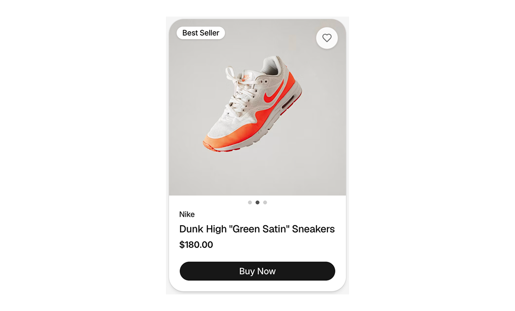
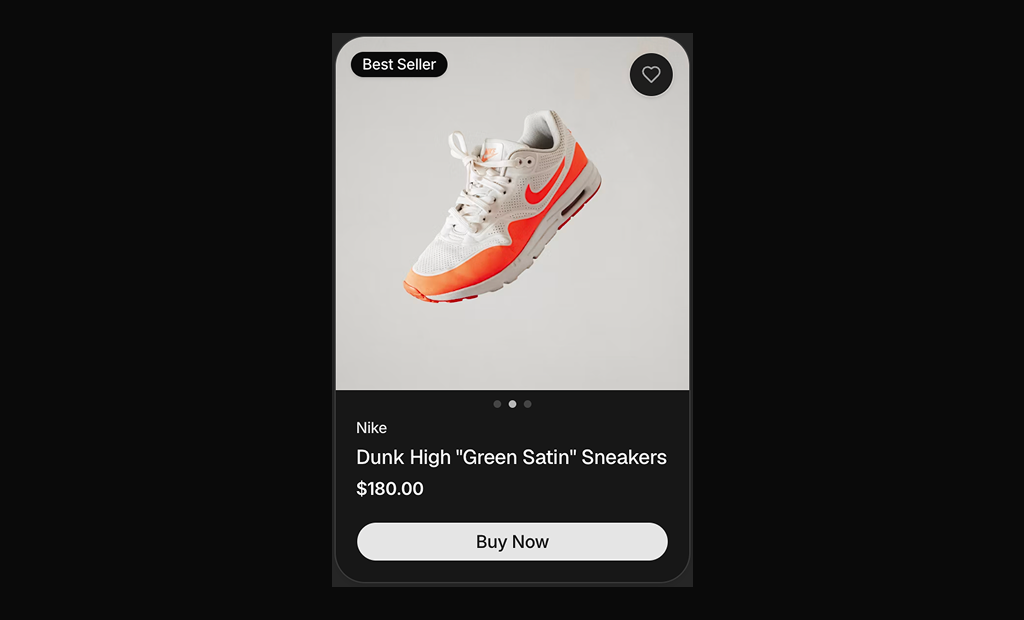
About Shadcn UI Product Cards Blocks
A product card is the small tile that stands for one item in a storefront: photo, name, price and a quick action that leads to the product page or the cart. These eleven shadcn product card blocks cover furniture, sneakers, skincare, fashion and property listings, with sale badges, countdowns, color swatches, hover galleries and wishlist toggles.
Like the rest of our shadcn blocks, each card is written in React and TypeScript, styled with Tailwind CSS and built from shadcn ui components such as Card, Button, Badge and Separator. The content lives in one data object per file, so turning a card into a reusable component for your catalog is a short step. All cards follow your light and dark theme.
Key Elements of a Product Card
- Product image: a consistent aspect ratio across the grid so rows line up, optionally with a second photo on hover.
- Name and price: readable at a glance, with the original price struck through when the item is on sale.
- Social proof: a star rating with the number of reviews, shown as a full row of stars or a single star and score.
- Variant hints: color swatches or size pills that tell shoppers which options exist before they open the product.
- Quick actions: wishlist, add to cart, quick view or buy now buttons that work without leaving the grid.
- Badges: short labels such as Best Seller, 50% Off or Active that flag what makes the item worth a click.
Where and Why to Use Product Card Blocks
The card is the most repeated element of an online store, so small decisions such as image ratio, price placement and button style add up across hundreds of products. Starting from a tested layout saves that design work and keeps every listing consistent. Because these are regular shadcn components, they share spacing, radius and colors with the rest of your shadcn ui pages.
- Category and search grids: map your products into a responsive grid with one of the compact cards.
- Flash sales: pair a discount badge and a countdown to create urgency on limited offers.
- Homepage features: image led cards work well in a “New arrivals” or “Bestsellers” row.
- Beauty and fashion brands: editorial cards with serif type or a lifestyle photo on hover match a premium look.
- Property and investment listings: cards with beds, baths, area and yield figures turn the same pattern into a real estate listing.
- Mini carts and saved items: a compact horizontal card with quantity and total fits a cart drawer or a wishlist.
Product Card Blocks in This Collection
- Product Card 1: A dependable default for furniture or home goods where shoppers pick a finish before buying. The add to cart button sits right next to the price.
- Product Card 2: Good for products that need several angles, such as sneakers. Shoppers browse the photos just by moving the pointer, without opening a gallery.
- Product Card 3: Fits sale collections where the saving should be obvious, with a stack of quick actions on the photo for saving, enlarging and adding to the cart.
- Product Card 4: A wider landscape card for lists, sidebars or search results where a short description helps the decision.
- Product Card 5: Made for deal of the day and flash sale sections, where a ticking timer pushes shoppers to act before the offer ends.
- Product Card 6: A quiet, centered card for skincare and beauty brands that sell on tone and copy rather than on badges.
- Product Card 7: Lets the photo carry the whole card. Use it for visual categories such as furniture or decor where the image sells the product.
- Product Card 8: For fractional property or investment platforms that need yield figures next to the listing.
- Product Card 9: A home listing for real estate portals, where price range, address and room count matter more than a buy button.
- Product Card 10: Suits cart drawers, wishlists and order recaps where shoppers review an item they already chose.
- Product Card 11: An editorial card for cosmetics or fragrance that keeps the grid calm and reveals the buying controls only on hover.
Similar Block Categories
- Product List: full product grids and lists when you need a whole section, not a single card.
- Product Quickviews: open a product preview from a card without leaving the grid.
- Product Details: the page a card links to, with gallery, variants and purchase options.
- Shopping Cart: the next step after a shopper adds a card to the cart.
- Customer Reviews: expand the rating shown on a card into full review sections.
Accessibility
The cards already cover a lot of the basics. Wishlist and cart toggles are real buttons with aria-label and aria-pressed, ratings are wrapped in an element with an aria-label such as “Rated 4.5 out of 5 stars” while the star icons are hidden from screen readers, and most prices carry a visually hidden “Price:” prefix. Color and size pickers in Product Card 1, 4 and 11 use the radiogroup role with aria-checked on each option, and the countdown in Product Card 5 uses the timer role.
Most cards wrap the whole tile in a link and place buttons inside it. This works with mouse and touch, but nested interactive elements can be confusing for keyboard and screen reader users, so consider making only the image and title the link. Product Card 11 hides its Add to cart button and size options until hover, so consider showing them on focus or on small screens as well.
Product Cards FAQ
PRODUCT in most cards and PROPERTY in Product Card 8 and Product Card 9. Change the name, price, image and href there. For a real grid, turn the constant into a prop and pass each item from your catalog.w-70 (280px) for most cards and max-w-sm for Product Card 4, Product Card 9 and Product Card 10. Map your products into a parent such as grid grid-cols-2 gap-4 lg:grid-cols-4 and replace the fixed width with w-full so the cards fill each column.useCountdown hook recalculates the days, hours, minutes and seconds every second with setInterval and stops at zero. The END_DATE constant is set relative to the moment the page loads, so replace it with the real end date of your sale, ideally coming from your backend.