About Shadcn UI Event Calendar Blocks
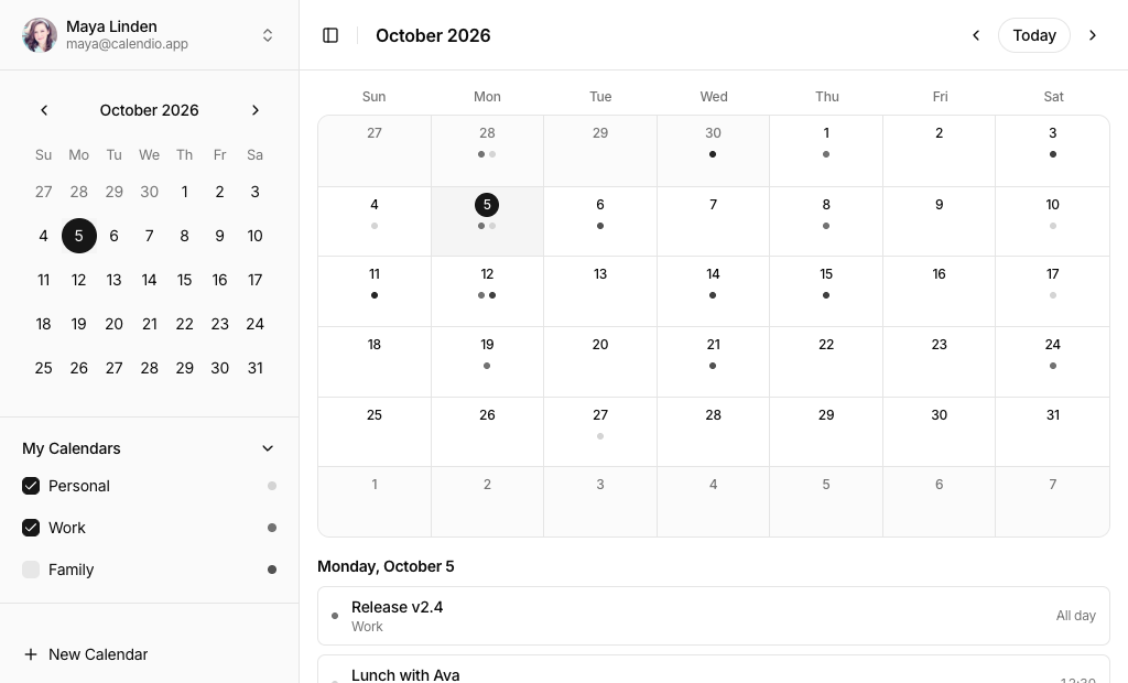
An event calendar places meetings, deadlines and reminders on a grid of days and hours so people can plan around them. These four shadcn event calendar blocks cover a full calendar with month, week, day and agenda views, a month calendar with a calendar list sidebar, a day planner with an hourly timeline and a minimal day summary with to-dos.
Like the rest of our shadcn blocks, each calendar is built with React, TypeScript and Tailwind CSS on top of shadcn ui components such as Calendar, Dialog, Popover, Select, Sidebar and Toggle Group. Date logic runs on date-fns, event colors come from the chart variables of your theme and every block works with sample events that are generated around today, so the demo always looks current.
Key Elements of an Event Calendar
- Period navigation: previous and next buttons, a Today button and a title that shows the visible month or range.
- Views: a month grid for the overview and a week or day view with hourly slots for detail.
- Readable events: a color per calendar or category, the title and the start time, with overflow handled when a day is full.
- Create and edit form: title, dates, times, an all day option, location and color in one dialog.
- Rescheduling: drag an event to a new slot or change its time in the form.
- Today markers: a highlighted current date and a line for the current time.
Where and Why to Use Event Calendar Blocks
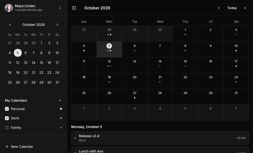
Building a calendar from scratch means solving month grids, time slots, overlapping events, multi day events and time zones before you get to your actual feature. These blocks give you that foundation in plain components you can read and change. They use standard shadcn components and theme tokens, so a calendar page fits the rest of your shadcn ui app and switches to dark mode without extra styles.
- Scheduling and booking apps: show availability and let staff move appointments by dragging.
- Project and team tools: display milestones, meetings and deadlines next to tasks.
- CRM and sales dashboards: plan calls and demos per day or week.
- Event and class platforms: list sessions in an agenda view that reads well on phones.
- Personal planners: a calm day view with to-dos for productivity and wellness apps.
- Shared calendars: toggle family, work and holiday calendars on and off in a sidebar.
Event Calendar Blocks in This Collection
- Event Calendar 1: The most complete option, for products where users manage a busy schedule and expect Google Calendar style views, keyboard shortcuts and drag to reschedule.
- Event Calendar 2: Choose it when people combine several calendars and need to switch them on and off, with a date picker in the sidebar for jumping to any day.
- Event Calendar 3: Suits apps centered on one day at a time, such as a creative studio or coaching planner, where the hourly timeline matters more than the month.
- Event Calendar 4: A minimal home screen for personal apps that should feel light, with today's to-dos and the next events shown before the month grid.
Similar Block Categories
- Gantt Chart: plan longer tasks with start and end dates on a timeline.
- Todo App: manage the tasks that sit behind the calendar entries.
- Kanban Board: track the status of work while the calendar tracks its dates.
- Sidebar Layouts: more sidebar patterns for calendar lists and navigation.
- Modal Dialogs: extra layouts for create, edit and confirmation dialogs.
Accessibility
Navigation buttons carry labels such as “Previous month”, “Next month” and “Today”, and the day buttons in Event Calendar 2, 3 and 4 have the full date as their accessible name plus aria-pressed for the selected day. Events in Event Calendar 1 are buttons, so they can be reached with the Tab key and opened with Enter, and when a narrow month cell hides the title it stays available to screen readers. The event, calendar and to-do dialogs use labelled fields, the color options have aria labels, and Event Calendar 1 and 3 show a validation message when the end is before the start.
Some interactions are pointer only today. Clicking an empty slot to create an event and dragging an event in Event Calendar 1 have no keyboard equivalent besides the New event button and the edit form, so consider adding the dnd-kit keyboard sensor. Events on the Event Calendar 3 timeline are not focusable, and the color options are named after their token, so friendlier names would help. Event Calendar 3 also scrolls the timeline smoothly, which you may want to disable for visitors who prefer reduced motion.
Event Calendar FAQ
@dnd-kit/core and @dnd-kit/utilities. In the week and day views every hour is split into four drop zones, so an event snaps to the nearest quarter hour, while in the month view it keeps its time and only changes the day. The duration is preserved, a preview follows the pointer and a toast confirms the new time.date-fns for date math and formatting. Event Calendar 1 adds @dnd-kit/core, @dnd-kit/utilities and sonner for toasts. Event Calendar 2 uses the shadcn Sidebar and Calendar components and imports the English locale from react-day-picker. Event Calendar 3 and Event Calendar 4 only need shadcn components and date-fns.data.ts. Event Calendar 1 expects objects with id, title, start and end dates, a color and optional description, location and allDay fields, and its EventCalendar component reports changes through onEventAdd, onEventUpdate and onEventDelete. Event Calendar 2 uses a date, a calendar name and an optional time, and Event Calendar 3 and Event Calendar 4 store times as HH:mm strings.bg-chart-1in each block's utils.ts. Because they use the chart variables from your theme, they follow light and dark mode. Change the mapping or the variables in globals.css to restyle every event at once.