About Task Cards Examples
Task cards are structured components used in project management and productivity interfaces to represent individual pieces of work with enough context to act on them quickly. They typically surface a task title, owner, status, and key metadata such as due dates or tags, making them ideal for kanban boards, backlog lists, and personal dashboards. Built with shadcn ui primitives and styled using tailwindcss utilities, TaskCards maintain a consistent visual language with other shadcn blocks while allowing nuanced layout differences between compact and detailed views in a next.js application.
Under the hood, a TaskCards component is a typed react building block that maps structured task data to visual elements and interactions. TypeScript interfaces describe the fields for identifiers, titles, assignees, status values, and optional attributes like priority or labels, ensuring predictable behavior across different boards. Shadcn ui components such as cards, badges, and checkboxes handle accessible states and keyboard navigation, while tailwindcss refines spacing and responsive layout. This pattern also supports drag‑and‑drop libraries by keeping the DOM structure simple and consistent.
In a next.js setup, TaskCards are usually rendered as client components due to their interactive nature, but the same design can be used in server‑rendered marketing or documentation pages to demonstrate features. By defining TaskCards as reusable react and typescript modules that compose shadcn ui components, teams can rapidly extend functionality with actions like quick edit, assignment changes, or context menus without rewriting core markup. This makes TaskCards a central building block for coherent, scalable productivity experiences.
Which Task Card Example Should You Pick?
Task Card 1 is a full task card. It shows one task with a checkbox, title, description, due date, priority badge, an actions menu and the assignee. Use it on kanban boards where each task is its own card.
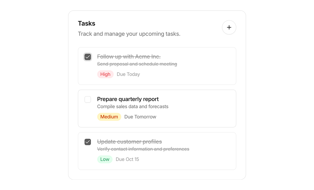
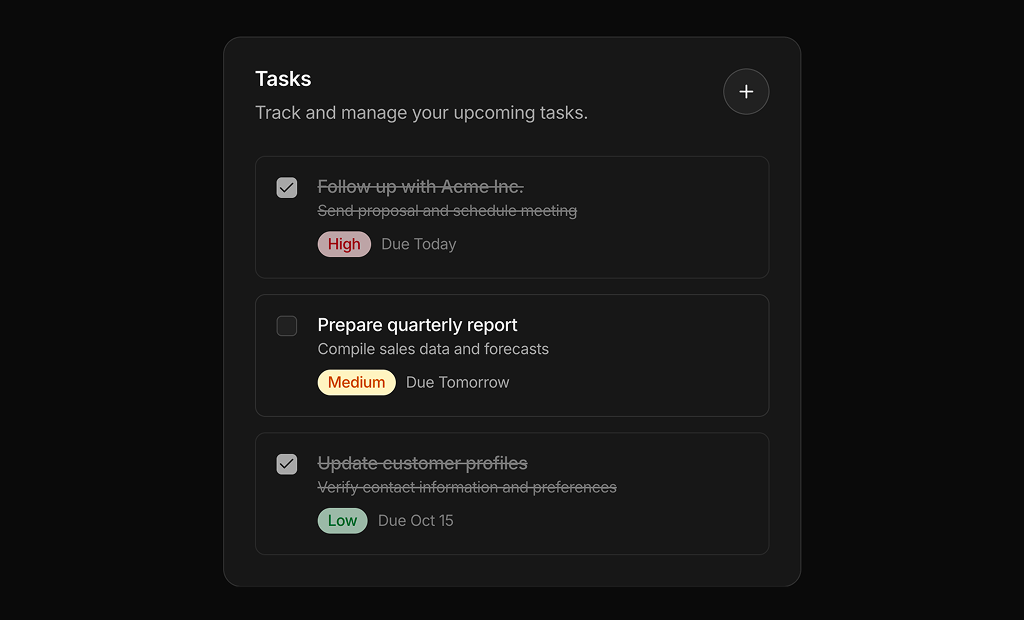
Task Card 2 is a task list. It groups three tasks in one card with checkboxes, priority pills, due dates and an Add Task button. Use it as a to do widget on a dashboard or CRM home page.