About Shadcn Feature Section Blocks
A feature section explains what your product does and why each capability matters, turning a list of functions into benefits visitors can scan in seconds. These thirteen shadcn feature section blocks cover the layouts you need most: icon card grids, image and text splits, alternating rows, tabbed content, a photo category grid and an autoplaying carousel.
Like all of our shadcn blocks, each section is written in React and TypeScript, styled with Tailwind CSS and assembled from shadcn ui components such as Card, Badge, Button, Tabs and Carousel. Icons come from lucide-react and images use next/image, so the shadcn components fit into an existing Next.js project and follow your light and dark theme.
Key Elements of a Feature Section
- Section headline: one sentence that sums up the value of all features together, often with a small badge or label above it.
- Feature items: a short title and one or two sentences per feature that describe the result for the user.
- Visual anchors: icons, numbers or images that let the eye jump from one feature to the next.
- Consistent layout: a grid, list or alternating rows that keep every item at a similar size and rhythm.
- Next step: a button or Learn more link that sends interested visitors to signup, docs or a deeper page.
Where and Why to Use Feature Section Blocks
The hero makes a promise, the feature section proves it. Visitors who keep scrolling want to know what exactly they get, and a well structured section answers that without forcing them to read documentation. Picking a layout that matches your content matters: a card grid suits many small capabilities, alternating rows suit a few big ones and tabs suit products with distinct areas. Because these are ordinary shadcn components, you can mix several layouts on one page and they still look consistent.
- SaaS homepages: place a card grid right after the hero to list the core capabilities.
- Product tours: use alternating rows or tabs to walk through larger product areas one at a time.
- Developer tools: list deployment, security and performance features in a compact two column list.
- Online stores: turn product categories into large photo tiles that lead into the catalog.
- Agency and service sites: combine a headline, a contact button and a wide image with the services you offer.
- Onboarding and pricing pages: a numbered list summarizes the main reasons to choose a plan.
Feature Section Blocks in This Collection
- Feature Section 1: Good for products with many small capabilities. The color coded tiles help visitors tell eight features apart at a glance.
- Feature Section 2: Pairs your pitch and a primary action with a compact set of four benefits, so the section doubles as a mini call to action.
- Feature Section 3: Suits AI and content products that want a bold headline and a link from every feature to its own page.
- Feature Section 4: Puts one product image at the center of attention and surrounds it with six supporting benefits.
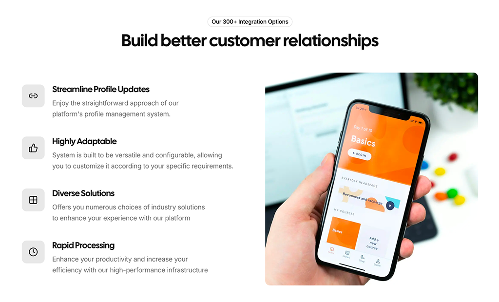
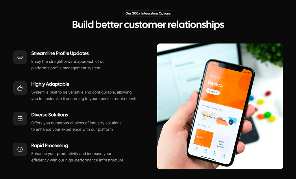
- Feature Section 5: A readable list next to a single visual, useful when each feature needs a full sentence of explanation.
- Feature Section 6: A left aligned layout with quiet outlined icons that fits security, finance or collaboration pages.
- Feature Section 7: Built for service and infrastructure companies that want a contact button, a large visual and six service cards in one section.
- Feature Section 8: Groups features by product area behind tabs, which keeps a page with many capabilities short.
- Feature Section 9: Tells a story in two steps, giving each major capability its own image, heading and button.
- Feature Section 10: Works best for stores and portfolios where photos sell the category better than icons.
- Feature Section 11: Shows product screenshots in motion while the feature list explains each one, ideal for dashboards and apps.
- Feature Section 12: A clean, semantic description list for technical products such as hosting, APIs or security services.
- Feature Section 13: Numbered items suggest an order or ranking, so it suits “why choose us” lists and comparison pages.
Similar Block Categories
- Hero Sections: open the page with the promise your features back up.
- How It Works: show the steps to get value after listing what the product offers.
- Integrations: add the tools your product connects with as another kind of feature.
- Stats: support feature claims with numbers such as uptime or active users.
- Product Features: highlight the specs of a single physical product on a store page.
Accessibility
Every image in the collection has an alt attribute, and Feature Section 12 marks its decorative icons with aria-hidden and uses a dl, dt and dd structure so screen readers announce each feature name with its description. Feature Section 8 uses the shadcn Tabs component, which supports arrow key navigation between tabs. Some alt texts are placeholders such as “Feature Section 5”, so replace them with a real description of your images.
In Feature Section 11 the feature items are clickable div elements, so they cannot be reached with the keyboard. Consider turning them into buttons with an aria-current state, and consider pausing the autoplay for visitors who prefer reduced motion. The decorative icons in the other blocks could also receive aria-hidden.
Feature Sections FAQ
features array at the top of the file with an icon from lucide-react, a title and a description. Feature Section 8 uses a tabContent object keyed by tab value, Feature Section 13 a FEATURES array with step numbers, while Feature Section 9 and Feature Section 12 write their content directly in the JSX.color key such as red, blue or green. A colorClasses map turns that key into a light background for the tile and a matching icon color, with separate dark mode values. Add a new entry to the map if you need another color, or switch to a single primary tile for a calmer look.src for your own screenshots or files in the public folder. If you load images from another remote host, add that host to images.remotePatterns in next.config, otherwise Next.js refuses to load them.embla-carousel-autoplay plugin set to an 8 second delay and loop enabled. Clicking a feature in the right column scrolls to the matching slide and resets the timer, and the active item fills with a progress bar driven by the embla__progress__bar keyframe animation in globals.css. Change the delay value to speed it up or slow it down.embla-carousel-autoplay package and the embla progress CSS. The progress bar class and its embla-progress keyframes live in globals.css, so copy those rules into your own stylesheet or the bar will not animate. All other blocks only need shadcn/ui components, lucide-react and next/image.#. Use Button with asChild around a Next.js Link, or replace the href values with your signup, docs or product pages. In Feature Section 10, link the Explore Now buttons to the matching category page.