About Shadcn UI Mail App Blocks
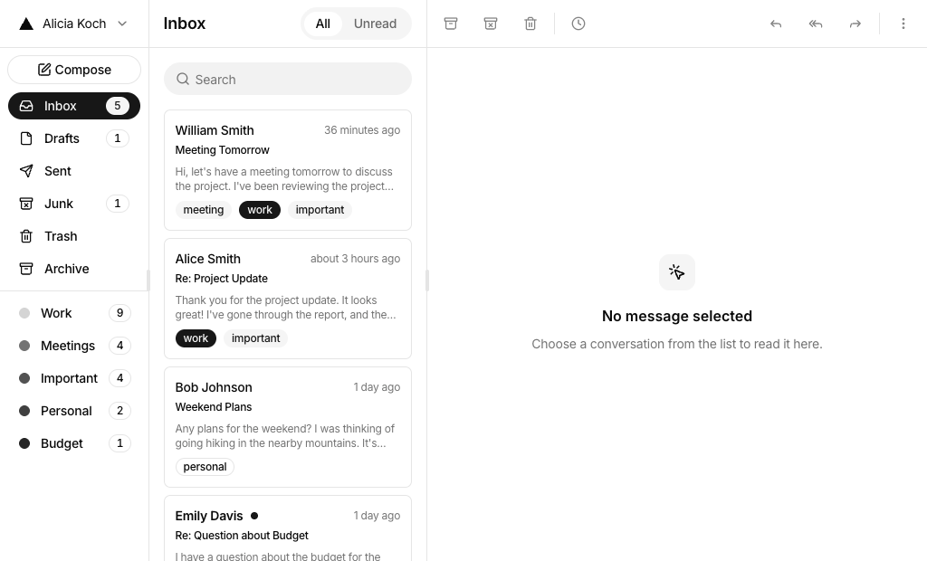
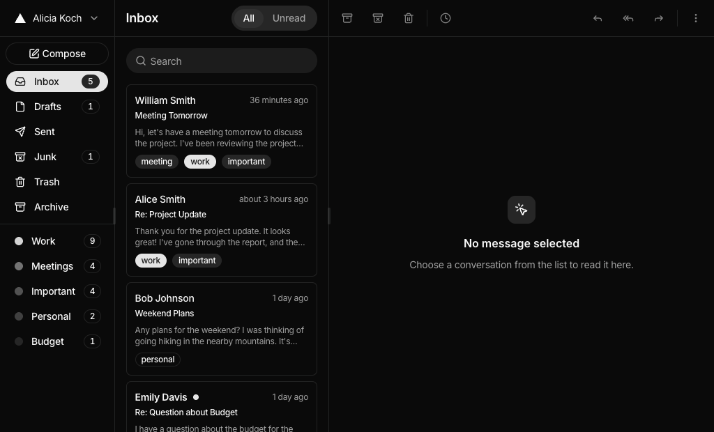
A mail app is the screen where people read, sort and answer email: folders on one side, a message list in the middle and the open message with a reply box. These eight shadcn mail blocks cover a classic three pane client, an inbox dashboard, a sales inbox with AI summaries, newsletter reading, bulk selection and a sectioned inbox with AI search.
Like the rest of our shadcn blocks, every layout is built with React, TypeScript and Tailwind CSS on top of shadcn ui components such as Sheet, Dialog, Tabs, Scroll Area, Input Group and Dropdown Menu. The blocks are interactive with sample data: opening a message marks it as read, replies appear in the thread, compose adds to Sent and archive or delete move messages out of the list.
Key Elements of a Mail App
- Folder navigation: Inbox, Sent, Drafts, Archive and Trash with unread counts, plus labels or custom folders.
- Message list: sender, subject, preview and time, with clear unread, starred and selected states.
- Reading pane: the full message with sender details, date, attachments and earlier replies.
- Reply and compose: an inline reply box and a compose dialog with To, Subject and Message fields.
- Quick actions: archive, delete, star, mark as unread and move, ideally with undo.
- Search and filters: text search plus tabs or chips for unread, flagged, labels or attachments.
Where and Why to Use Mail App Blocks
Many products need an inbox even when they are not email clients: support tools, CRMs, client portals and internal admin panels all show threads of messages that people triage and answer. These blocks give you that interface with the hard details already handled, including the mobile switch between list and message, empty states and toasts. Since they are made of regular shadcn components and Tailwind CSS tokens, they fit into an existing shadcn ui dashboard without a separate design pass.
- Email clients: a full client with folders, labels, compose and a resizable reading pane.
- Sales and outreach tools: lead conversations with intent, contact data and campaign stats next to the thread.
- Client portals and agencies: a shared inbox where each conversation belongs to a client project.
- Support desks: triage incoming messages with bulk actions, categories and priority flags.
- Personal dashboards: combine the inbox with tasks and comments on one start page.
- AI assistants: add summaries, drafted replies and natural language search on top of the inbox.
Mail App Blocks in This Collection
- Mail App 1: Start here if you need a familiar desktop email client. Users can resize the panes, collapse the navigation and snooze a conversation to a preset time or a calendar date.
- Mail App 2: A start page rather than a client. It suits personal workspaces where mail, tasks and team comments should be visible together.
- Mail App 3: Fits multi workspace products. It has nested folder groups, a storage meter, attachment previews and next and previous buttons for reading through the list.
- Mail App 4: Built for outbound sales. Reps see lead intent and the next step before reading the thread and can add the contact to the CRM in one click.
- Mail App 5: Works well for consumer mail with many newsletters, thanks to the image privacy notice, the unsubscribe button and user created folders and labels.
- Mail App 6: The pick for heavy triage. Category tabs, day groups and bulk actions help clear a large inbox quickly.
- Mail App 7: Aimed at freelancers and studios. Each row shows the client, the latest activity and a status, and replies open in a focused inline composer.
- Mail App 8: A wide single column inbox for teams that prefer one scrolling page, with filter chips and an Ask AI popover for finding mail.
Similar Block Categories
- Chat UI: real time conversations and shared inboxes with a chat layout.
- AI Chat: add an assistant that answers questions about the inbox.
- Sidebar Layouts: more navigation patterns for the folder sidebar.
- Empty State: friendly screens for an empty folder or a search with no results.
- Modal Dialogs: extra dialog layouts for compose, settings or confirmations.
Accessibility
Message rows are real buttons, so the list can be navigated with the Tab key, and Mail App 3, 4, 5 and 7 mark the open message with aria-current. Icon only actions such as archive, delete, snooze and star have aria labels or screen reader text, most of them with a tooltip, and unread dots in Mail App 3 and 4 carry an “Unread” label. Sheets used for navigation and reading include a title and description for screen readers, and the compose dialogs use labelled To, Subject and Message fields. In Mail App 6 every checkbox has a label such as “Select all” or the message subject.
A few fields rely on placeholder text alone. Consider adding an aria-label to the reply box in Mail App 1 and 7, to the header search in Mail App 7 and 8 and to the Ask AI input in Mail App 8. The attach, emoji and link buttons in several reply boxes are placeholders, so connect them to real actions or remove them before launch.
Mail App FAQ
mail-app-1-layout id so they survive a reload. On phones it switches to a list view and a reading view with a back button.date-fns for message times and sonner for toasts through the shadcn Toaster. Mail App 1 also keeps its state in a zustand store, uses the Resizable component, which is built on react-resizable-panels, and imports VisuallyHidden from radix-ui. Mail App 5 renders newsletter images with next/image.use-mail.ts, such as moveMail, toggleRead, replyToMail and sendMail. The other blocks keep messages in useState and change them through small update functions. Load the list from your API and call it inside those actions.suggestedReply after a short delay. In Mail App 8 Ask AI matches keywords such as a label name, unread or attachment and turns them into filters, otherwise it runs a normal search.