500+ Free and Premium Shadcn UI Blocks
A guide to the Shadcn UI Kit blocks library: free shadcn/ui blocks you can install with the CLI, premium blocks for landing pages, dashboards, stores and apps, and how to pick the right ones.
Most projects need the same sections over and over. A hero, a pricing table, a few feature rows, a sign in form, a data table with filters, a settings page. Writing them from scratch every time is slow, and copying them from an old project usually means untangling styles that no longer match.
That is the problem shadcn/ui blocks solve. Shadcn UI Kit has a library of shadcn/ui blocks that has now passed 500. Today it holds 513 blocks across 44 categories: 15 of them are free and install with one command, and 498 are premium blocks that install from the same registry with an API key. In this post we walk through what is in the library, which blocks are free, how to install them with the shadcn CLI and how to pick the right ones for a landing page, an admin dashboard, an online store or an app feature.
Blocks vs components
If you have used shadcn/ui before, you already know components: a Button, a Card, a Dialog, a Table. They are the building materials.
Blocks are what you build with those materials. A block is a complete, ready to use section or screen, like a pricing section with a monthly and yearly toggle, an invoices table with sorting and row actions, or a store locator with a map and a synced list. Each block is a regular React file that uses shadcn/ui components and Tailwind CSS classes, so it follows your theme and you can change anything in it.
A simple way to think about it:
- Components answer "what is this element?" The kit includes 532 shadcn/ui components and variants for that.
- Blocks answer "what does this part of the page look like?" They save you the layout, spacing, copy structure and state handling.
All blocks are built with React 19, TypeScript and Tailwind CSS v4, they use the standard shadcn/ui theme tokens, and every block has a live preview in light and dark mode before you install it.
A tour of the four block groups
The library is split into four groups. Here is what each one covers and when it is useful.
Marketing blocks
The Marketing group is the largest set for public facing pages, with 175 blocks across 15 categories. These are the shadcn ui sections you need for a landing page, a product site or a startup homepage:
- Hero sections (14): centered and two column heroes with badges, avatars, product images, signup forms and image marquees.
- Pricing tables (20): plan cards, comparison layouts, monthly and yearly toggles and highlighted popular plans.
- Feature sections (13) and How it works (10): explain the product and walk visitors through a process step by step.
- Testimonials (15), Stats (12) and Team sections (12): social proof, key numbers and the people behind the product.
- Call to action (11), Newsletter sections (8) and Contact us (13): the sections that turn visitors into signups and leads.
- Navbars (15) and Footers (12): responsive navigation with mobile menus, plus footers with link groups and newsletter forms.
- FAQs (10), Integrations (6) and Changelog page (4): answer common questions, show what you connect with and announce releases.
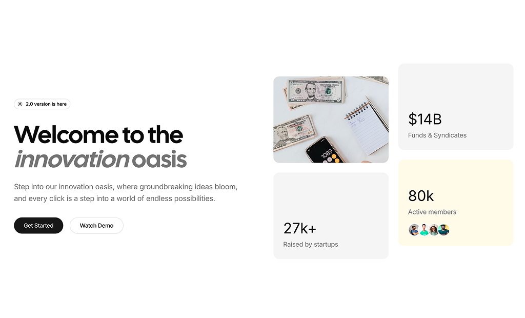
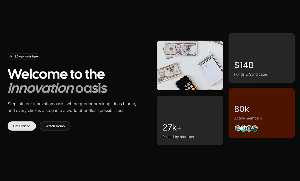
If you only pick two categories from this group, start with the hero and the pricing table blocks. Those are the two sections visitors look at longest, and they set the visual style for the rest of the page.
Ecommerce blocks
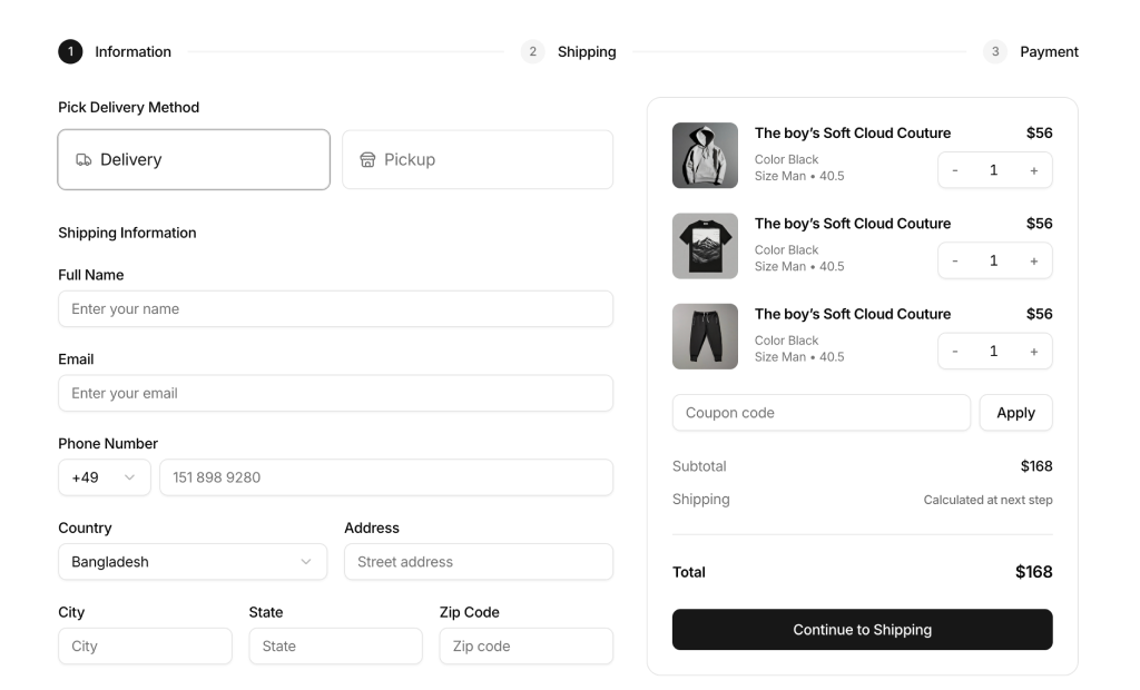
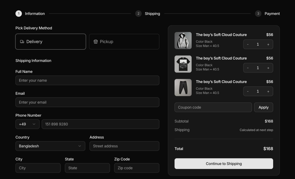
The Ecommerce group has 59 shadcn blocks across 11 categories for online stores:
- Product list (8), Product category (9) and Product cards (11): grids and cards with images, color swatches, ratings, wishlist buttons and prices.
- Product details (7), Product features (2) and Product quickviews (2): image galleries, specifications and quick previews.
- Shopping cart (4) and Checkout page (5): cart items with quantity updates and discount codes, then shipping forms and an order summary.
- Customer reviews (9): rating summaries and review lists that add social proof to product pages.
- Promo sections (1) and Store navigation (1): campaign banners and store menus.
Dashboard UI blocks
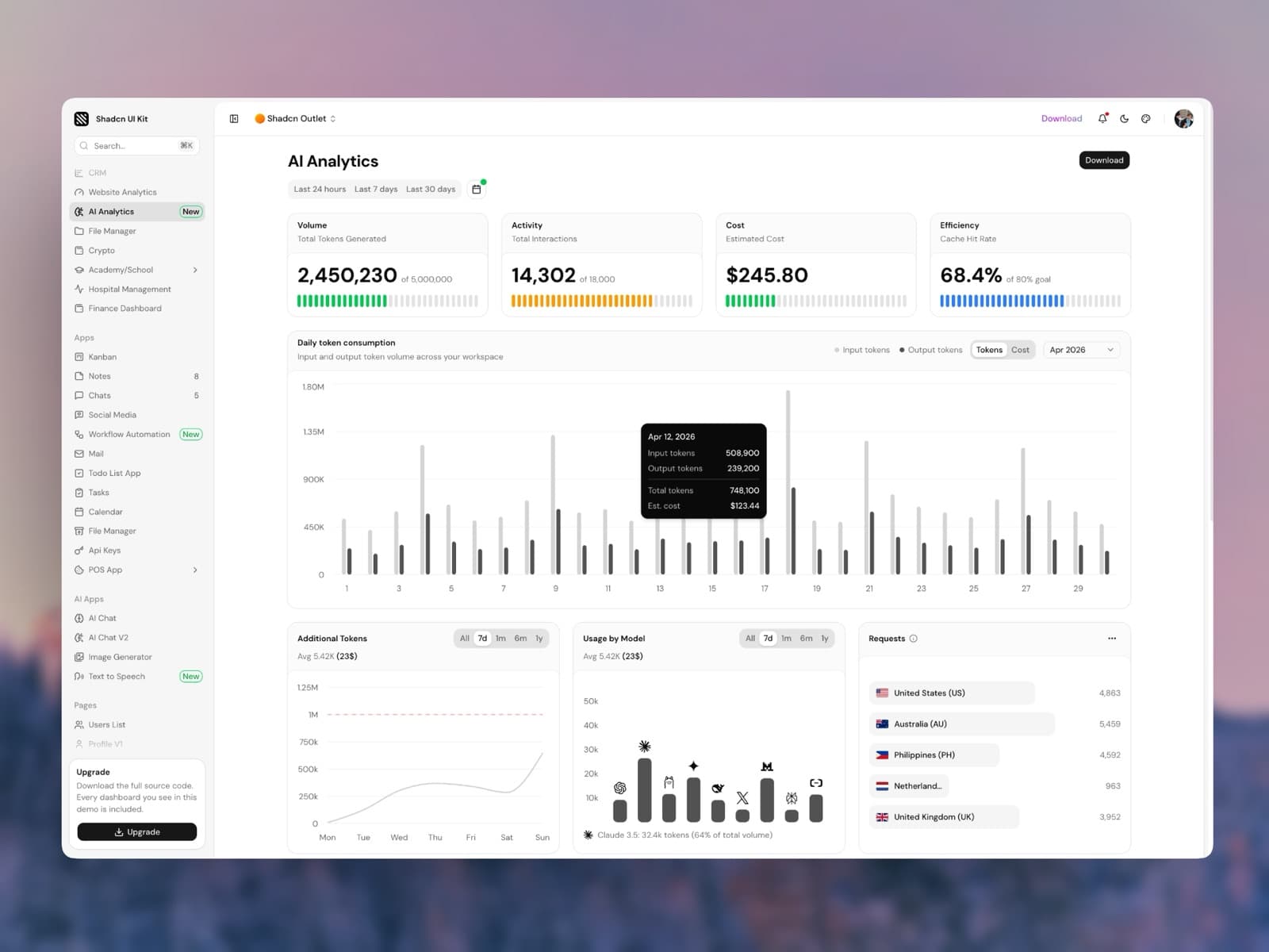
The Dashboard UI group is where most of the library lives, with 236 shadcn dashboard blocks across 12 categories. These are the screens and widgets inside an app:
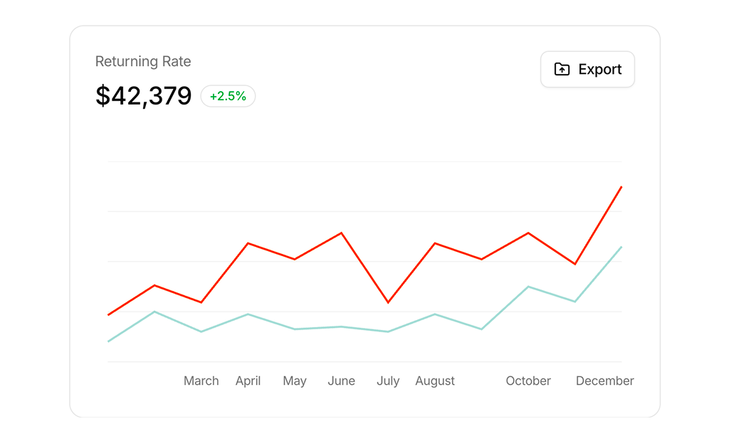
- Charts (70): line, bar, area and donut charts built on Recharts, with tooltips, legends, export menus and range switchers.
- Stat cards (33): KPI cards with values, trends and small charts for the top of a dashboard.
- Modal dialogs (28): confirmations, forms and focused tasks in a dialog.
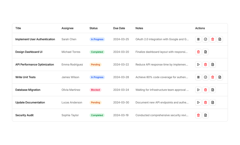
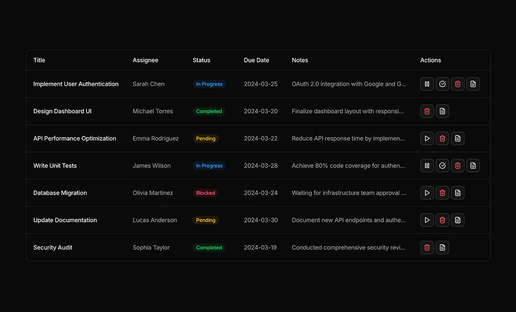
- Tables (25): data tables built with TanStack Table, with filtering, sorting, pagination, inline status changes and bulk actions.
- Form layouts (22): settings pages, profile forms and multi step forms with Zod validation.
- Dashboard shell (9), Page layouts (3) and Sidebar layouts (1): the frame around your app, with a sidebar, grouped navigation, a user menu and a header.
- Onboarding screens (10): guided setup flows with one question per step, a progress indicator and a completion state.
- Dashboard dropdowns (10): account menus, notification inboxes, workspace switchers and other top bar menus.
- Sign in forms (3): login screens with email, password and social login options.
- Empty state (22): no results, no data, first run, syncing, access denied and offline screens with illustrations built from components, so they follow your theme.
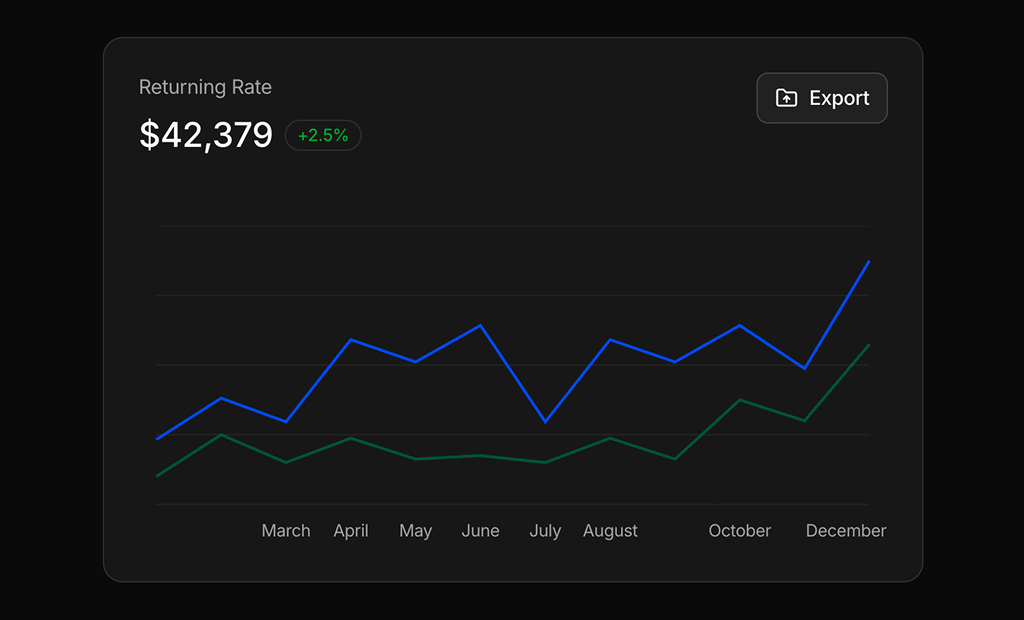
The dashboard shell blocks are a good starting point for any new app. Each one gives you the sidebar, navigation and header around an empty content area, so you can drop charts, stat cards and tables into it right away.
Application UI blocks
The Application UI group is the newest one, with 43 full screen blocks for features that usually take days to build:
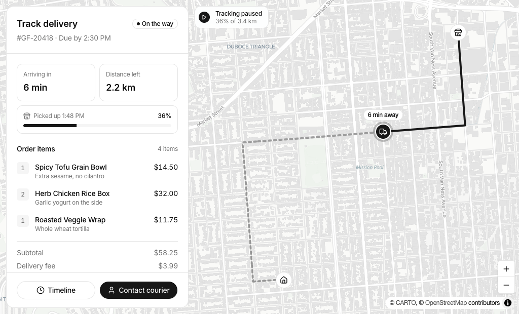
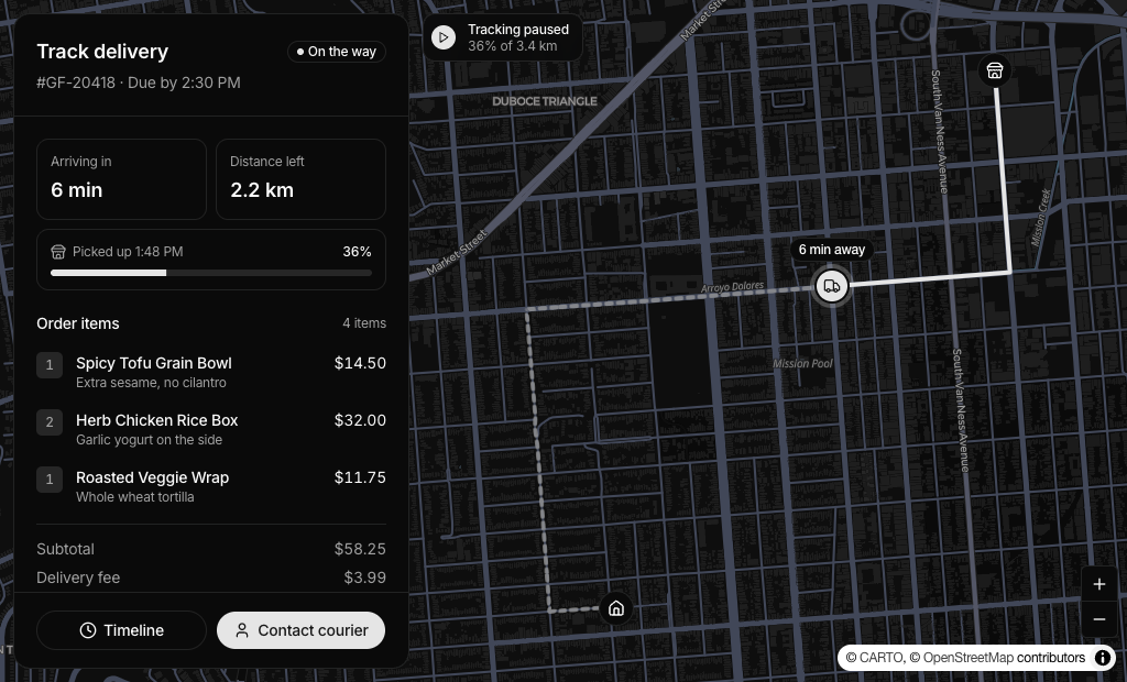
- Map view (11): interactive maps built with MapLibre for property search, store locators, delivery tracking, route planners and analytics, with markers, popups, routes and side panels that stay in sync with the map.
- Gantt chart (3): product roadmaps, project schedules and team resource planners built on the Kibo UI Gantt component, with drag to reschedule, markers, grouping and detail panels.
- Kanban board (7): sprint boards, sales pipelines, team workspaces and AI agent boards built on the Kibo UI Kanban component, with drag and drop between columns.
- Mail app (8): three pane mail clients, inbox dashboards and sales inboxes with compose, reply, folders, labels and search.
- Chat UI (10): messengers with media messages and reactions, team and group chats, shared support inboxes, an AI agent inbox, a CRM chat and video call screens with participant lists.
- Event calendar (4): a full calendar with month, week, day and agenda views and drag and drop rescheduling, plus a sidebar calendar, a day planner and a minimal calendar.
If you are building a planning tool, the gantt chart blocks show how far a block can go: they are full, working features, not just layouts.
Free shadcn blocks you can install today
The free set has 15 blocks. You do not need an account or an API key to install them:
- Hero Section 1: a centered hero with an announcement badge, headline and two buttons, from the hero section blocks.
- How It Works 9: a 2x2 grid of steps, each with a small UI mockup, from the how it works sections.
- Newsletter Section 1 and Newsletter Section 3: email signup sections, from the newsletter sections.
- FAQ 1: a centered FAQ with an accordion list, from the FAQ sections.
- Sign In Form 1: a login form with email, password and a submit button, from the sign in forms.
- Stat Card 1: a card with a metric value, a label and an optional trend, from the stat cards.
- Modal Dialog 16: a confirmation dialog with an icon, a message and a dismiss button, from the modal dialogs.
- Tables 1 to 7: seven complete data tables, including recent invoices with status filters, a quote summary with live totals, a launch checklist, a product catalog, team members with role changes, an issue tracker and expense claims with bulk actions. You will find them at the top of the data table blocks.
Seven free tables is not a typo. Tables are one of the most repeated parts of any dashboard, so they make a good test of how the blocks are written before you decide on anything else.
How to install a free block with the shadcn CLI
Every block page shows its install command. For a free block it points straight at the public registry file:
npx shadcn@latest add https://shadcnuikit.com/r/hero1.json
Swap hero1 for the block you want. The registry names for the free set are hero1, how-it-works9, newsletter1, newsletter3, faq1, signin-form1, stat-card1, dashboard-modal12 and tables1 through tables7. For example:
npx shadcn@latest add https://shadcnuikit.com/r/tables1.json
The shadcn CLI adds the block file to your project, installs any shadcn/ui components it needs that you do not have yet and adds the npm packages it depends on. The blocks are built on Radix UI, so use a Radix based shadcn/ui style in your project.
Premium shadcn blocks and the registry
The other 498 blocks are premium. They are served from the same registry, so the install flow is almost the same. You only add a key once.
With a Pro, Team or Enterprise plan you create an API key in your account under API Keys. Then add the registry to your components.json:
{
  "registries": {
    "@shadcnuikit": {
      "url": "https://shadcnuikit.com/r/{name}.json",
      "headers": {
        "Authorization": "Bearer ${REGISTRY_TOKEN}"
      }
    }
  }
}
Put the key in your .env file as REGISTRY_TOKEN and install any block by name with the namespace:
npx shadcn@latest add @shadcnuikit/hero2
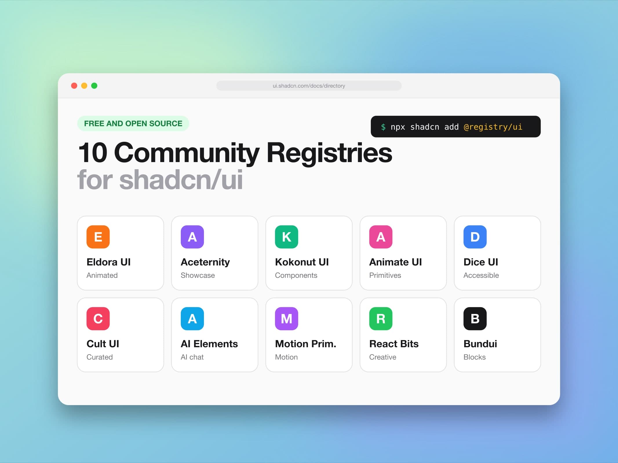
From then on, adding a premium block is one short command. If you want to learn more about how namespaced registries work, or look at other free registries you can combine with this one, read our list of free shadcn/ui community registries.
Free vs premium at a glance
| Free | Premium (Pro, Team, Enterprise) | |
|---|---|---|
| Blocks | 15 free blocks | All 513 blocks (498 premium plus the free set) |
| Install | Public registry URL, no key | Namespaced registry with an API key |
| Live previews | Every block | Every block |
| Page Builder export | Not included | Next.js project or shadcn CLI |
| Future blocks | Free updates to the free set | All future blocks with free updates |
| Payment | Free | One time payment, lifetime access |
The paid plans differ in the number of users: Pro is for one user, Team for up to 10 and Enterprise has no limit. All three cover unlimited projects, including commercial and client work under the license, and they also unlock the admin dashboard templates and website templates. The current prices are on the pricing page.
How to pick blocks for common projects
The size of the library is only useful if you can find the right blocks fast. Here are starting points for four common projects.
SaaS landing page
A solid shadcn landing page usually follows this order:
- Navbar
- Hero section
- Stats
- Feature sections and a how it works section
- Testimonials
- Pricing table
- FAQ
- Call to action
- Footer
You can build a working version of this page entirely from Marketing blocks. Pick the hero first, then choose the rest so their spacing and card styles match it.
Admin dashboard
Start with a dashboard shell, then fill the content area:
- A row of stat cards for the most important numbers.
- Two or three charts for trends over time.
- A data table for the records your users work with every day.
- Form layouts for settings and profile pages, and modal dialogs for confirmations.
- Dashboard dropdowns for the account menu and notifications in the top bar.
- Empty states for screens that have no data yet, so new users always see a clear next step.
If you would rather start from a finished product than from separate blocks, see our roundup of the best shadcn/ui dashboard templates, which covers complete dashboards for e-commerce, CRM, finance and more.
Online store
For a store, combine a store navigation block and a promo section on the home page, product category and product list blocks for browsing, product details with customer reviews on the product page, and the shopping cart and checkout page blocks for the purchase flow. Product quickviews are useful when you want shoppers to see more without leaving the list.
App features
Some features are hard to build well and easy to get wrong. A map with a synced list, a roadmap with drag to reschedule, a chat with media messages, a calendar with drag and drop or a multi step onboarding flow can each take days. The Application UI blocks and the onboarding screens give you a working version you can adapt to your own data instead of starting from an empty file.
Assemble pages with the Page Builder
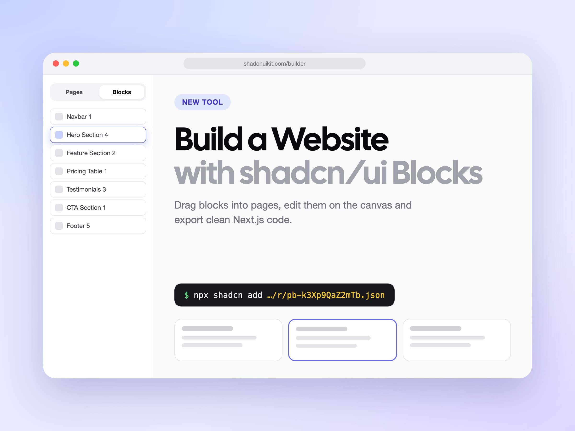
Installing blocks one by one is great when you need a single section in an existing page. When you are building a whole site, the Page Builder is faster. You pick blocks from a searchable library, arrange them into pages, edit text, images and links right on the canvas and preview every breakpoint. When you are done, you export a clean Next.js project or add the pages to your app with the shadcn CLI.
Our guide on how to build a website with shadcn/ui blocks walks through the whole process step by step.
Tips for working with shadcn blocks
- Preview before you install. Every block has a live preview. Check it in dark mode and at mobile width before you add it.
- Set your theme first. Blocks use the shadcn/ui theme tokens, so a new theme changes every block at once. The Theme Generator helps you create colors and typography that match your brand.
- Keep one style per page. Mixing very different hero, feature and pricing styles makes a page feel stitched together. Pick blocks with similar card shapes and spacing.
- Replace the sample data early. Real copy and real numbers show spacing problems right away.
- Treat blocks as your code. After installing, the file is yours. Rename it, split it into smaller components or remove the parts you do not need.
Frequently asked questions
What are shadcn/ui blocks?
They are ready to use sections and screens built with shadcn/ui components and Tailwind CSS, such as hero sections, pricing tables, data tables, forms and charts. You install them into your project and edit them like any other React component.
How many blocks are there?
There are 513 blocks today: 15 free and 498 premium, across 44 categories in Marketing, Ecommerce, Dashboard UI and Application UI. New blocks are added regularly.
Which shadcn blocks are free?
Hero Section 1, How It Works 9, Newsletter Section 1 and 3, FAQ 1, Sign In Form 1, Stat Card 1, Modal Dialog 16 and Tables 1 to 7. They install without an account.
Do I need an account to install free blocks?
No. Run npx shadcn@latest add with the block's registry URL, for example https://shadcnuikit.com/r/faq1.json, and the CLI adds it to your project.
How do I install premium blocks?
Create an API key under API Keys in your account, add the @shadcnuikit registry to your components.json, put the key in .env as REGISTRY_TOKEN and run npx shadcn@latest add @shadcnuikit/<name>.
Do the blocks work with my existing shadcn/ui project?
Yes, as long as your project uses a Radix based shadcn/ui style. The blocks use the standard theme tokens, so they pick up your colors, radius and fonts.
Is it a subscription?
No. The paid plans are a one time payment with lifetime access. Future blocks and updates are included at no extra cost.
Can I use the blocks in client and commercial projects?
Yes. The license covers an unlimited number of projects, including client work and paid SaaS products. It does not allow using the blocks to build website builders, template marketplaces or similar tools for others.
Start building
The quickest way to see if the blocks fit your project is to install a free one. Run the command for tables1 or hero1, change the copy and check it in your own app. When you need more, browse all shadcn/ui blocks by category, open a live preview and install the ones you like.