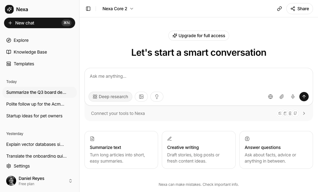
About Shadcn UI AI Chat Blocks
An AI chat interface is the screen where people ask an assistant for help: a composer for prompts and files, a place for replies and the controls around them, such as chat history, model choice and suggested prompts. These twenty one shadcn blocks cover the main shapes of that screen, from full chat homes with a sidebar to assistant panels and a floating widget that sit on top of an existing page.
Like all our shadcn blocks, they are written in React and TypeScript and styled with Tailwind CSS. The layout comes from shadcn ui components such as Sidebar, Dropdown Menu, Item, Card and Drawer, while the chat parts use AI Elements: Prompt Input, Attachments, Conversation, Message, Suggestion and Shimmer. Everything is wired with local state, so you can attach files, switch modes and click starters before connecting a real model.
Key Elements of an AI Chat Interface
- Composer: a textarea that sends on Enter, keeps Shift+Enter for new lines and shows attached files as chips.
- Mode and model controls: selects, toggle groups or menus for the model, writing style, research mode or answer speed.
- Start screen helpers: greetings, starter cards and suggestion chips that show what the assistant is good at.
- Chat history: grouped recent, pinned or saved chats in a sidebar, a side column or a dropdown.
- Reply area: message bubbles, a scroll to bottom button and a shimmering status line while the assistant works.
- Context and trust cues: source chips, connected tools and a short note that answers can contain mistakes.
Where and Why to Use AI Chat Blocks
Most of the work in an AI product happens on one screen, and small details decide whether people use it: how fast they find a starting point, whether they can see what the assistant read and how easily they switch models or modes. These shadcn components give you those details already arranged, so you can spend your time on the model and the data instead of the composer. Because they share the same theme tokens as the rest of the kit, the chat matches your dashboard or marketing pages in light and dark mode.
- Standalone chat products: a full page assistant with history, model choice and starter prompts.
- In-app copilots: a side panel or floating widget that answers questions about the page a user is on.
- Vertical assistants: sales, legal, finance or recruiting tools where the starters and context controls speak the language of one field.
- Image generation tools: a prompt with ratio and style controls and a strip of generated results.
- Team messaging with AI help: a group thread with files, reactions and a button that polishes a draft.
- Public landing chats: a logged out entry point with example prompts, a login button and footer links.
AI Chat Blocks in This Collection
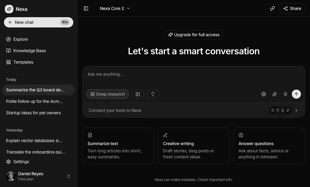
- AI Chat 1: A general purpose starting point for a consumer chat app. The free block of the set, with a prompt to connect Gmail, Calendar, Docs and GitHub under the composer.
- AI Chat 2: Fits a calm, writing focused assistant. An incognito toggle changes the placeholder, and a project menu sits next to the model and effort picker.
- AI Chat 3: Good for marketing or research teams who start from templates. Picking a card marks it as selected and loads its prompt into the composer.
- AI Chat 4: Made for a sales or outreach tool where onboarding progress, lead credits and quick actions matter as much as the chat itself.
- AI Chat 5: The lightest option when you only need a polished composer, for example inside an existing page or as the hero of a product.
- AI Chat 6: Suits professional tools where every request needs context. The tray under the composer keeps the client, documents and jurisdiction in view.
- AI Chat 7: A public, logged out chat page with a language menu and a footer, ready to serve as the homepage of a chatbot.
- AI Chat 8: Choose it when users pick between many models from several providers. The picker opens by default so you can review it right away.
- AI Chat 9: A friendly home screen for everyday users, with a greeting, three idea cards and one tap prompts under the composer.
- AI Chat 10: Fits an assistant inside a larger app, such as a hiring platform, where past conversations live in their own column on wide screens.
- AI Chat 11: Built for a money or budgeting app. The prompt cards rotate through two sets so returning users see fresh ideas.
- AI Chat 12: The pick for image generation. Results appear as removable thumbnails above the prompt, and a banner can promote a paid plan.
- AI Chat 13: A composer first page where users decide which tools the assistant may use, with a live count of connected apps.
- AI Chat 14: Shows how an assistant can offer choices inside a reply. Style and font options send a follow up when clicked, which fits design or code generators.
- AI Chat 15: A team chat rather than a bot chat, useful when AI is a helper inside messaging. Sent files turn into attachment cards in the thread.
- AI Chat 16: A left aligned, editorial take on the chat home that leaves more room for a prompt gallery below the composer.
- AI Chat 17: The most minimal full flow: one tap starters send at once, and the screen switches from the start view to a conversation.
- AI Chat 18: Place it beside a document or dashboard so users can question what they see and check which notes the answer came from.
- AI Chat 19: Use it when an assistant should confirm scope before running a long task. Answers are pre selected, so confirming takes a few clicks.
- AI Chat 20: A support style widget for any page. It can grow wider, shrink to a round launcher and start over with a fresh chat.
- AI Chat 21: The richest workspace in the set, for assistants with several sections, saved assistants and a configuration drawer for memory and web access.
Similar Block Categories
- Chat UI: person to person messaging layouts when your product needs chat between users as well as with an assistant.
- Sidebar Layouts: more navigation patterns to wrap around the assistant in a larger app.
- Empty State: first run screens for the parts of your app where there is no chat yet.
- Onboarding Screens: collect the context an assistant needs before the first prompt.
- Pricing Tables: the next step after the upgrade buttons and trial cards shown in several chat blocks.
Accessibility
The composer is a real form: Enter submits, Shift+Enter adds a line and the submit button is labelled Submit or Stop. Conversation areas use role="log", so screen readers treat new messages as a live feed. Many icon buttons carry an aria-label, such as Copy link, New chat, Minimize or Close, and toggles like web search, dictation and incognito expose their state with aria-pressed. AI Chat 19 binds every checkbox and radio card to its label, and its A to D shortcuts ignore key presses while the user types in a field. The drawers in AI Chat 14 and AI Chat 21 connect their switches to labels with htmlFor.
Some icon only buttons, such as the paperclip and microphone in several composers, have a tooltip but no aria-label, so consider adding one. In AI Chat 10 the conversation menu button only becomes visible on hover, and making it visible on keyboard focus as well would help. The Creativity slider in AI Chat 14 could use an aria-label too. The shimmering status text animates continuously, so you may want to tone it down for visitors who prefer reduced motion.
AI Chat FAQ
npx shadcn@latest add @shadcnuikit/ai-chat1. The other twenty blocks are part of All Access.ai package and use nanoid. Conversation blocks add Conversation, which relies on use-stick-to-bottom, and Shimmer, which animates with motion. Most blocks also show toasts with sonner.handleSubmit function to PromptInput, and it receives a message with the typed text and the attached files. Right now it shows a toast or, in the conversation blocks, adds a canned reply after a short timeout. Replace that part with a call to your API route or the AI SDK useChat hook and render the streamed reply in the same message list.setText with its prompt. AI Chat 6 wraps the page in PromptInputProvider and writes the task into the composer with the controller. In AI Chat 17 and AI Chat 20 a starter sends the message right away instead of filling the field.openFileDialog from the Prompt Input attachments hook. Chosen files appear as removable chips above the textarea, and Backspace in an empty textarea removes the last one. AI Chat 8 also starts with a meeting recording attached. AI Chat 12 and AI Chat 18 are the only blocks without file uploads.multiple flag. Multiple choice questions render checkbox cards, single choice ones render a radio group, and the letters A to D select options from the keyboard. A progress bar, Back and Next buttons and a final summary complete the flow, and the Sources menu in the composer stays in sync with the first answer.