Shadcn Date Picker Examples
Calendar and date-range pickers with presets like today, last 7 days, this month. Copy these shadcn/ui patterns for filters and booking flows.
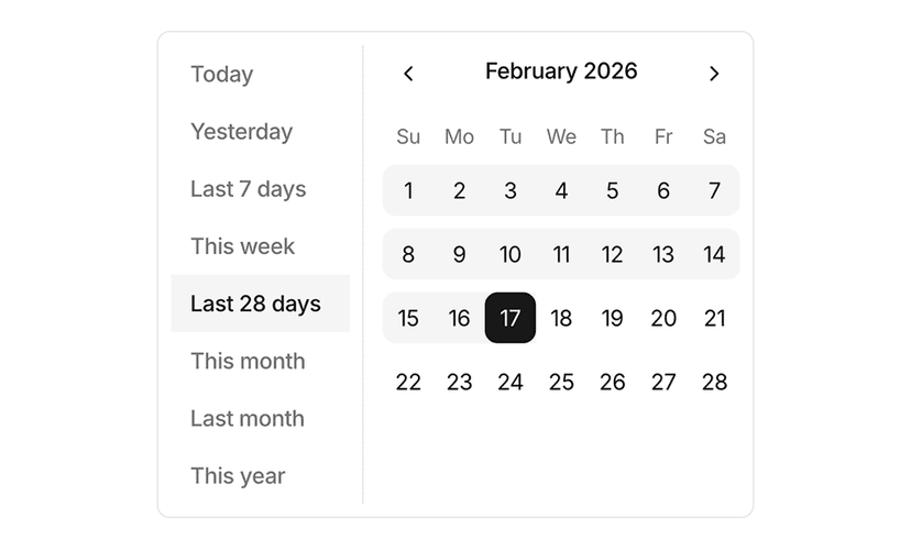
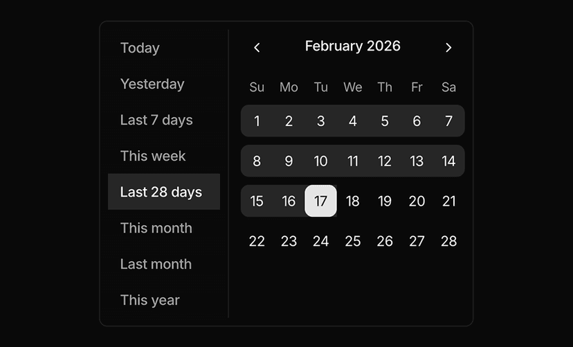
Shadcn Date Picker Examples for Forms and Filters
Date picker examples cover the most common use cases: single dates, date ranges, presets, time selection, booking flows and report filters. Each example combines the shadcn/ui calendar, popover and button components with Tailwind CSS and React.
What You Get With Date Picker Examples
- Single and range selection: Pick one date or a start and end date with clear visual states for selected, hovered and disabled days.
- Presets and shortcuts: Quick options like today, last 7 days or this month for analytics filters and reporting screens.
- Form integration: Examples wired to form fields with labels, validation states and keyboard navigation.
- Booking and scheduling: Patterns for check in and check out dates, appointment slots and blocked days.
- Accessible by default: Built on the shadcn/ui calendar, so focus management, ARIA attributes and keyboard support come for free.
Date Selection Without the Edge Cases
Date inputs are easy to get wrong: time zones, disabled ranges, mobile layouts and keyboard access all need attention. These examples show proven layouts so you can focus on your data instead of the picker.
See the calendar component for the underlying primitive and form examples for complete forms that include date fields.
Frequently Asked Questions
The examples use the shadcn/ui calendar component, which is built on React DayPicker and works with date-fns for formatting.
Yes. The calendar accepts disabled and matcher rules, so you can block past dates, weekends or specific ranges.
Yes. The popover based pickers adapt to small screens and the calendar supports touch interaction.