The shadcn/ui Figma Kit: A Complete Guide to Designing with shadcn Components
Everything about shadcn/ui and Figma: why there is no official file, what a good shadcn Figma kit needs, and a full tour of the Shadcn UI Kit Figma file with variables, components, themes and developer handoff.
If you build products with shadcn/ui, sooner or later someone on the team asks the same question: where is the Figma file? Designers want to mock up a new screen, product managers want to try an idea before anyone writes code, and developers want a design that uses the components they already have. Searching for "shadcn Figma" gives you a long list of kits, screenshots and community files, and it is hard to tell which ones actually match the code.
This guide explains how shadcn/ui and Figma fit together, what a good shadcn Figma kit should include, and how to check whether a kit will save you time or create more work. Then we walk through the Shadcn UI Kit for Figma in detail: what is inside, how its variables and components are built, how to change the theme and the icon library, and how to hand a design off to developers so the page in the browser looks exactly like the frame in Figma.
Is there an official shadcn/ui Figma file?
No. shadcn/ui is a code first project. It is not an npm package with a fixed design, it is a set of React components that you copy into your project with the shadcn CLI and own from that point on. The source of truth is the code: the component files in components/ui and the CSS variables in globals.css.
Because of that, there is no single official Figma library that mirrors every component. The shadcn/ui documentation points to community and commercial kits instead, and each of them takes a different approach. Some are a handful of components drawn by hand, some are large design systems, and some are built from a real codebase. Picking the right one matters, because a Figma file that does not match the code is worse than no file at all: designers create screens that developers cannot build with the components they have, and every handoff turns into a negotiation.
Why a shadcn Figma kit is harder than it looks
Drawing a button that looks like the shadcn/ui button is easy. Building a Figma file that stays in sync with shadcn/ui is not, for a few reasons:
- Theme tokens. shadcn/ui colors are CSS variables such as
--background,--primary,--muted-foregroundand--chart-1, each with a light and a dark value. A Figma kit has to use the same names and the same two modes, or developers have to translate every color by hand. - Tailwind CSS scale. Spacing, sizes, radius, font sizes and shadows come from Tailwind. If the kit uses its own spacing like 13px and 22px, nothing lines up with
p-3orgap-6in the code. - Variants and sizes. In code, a Button has a
variantand asizeprop, and states like hover, focus and disabled. A kit needs the same variants with the same names, otherwise "the secondary small button" means something different in each tool. - Responsive layouts. Tailwind layouts change at
sm,mdandlgbreakpoints. A desktop only mockup leaves developers to guess what happens on a phone. - Dark mode. Duplicating every frame for dark mode doubles the work and the frames drift apart. A good kit switches themes with variable modes.
- Keeping up with the code. shadcn/ui keeps evolving. New components, new variants and new defaults appear regularly, and a kit that is not maintained falls behind within months.
What to look for in a shadcn Figma kit
Before you commit to a kit, check these points. They are the difference between a nice looking file and a file your team can actually work with.
- Variables named after the shadcn tokens. Open the local variables panel. You should see
background,foreground,primary,card,border,ring, the chart colors and the sidebar colors, with a light and a dark value for each. - The Tailwind scale as variables. Spacing, sizes and radius should be variables that match Tailwind, so
16in Figma means4in a Tailwind class androunded-lghas a direct equivalent. - Components with real variants. Buttons, badges, inputs, tabs and the rest should expose variant, size and state in the properties panel, using the same names as the code.
- Auto layout everywhere. Frames should resize and reflow like flexbox and grid. If a card breaks when you type a longer title, the developer will hit the same problem later.
- Light and dark through modes. One frame, two modes. Changing the mode on a frame should update every nested component.
- Responsive variants. Look for desktop, tablet and mobile versions of screens and blocks, not only desktop.
- Full screens, not only components. Components are building materials. Dashboards, app screens and page sections show how the materials fit together and give you a starting point for real work.
- A codebase behind it. The strongest sign of a good kit is a matching codebase. If every frame has a page in code, design and development speak the same language.
Meet the Shadcn UI Kit for Figma
The Shadcn UI Kit Figma file was built the other way around from most kits. Instead of drawing screens first and coding them later, every dashboard, app and page was rebuilt in Figma from the Next.js source of the kit, with the same copy, the same data, the same components and the same breakpoints. Open a frame and its live demo side by side and you are looking at the same screen.
Here is what the file includes:
- 16 admin dashboards: e-commerce, sales, CRM, finance, crypto, hotel, hospital, HR, project management, academy, analytics, payment, file manager, real estate, AI analytics and the classic dashboard.
- 17 web apps: kanban, notes, chat, social media, workflow automation, mail, to-do, tasks, event calendar, file manager, API keys, POS and courses, plus 4 AI apps: two AI chat versions, an image generator and text to speech.
- 30 extra pages such as user lists, user profile, onboarding, authentication, notifications, settings and error pages.
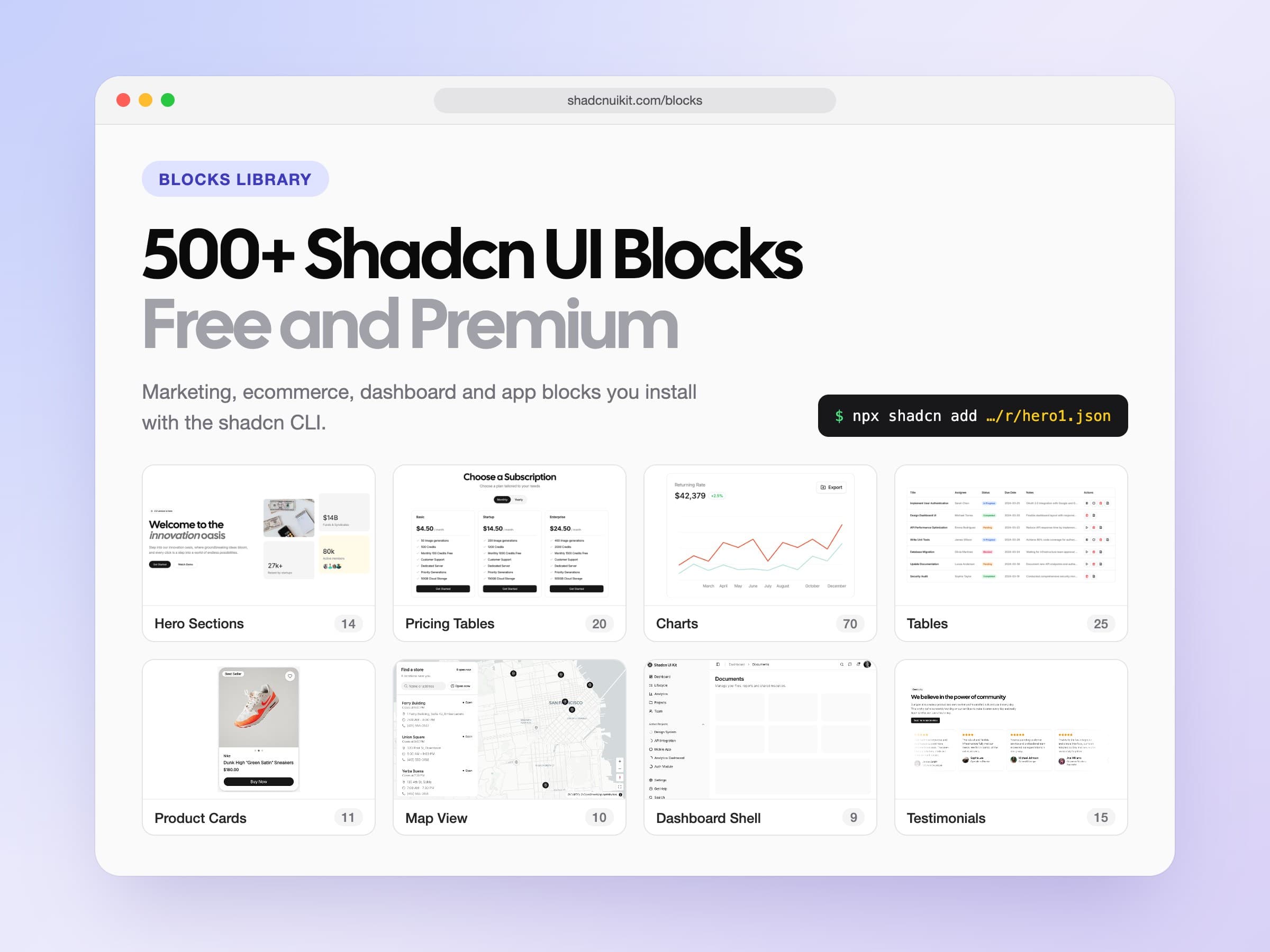
- 550+ blocks for marketing, ecommerce, application and dashboard UI, each with desktop, tablet and mobile variants and a dark preview.
- 60 core shadcn/ui components with every variant, size and state, plus hundreds of component and block variants.
- 6 chart types: area, bar, line, pie, radar and radial, built from shared grid, legend, tooltip and dot components.
- 5 icon libraries: Lucide, Tabler, HugeIcons, Phosphor and Remix Icon.
- Text and effect styles for the full type scale, shadows, inset shadows and blur.
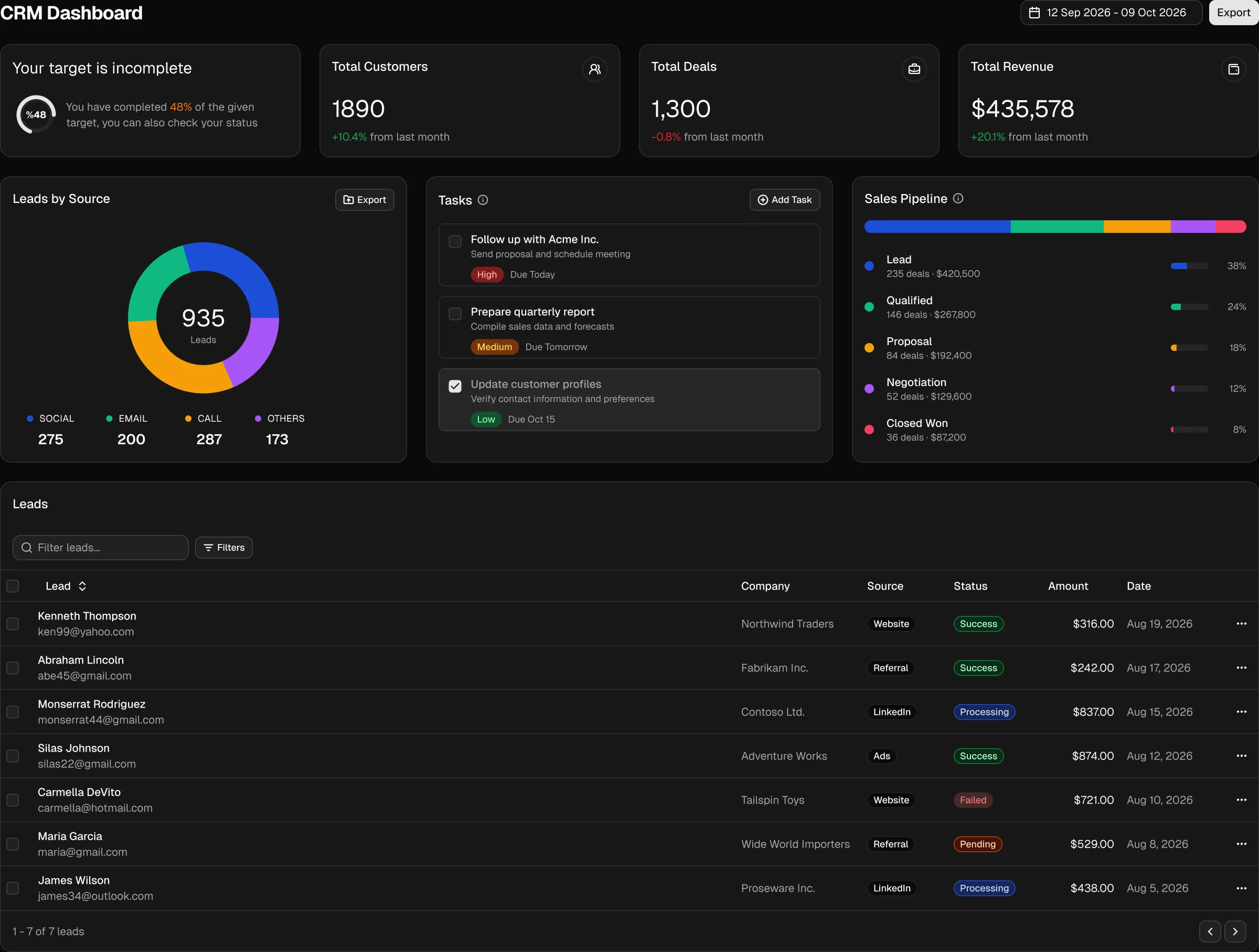
You can browse the file without buying anything. The Figma page has an embedded preview of the file and a gallery of screens with links to their live demos.
Variables that match your CSS
The heart of the file is its variables. They are split into five collections, and each one has a clear job:
- 1. TailwindCSS: the full Tailwind scale, nearly 500 variables for spacing, sizes, radius and the Tailwind color palette. When a frame uses 16 for padding, it is the same value as
p-4in code. - 2. Theme: the shadcn/ui theme. Colors use the same names as
globals.css, with a light and a dark variable for each one, such asprimary-lightandprimary-dark. Fonts, breakpoints, container widths and responsive text sizes live here too. - 3. Mode: the switch between light and dark. Components read their colors from this collection, which points to the light or dark theme variables depending on the mode you pick.
- 4. Custom: a small set of extra variables that sit outside the base shadcn/ui theme.
- 5. Icon Library: one on and off variable for each icon library.
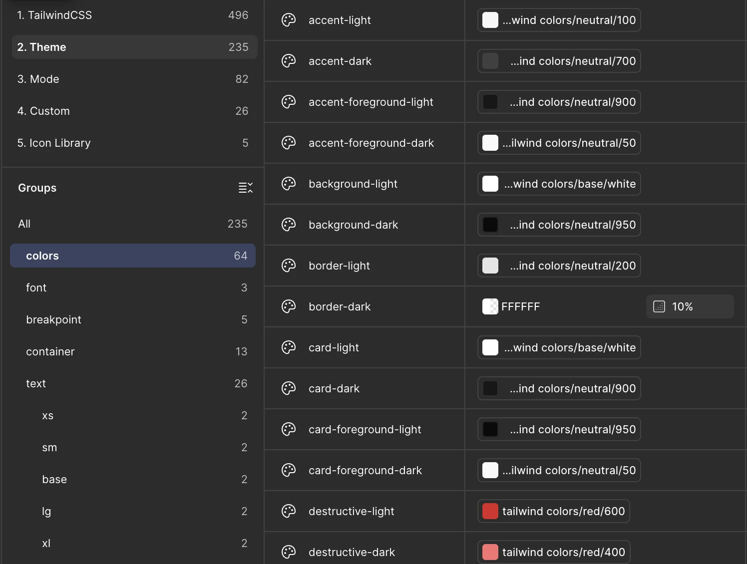
Because the names match, a developer never has to guess. If a card uses card for its fill and border for its stroke in Figma, the code uses bg-card and border-border. If the designer changes primary, the developer changes --primary in globals.css. There is no translation table to maintain.
Components with every variant, size and state
Components are built the way shadcn/ui ships them. A single Button component covers six variants (default, secondary, outline, ghost, destructive and link), eight sizes from xs to icon-lg, and six states: default, hover, focus, loading, disabled and pressed. You switch all of them from the properties panel, and icons, labels and keyboard shortcuts are exposed as component properties, so you rarely need to detach anything.
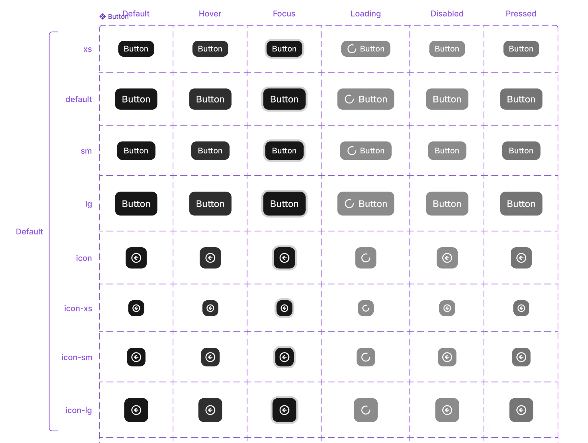
The same approach runs through the whole library: inputs with their focus and invalid states, selects, checkboxes, switches, tabs, tables, sidebars, dialogs, drawers, tooltips, charts and more. Newer components like chat bubbles, attachments and questionnaires are included too, because the AI apps in the kit use them.
Slots for your own content
Cards, dialogs and blocks come with slots: empty areas inside a component where you can drop any other component, block or element of your own. Select the slot, pick an instance from the picker and place it. The content takes the padding, spacing and theme of its parent, and you never have to detach the parent component.
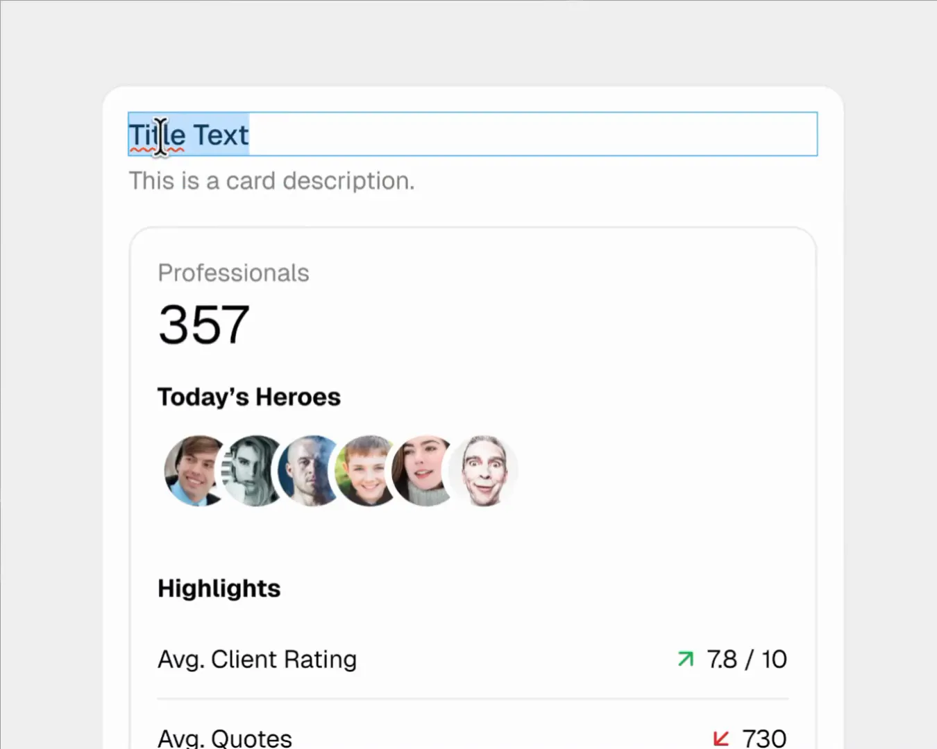
Slots are what make the file useful for new screens, not only for copying existing ones. You can build a settings page from a card, a form block and your own illustration without breaking a single component.
Light and dark mode from one switch
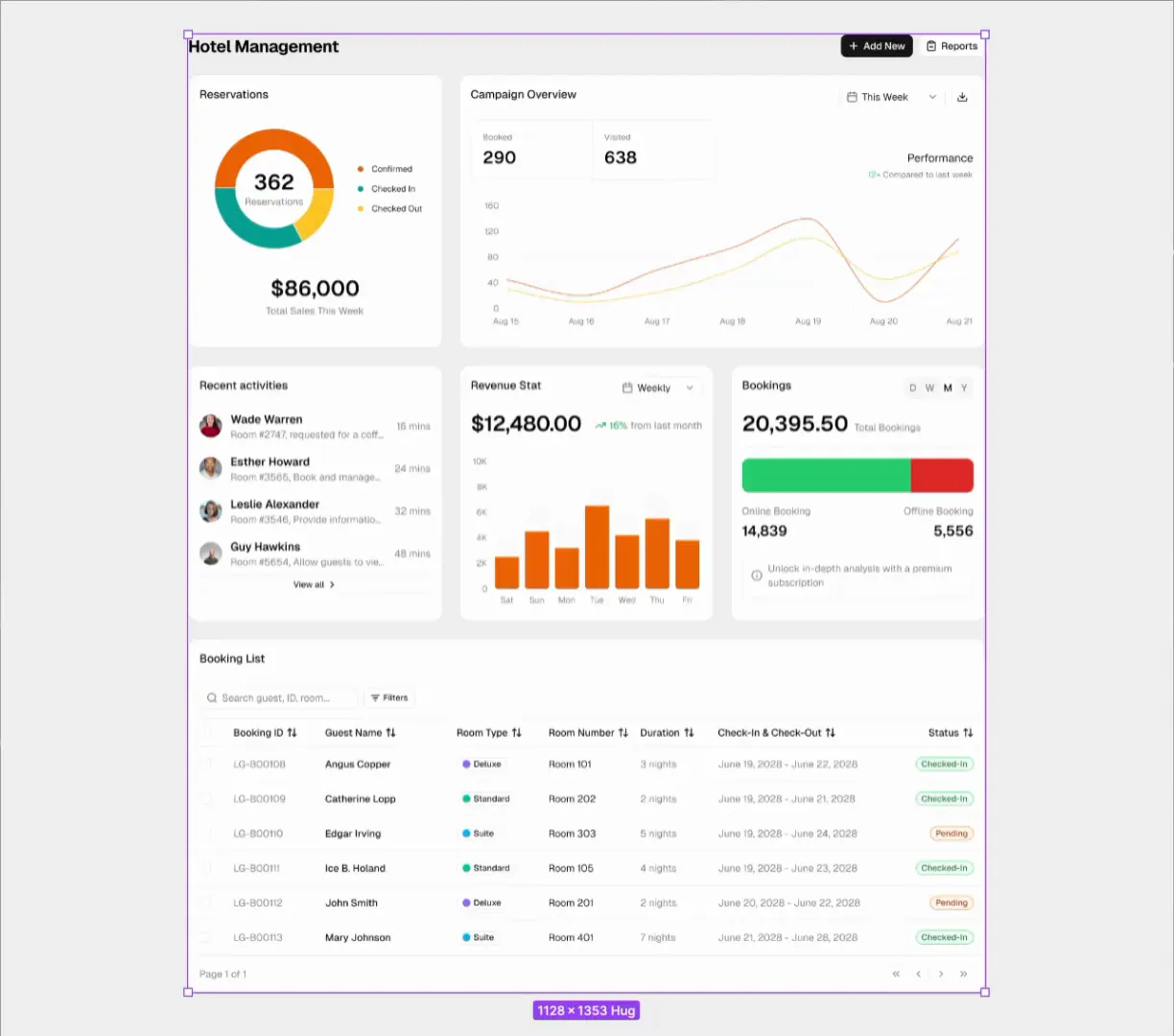
Every color is a variable with a light and a dark value. To switch a screen, select the frame and change the 3. Mode collection from Light to Dark in the right panel. Charts, badges, tables and every nested component follow the active mode. There are no duplicated dark frames, so there is nothing to keep in sync, and any theme colors you change carry over to both modes automatically.
Responsive from desktop to mobile
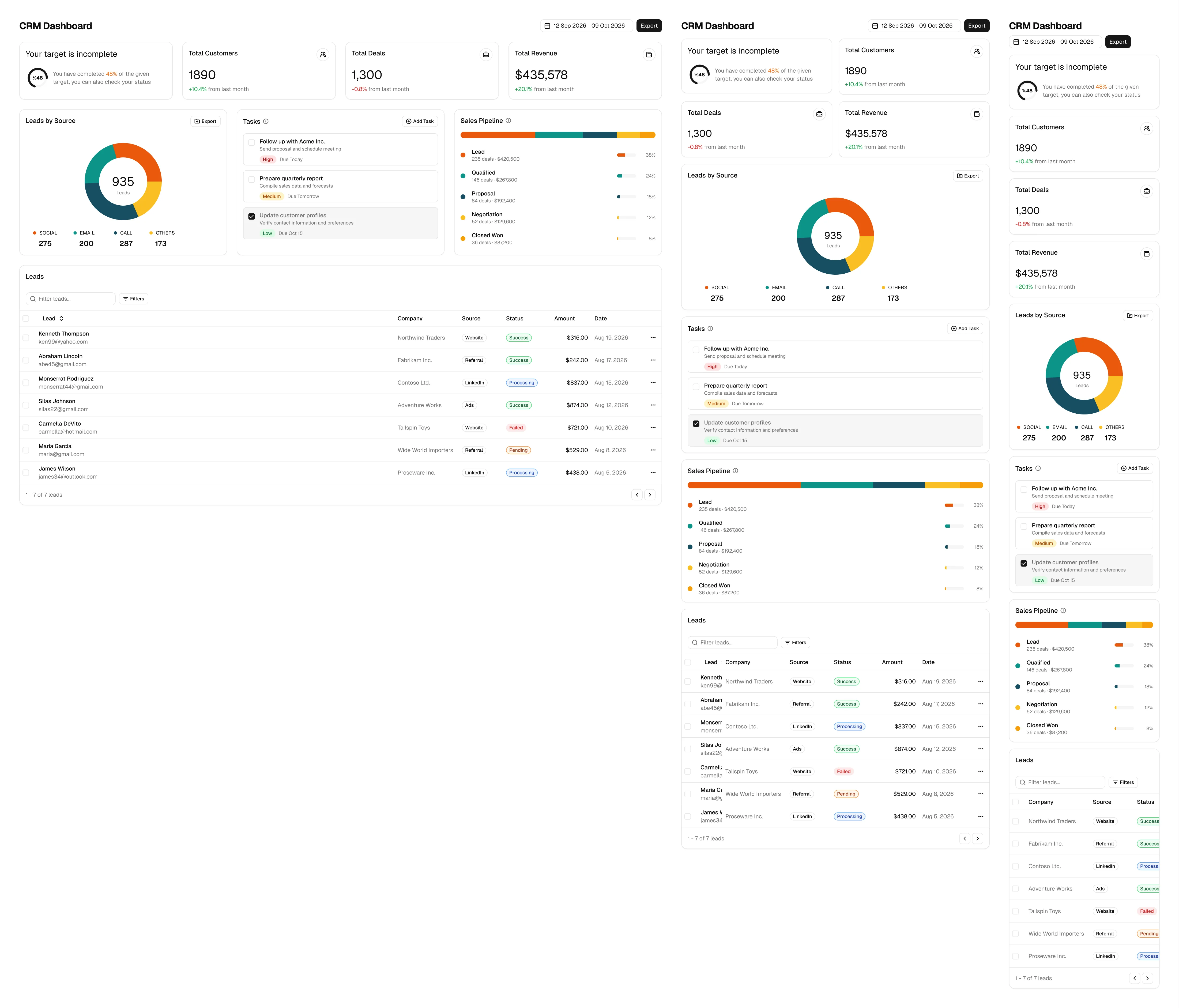
Screens and blocks come in desktop, tablet and mobile variants. The breakpoints follow the sm, md and lg classes in the code, so columns stack, sidebars collapse into drawers and tables hide columns at the same widths as the real app. Frames use auto layout, so you can also drag a frame to any width and preview the layout between breakpoints.
Charts, icons and styles
Charts are built from shared parts: one grid, one legend, one tooltip and one set of dots. Area, bar, line, pie, radar and radial charts all use them, so changing the tooltip style once updates every chart in the file. Chart colors come from the chart-1 to chart-5 theme variables, exactly like the Recharts components in the code.
Icons are components too. Lucide is the default, as in shadcn/ui, and Tabler, HugeIcons, Phosphor and Remix Icon are included. Text styles cover the full type scale with responsive heading sizes for desktop and mobile, and effect styles cover shadows, inset shadows and blur, named after the Tailwind utilities like shadow-sm and shadow-lg.
Getting started with the file
The Figma file is included in the Pro, Team and Enterprise plans. There is no separate purchase.
- Sign in and open your account.
- Find the Figma File card under Tools you have.
- Click Duplicate to Figma. Figma opens and saves a copy to your drafts.
- Move the copy to a project or team if you want to share it with others.
Your copy is yours to edit. When a new version is released, duplicate the file again from your account to get it.
The file opens on every Figma plan, but we recommend Figma Professional or higher. Variable modes, which power light and dark themes, and publishing the file as a team library are limited on the free Starter plan.
How to change the theme
Most teams want their own brand colors, radius and fonts. Because the Figma variables use the same names as globals.css, the theme only has to be changed in two places, and both places use the same values.
- In Figma, open the local variables and select the 2. Theme collection.
- Change the light and dark values of the colors you want, for example
primary-lightandprimary-dark. - Every component and screen updates in both modes.
- Apply the same values to the CSS variables in your project:
:root {
  --radius: 0.75rem;
  --primary: oklch(0.55 0.2 264);
  --primary-foreground: oklch(0.98 0 0);
}

.dark {
  --primary: oklch(0.68 0.16 264);
  --primary-foreground: oklch(0.15 0 0);
}
If you do not have a palette yet, the Theme Generator creates a full set of shadcn/ui colors for light and dark mode that you can paste into globals.css and copy into the Figma variables.
How to switch the icon library
Open the local variables and select the 5. Icon Library collection. It has one on and off variable for each library: Lucide Icons, Tabler Icons, HugeIcons, Phosphor Icons and Remix Icon. Turn on the library you want and turn off Lucide Icons. The icons in every component switch with it, so the whole file follows the library your code uses.
From Figma to code
A Figma file only pays off when the design turns into a page without a rebuild. This is where a kit built from the code makes the biggest difference.
The file follows the structure of the Tailwind classes in the code:
| In Figma | In code |
|---|---|
Fill background | bg-background |
Text color muted-foreground | text-muted-foreground |
Stroke border | border-border |
| Padding 16, gap 24 | p-4 gap-6 |
Radius lg | rounded-lg |
Text style text-sm | text-sm |
Effect shadow-sm | shadow-sm |
| Horizontal auto layout | flex |
| Mode Dark | .dark class |
A developer reads the token, spacing and component names straight from the design and writes the same classes. For anything larger than a single element, there is an even faster path: every block and component in the file has a matching item on shadcnuikit.com that installs with the shadcn CLI.
npx shadcn@latest add @shadcnuikit/pricing1
Dashboards and apps map to pages in the Next.js admin dashboard, so the developer starts from code that already looks like the design and only adds the changes from the new frame.
With AI coding tools
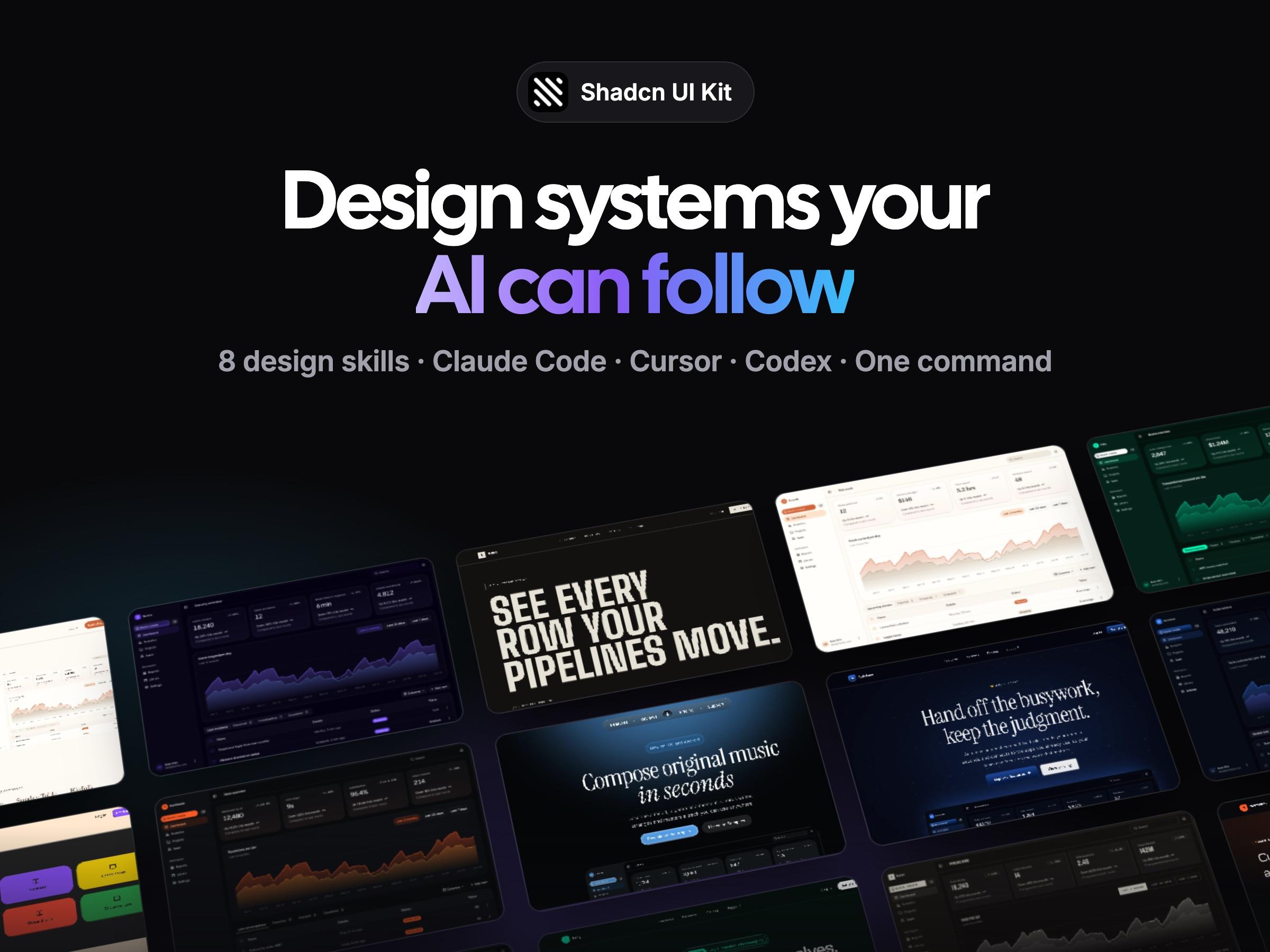
If your team builds with Claude Code, Cursor or Codex, the handoff gets shorter again. The MCP Server gives the AI assistant the full kit catalog, so it can find and install the same blocks and dashboards that the designer used in Figma. Design Skills give it the visual rules of a design system, so new screens match the look of the file. The designer picks blocks in Figma, the assistant installs the same blocks in code and styles them with the same tokens.
A workflow for teams
Here is a simple workflow that works well for product teams using shadcn/ui:
- Agree on the theme first. Set the brand colors, radius and fonts in the Theme collection and in
globals.csson the same day. From then on, both tools share one look. - Start from an existing screen. Find the closest dashboard, app or page in the file and duplicate it. It is almost always faster than starting from a blank frame.
- Swap content with slots and variants. Change component variants from the properties panel and fill slots with your own content instead of detaching components.
- Check every breakpoint. Look at the desktop, tablet and mobile variants before you hand off. Responsive decisions are much cheaper in Figma than in code review.
- Check dark mode. Switch the mode on your frame. If something looks off, it is usually a hardcoded color that should be a variable.
- Hand off with names, not measurements. Point developers to the block or component name and the tokens. They install the item and adjust it, instead of measuring pixels.
- Keep the file and the code in sync. When you change a token in one place, change it in the other in the same pull request or design review.
Common mistakes to avoid
- Detaching components. It feels faster in the moment, but a detached button no longer follows theme or variant changes. Use properties and slots instead.
- Using raw hex colors. A hex value in Figma becomes a hardcoded color in code that breaks in dark mode. Always pick a variable.
- Off-scale spacing. A gap of 18 has no Tailwind class. Stick to the spacing scale and handoff stays exact.
- Designing only for desktop. Tablet and mobile layouts are part of the design, not an afterthought for developers.
- Duplicating frames for dark mode. Use the mode switch. Duplicated frames go out of sync after the first edit.
- Letting the file fall behind. Duplicate the latest version when it is released, and copy over your own pages.
Frequently asked questions
Is there an official shadcn/ui Figma kit?
No. shadcn/ui is distributed as code that you copy into your project, and it does not ship an official Figma library. Designers use community or commercial kits. The Shadcn UI Kit Figma file is one of them, built from a Next.js codebase so the designs match real components.
Is the Shadcn UI Kit Figma file free?
The file is included in the Pro, Team and Enterprise plans, together with the admin dashboards, templates, blocks, components, MCP server and Design Skills. You can preview it for free on the Figma page.
Does the Figma file match the code?
Yes. Every dashboard, app and page was rebuilt from the Next.js source with the same copy, data, components and breakpoints. The variables use the shadcn/ui token names and the Tailwind scale, so a frame in Figma and the page in the browser give the same result.
Which Figma plan do I need?
The file opens on any plan, including the free Starter plan. We recommend Figma Professional or higher, because variable modes for light and dark themes and publishing the file as a team library are limited on Starter.
Does it support dark mode?
Yes. Every color is a variable with a light and a dark value. Switch the 3. Mode collection on a frame and every nested component follows.
Can I use my own brand colors and fonts?
Yes. Change the colors, radius and fonts in the 2. Theme collection and every component and screen updates in both modes. Use the same values in globals.css and your code matches the design.
Does it work with Tailwind CSS v4?
Yes. The file follows Tailwind CSS v4 and the current shadcn/ui theme structure, including the sidebar and chart tokens and the Tailwind spacing scale, and the code it was rebuilt from runs on Tailwind CSS v4.
Can I switch to another icon library?
Yes. Lucide is the default. Tabler, HugeIcons, Phosphor and Remix Icon are included, and you switch between them in the 5. Icon Library variable collection.
Are the blocks responsive in Figma?
Yes. Every block has desktop, tablet and mobile variants and a dark preview, and every dashboard and app has responsive versions that follow the sm, md and lg breakpoints in the code.
Can I use it for client projects?
Yes. You can use the file in personal and commercial projects, including client work. Pro is for one user, Team covers 10 users and Enterprise has no user limit. You cannot share or resell the file outside your license.
Will I get updates?
Yes. New dashboards, screens, blocks and components are added to the file as the code grows. The plans are a one time payment and future updates are included. Duplicate the file again from your account to get the latest version.
Can developers use the file without Figma experience?
Yes. Developers mostly need two things from it: the names of the blocks and components, and the tokens. Both match what they already use in code, so Dev Mode or a quick look at the layers panel is enough.
Start designing
The fastest way to see whether the file fits your team is to open the Figma page, explore the embedded file and compare a few frames with their live demos. If you already have a plan, duplicate the file from your account, set your theme in the Theme collection and globals.css, and design your next screen from a dashboard that already exists in code. For step by step instructions, see the Figma docs.