About Shadcn Dashboard Dropdowns Blocks
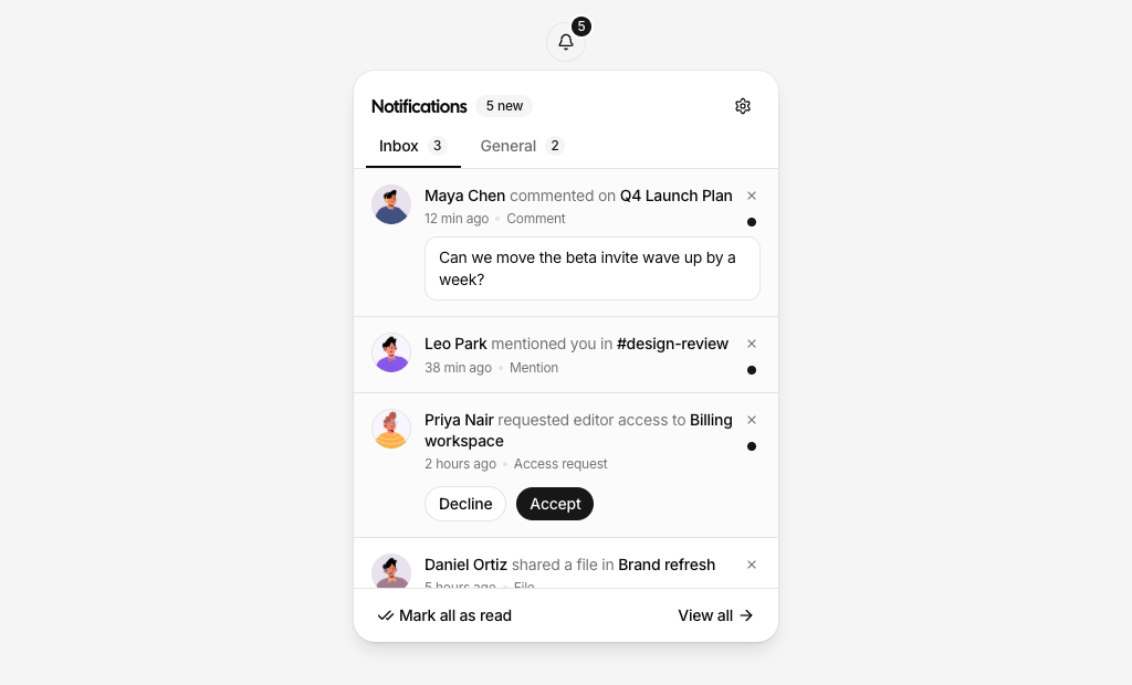
Dashboard dropdown blocks are shadcn blocks for the small menus and panels that live in an app top bar: the account menu behind the avatar, a notifications inbox, recent chats, a mini cart, saved items, a workspace switcher, a language picker, message actions, and a column picker for data tables. Built with React and TypeScript, they use shadcn/ui dropdown menu, popover, tabs, toggle group, checkbox, and avatar components styled with Tailwind CSS.
They suit SaaS dashboards, admin panels, ecommerce back offices, and team tools. Drop one next to the search field or user avatar in your Next.js or React layout and connect it to your own data: unread counts, cart totals, the active workspace, and the selected language all update as the user interacts, so the trigger always reflects the current state.
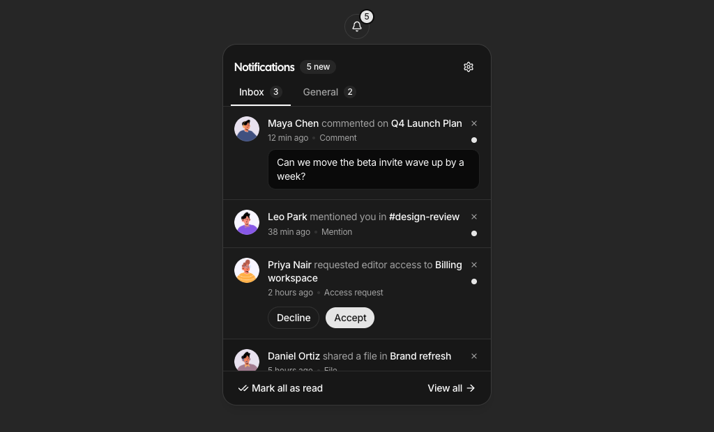
Every panel works with the keyboard, closes on outside click, and fits small screens without overflowing. Items, icons, shortcuts, and actions live in plain arrays in your code, and Tailwind controls width, spacing, and light and dark theme support, so you can add a menu item, swap a badge, or change the panel layout while keeping the same shadcn UI structure.