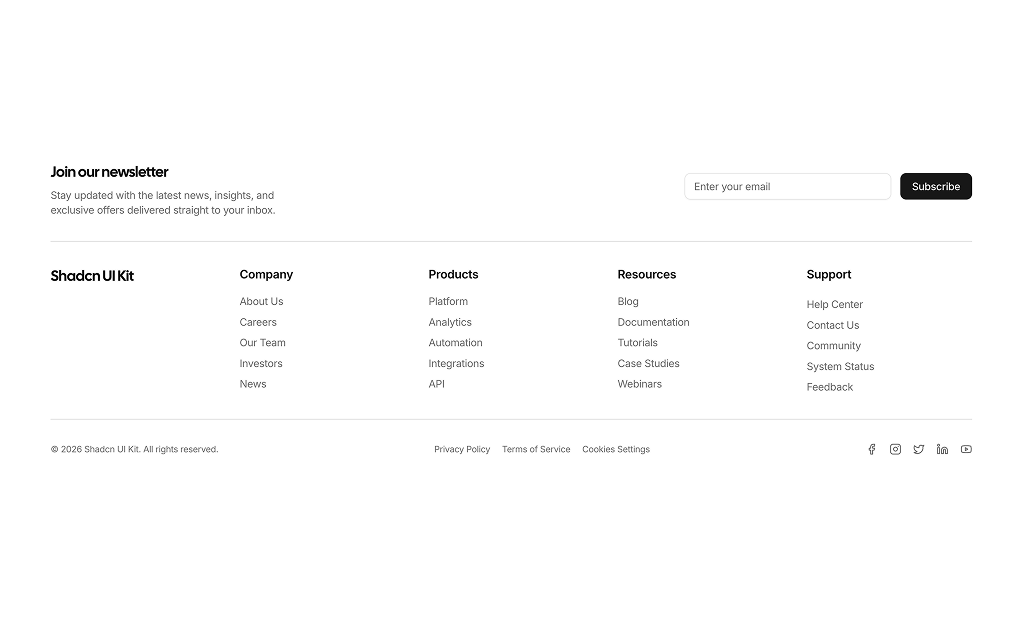
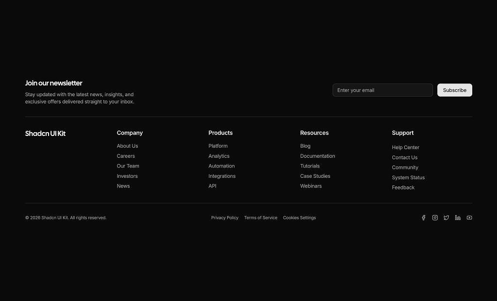
About Footers Blocks
Footer blocks are shadcn blocks that form the bottom of a page: links, contact info, social icons, and optional newsletter or legal text. Built with React and TypeScript, they use shadcn/ui components and Tailwind CSS for layout and styling. Each block is a complete footer layout you can drop into a Next.js or React app so you don’t have to build columns and spacing from scratch.
They are for marketing sites, SaaS pages, docs, and any multi-page app that needs a consistent bottom section. Use one footer block per layout; it can include multiple columns, link groups, and CTAs. They work with the rest of your shadcn UI and support light and dark themes.
All links, labels, and copy live in your code. Tailwind controls columns, gaps, and typography so you can align with your brand. You can add or remove sections, change the grid, or nest a newsletter block inside. The markup stays accessible and consistent with shadcn design principles.