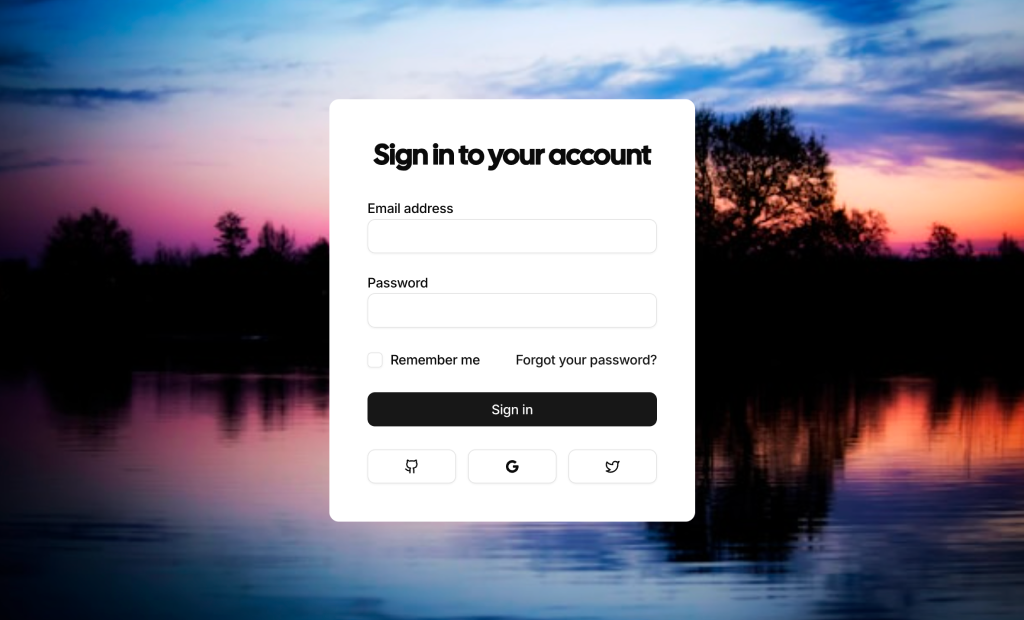
About Signin Forms Blocks
Sign-in form blocks are shadcn blocks for authentication: email and password fields, submit button, and optional links (forgot password, sign up). Built with React and TypeScript, they use shadcn/ui form and input components styled with Tailwind CSS. Each block gives you a consistent login layout so you can wire it to your auth provider without building the UI from scratch.
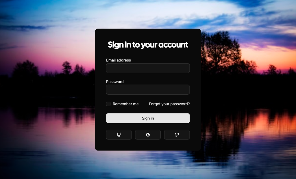
They fit login pages, modal auth flows, and gated sections in Next.js or React apps. Use them on dedicated sign-in routes or inside dialogs; they work with social login buttons and password recovery flows. They support light and dark themes and align with the rest of your shadcn UI and design system.
Labels, placeholders, and link text are editable in code. Tailwind controls layout, spacing, and input style. You can add “remember me,” captcha, or social providers; the form structure and accessibility stay consistent so you keep full control over styling and behavior.