Eclipse design skill for AI agents
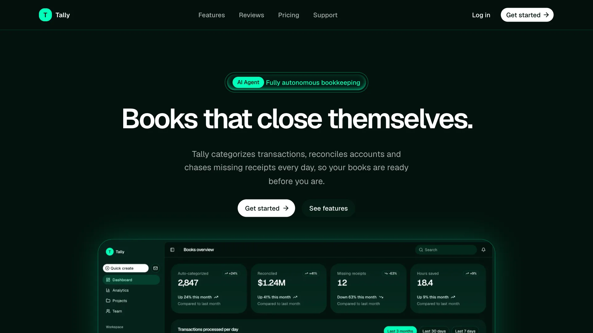
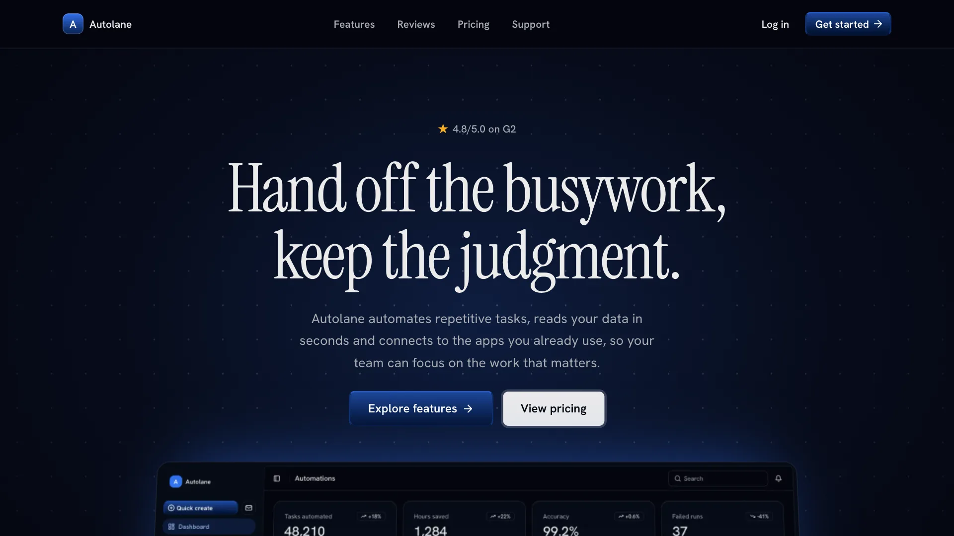
Eclipse gives your AI assistant a deep violet, technical direction for AI products, agent platforms and automation agencies. Pages sit on an almost black purple canvas, buttons look like lit glass and a glowing eclipse sits behind the hero.
Its signature is restraint: one violet brand color, hairline grids instead of heavy cards, gradient eyebrow labels and large medium-weight headlines. Use it when the product should feel precise and premium without loud colors.
Visual language
- Color
- Near black violet background, white with a lilac tint for text and lilac at 70 percent for body copy. Violet is the only brand color: button gradients, glows, the featured card and charts. Borders are white at 8 percent.
- Shape
- Buttons and inputs use an 8px radius, cards about 22px, labels and the navigation pill are full pills. Feature lists use a hairline grid: cells separated by 1px lines inside a 20px rounded frame.
- Typography
- Plus Jakarta Sans medium with tight tracking for headlines, 72px in the hero and 48px for section titles. Inter for body text at 16 to 18px. Eyebrow labels are 13px with a pink to violet to blue gradient fill.
- Depth
- Glass, not shadows: primary buttons have a violet gradient, a soft inner light, a 1px top highlight and a faint outer glow. Cards are 2 percent white with an inner glow. One eclipse glow sits behind the hero.
- Layout
- Full-width navigation bar with the links in a centered pill. Centered section headers, generous spacing and no divider lines between sections. The footer ends with the brand name in huge violet gradient type.
Component classes
Shadcn UI Kit components ship with large radii and soft shadows. The skill tells your assistant to pass these classes so every component matches Eclipse.
| Component | className |
|---|---|
| heading | font-medium tracking-tight |
| button | rounded-lg dark:data-[variant=default]:bg-transparent dark:data-[variant=default]:bg-linear-to-b dark:data-[variant=default]:from-primary/15 dark:data-[variant=default]:to-primary/45 dark:data-[variant=default]:text-foreground dark:data-[variant=default]:shadow-[inset_0_0_12px_rgb(194_178_255/0.28),inset_0_1px_0_rgb(255_255_255/0.14),0_0_20px_rgb(124_92_255/0.16)] dark:data-[variant=default]:hover:to-primary/60 data-[variant=outline]:border-transparent data-[variant=outline]:bg-linear-to-b data-[variant=outline]:from-transparent data-[variant=outline]:to-foreground/5 data-[variant=outline]:shadow-[inset_0_0_12px_rgb(255_255_255/0.06),inset_0_1px_0_rgb(255_255_255/0.06)] data-[variant=secondary]:bg-linear-to-b data-[variant=secondary]:from-transparent data-[variant=secondary]:to-foreground/5 data-[variant=secondary]:shadow-[inset_0_0_12px_rgb(255_255_255/0.06),inset_0_1px_0_rgb(255_255_255/0.06)] data-[variant=outline]:ring-1 data-[variant=outline]:ring-foreground/10 data-[variant=secondary]:ring-1 data-[variant=secondary]:ring-foreground/10 |
| card | bg-foreground/[0.02] rounded-4xl shadow-[inset_0_0_12px_rgb(255_255_255/0.04)] ring-foreground/8 dark:ring-foreground/8 |
| input | rounded-lg |
| badge | rounded-full |
| tabs | rounded-full |
| menu | rounded-xl |
Do
- Default to the dark theme and keep violet as the only accent.
- Use glass gradients and inner light instead of drop shadows.
- Use hairline grids for lists of features or services.
- Start from Shadcn UI Kit blocks and restyle them with these tokens.
Don't
- Do not use bright solid backgrounds or more than one glow per screen.
- Do not use pill shaped buttons. Buttons use an 8px radius.
- Do not hardcode hex colors. Use the theme tokens.
- Do not edit files in components/ui.
Blocks it builds with
The skill points your assistant to these Shadcn UI Kit blocks first. It installs them with the shadcn CLI or the MCP server and restyles them to match.
- Top navigation
navbar1 - AI hero
hero4 - Feature grid
feature3 - Steps
how-it-works1 - Results
stats1 - Pricing
pricing3 - Testimonials
testimonial1 - FAQ
faq1