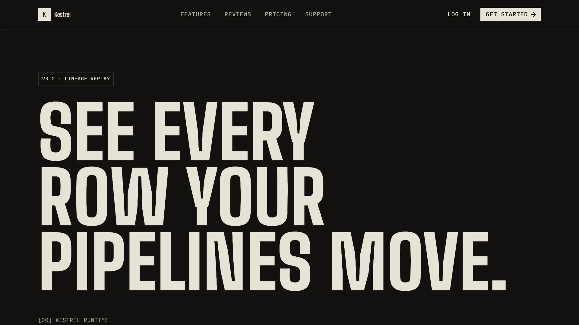
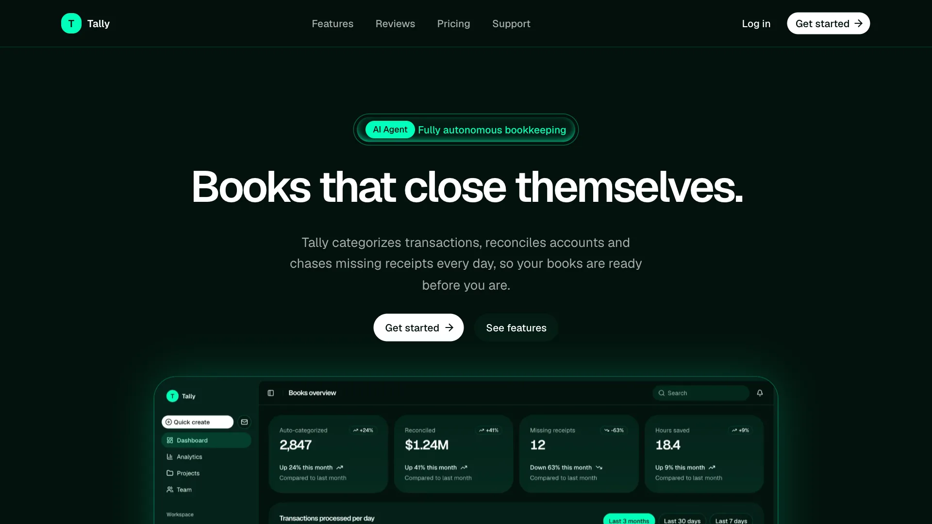
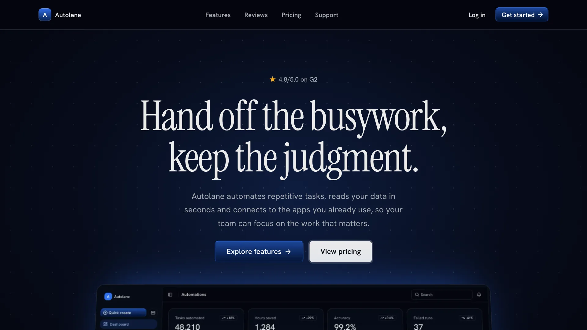
Crayon design skill for AI agents
Crayon gives your AI assistant a playful storybook direction for creative, family and education products. Pages sit on a warm cream canvas, every object is drawn with a crisp ink outline and corners are big and friendly, so cards feel like panels in a picture book and buttons feel like stickers.
Saturated purple, yellow and red appear as full width bands and color blocks, never as small accents everywhere. Surfaces stay flat, type is bold and large, and the copy stays short and specific, so the interface feels joyful without becoming noisy.
Visual language
- Color
- Warm cream background, off white panels and near black ink for text and outlines. Purple is the primary action color, yellow marks badges and highlights, red is used for one loud band and errors, green only for success. Whole sections switch to a purple, yellow, red or ink band.
- Shape
- Every object has a 1px ink outline. Buttons, inputs and tabs use 14px corners, cards and panels 28px, badges 8px. Pastel tiles are the panel color mixed with purple, yellow or red.
- Typography
- Archivo in two weights: bold for headlines, buttons, labels and card titles, regular for body text. Section titles are 64px with -2 percent tracking and tight leading, body text is 16px with relaxed leading.
- Depth
- Completely flat. No shadows, blur or gradients. Separation comes from ink outlines, color bands and spacing. Buttons lift 2px on hover instead of casting a shadow.
- Layout
- Full width bands of 80px vertical padding, each in its own color. A two row header with an ink rule, a dark hero with four colored story tiles, card grids with mixed pastel fills and a cream footer with sticker buttons.
Component classes
Shadcn UI Kit components ship with large radii and soft shadows. The skill tells your assistant to pass these classes so every component matches Crayon.
| Component | className |
|---|---|
| heading | font-bold tracking-[-0.02em] |
| button | rounded-[0.875rem] font-bold shadow-none transition-[translate,background-color,color] hover:-translate-y-0.5 active:not-aria-[haspopup]:translate-y-0 data-[size=lg]:h-12 data-[size=lg]:px-6 data-[size=lg]:text-base data-[variant=default]:border data-[variant=default]:border-border data-[variant=default]:hover:bg-primary/90 data-[variant=secondary]:border data-[variant=secondary]:border-border data-[variant=outline]:border data-[variant=outline]:border-border data-[variant=outline]:bg-secondary dark:data-[variant=outline]:bg-secondary data-[variant=outline]:hover:bg-accent data-[variant=outline]:hover:text-accent-foreground dark:data-[variant=outline]:hover:bg-accent data-[variant=destructive]:border data-[variant=destructive]:border-border data-[variant=destructive]:bg-destructive data-[variant=destructive]:text-primary-foreground |
| card | bg-card rounded-[1.75rem] shadow-none ring-1 ring-border dark:ring-border |
| input | rounded-[0.875rem] border border-border bg-card dark:bg-card |
| badge | rounded-lg border border-border font-bold |
| tabs | rounded-xl font-bold data-active:bg-primary data-active:text-primary-foreground dark:data-active:bg-primary dark:data-active:text-primary-foreground dark:data-active:border-transparent |
| menu | rounded-3xl border border-border shadow-none ring-0 |
Do
- Keep the cream canvas and the 1px ink outline on every object.
- Use one saturated color per band and keep text on it high contrast.
- Write short, friendly and specific labels.
- Start from Shadcn UI Kit blocks and restyle them with these tokens.
Don't
- Do not add drop shadows, glass effects or gradients.
- Do not use thin gray borders or sharp corners.
- Do not hardcode hex colors. Use the theme tokens.
- Do not edit files in components/ui.
Blocks it builds with
The skill points your assistant to these Shadcn UI Kit blocks first. It installs them with the shadcn CLI or the MCP server and restyles them to match.
- Two row header
navbar1 - Hero with color tiles
hero1 - Feature grid
feature3 - Proof band
stats1 - Case studies
testimonial1 - Pricing
pricing3 - Color band call to action
cta1 - Footer
footer1