About Shadcn UI Empty State Blocks
An empty state is what a screen shows before there is any data, when a search returns nothing, or when something blocks the content, such as a missing permission or a lost connection. Instead of a blank area, it tells people what belongs there and what to do next. These 22 shadcn empty state blocks cover first run screens, no results views, access and offline errors, setup prompts and illustrated feature cards.
Like the rest of our shadcn blocks, they are built with React, TypeScript and Tailwind CSS on top of shadcn ui components, mainly the Empty component together with Button, Card, Skeleton, Avatar, Tabs and InputGroup. Illustrations are drawn with Tailwind classes and lucide-react icons instead of image files, so they follow your theme tokens in light and dark mode and sit naturally next to other shadcn components in your dashboard.
Key Elements of an Empty State
- Clear title: names the situation in a few words, such as “No projects yet” or “You are offline”.
- Helpful description: one or two sentences on why the area is empty and what will appear once the user acts.
- Visual cue: an icon, avatar stack or small illustration that makes the state recognizable at a glance.
- Primary action: the one step that fills the screen, like Create project, Add domain or Try again.
- Recovery path: a Clear search, Clear filters or Go back button when the emptiness comes from the user’s own query or access level.
Where and Why to Use Empty State Blocks
Every list, table and widget in an app has a moment where it has no data. If that moment is a blank box, users assume something is broken. A well designed empty state keeps them oriented, explains the feature and moves them toward the action that makes the product useful. Because these blocks are standard shadcn components styled with Tailwind CSS, you can drop them into cards, tables and pages without fighting the rest of your shadcn ui layout.
- First run and onboarding: invite new users to create their first project, agent or domain.
- Search and filters: explain that nothing matched and offer a quick way to reset the query.
- Dashboard widgets: fill a chart or report card that has no data yet with a message and a call to action.
- Permissions and errors: show access denied or offline screens that tell users how to recover.
- Background jobs: keep users informed while an import or sync is still running.
- Feature promotion: use an illustrated card to describe a feature before the user has turned it on.
Empty State Blocks in This Collection
First run and no data
- Empty State 1: Use it for a chart card that has no data yet, keeping the card title visible so the layout of the dashboard does not jump.
- Empty State 6: A neutral fallback for any list or data view, with a learn more link next to the add action.
- Empty State 9: Fits places where the user cannot act yet, because it shows only an illustration and a message about when reports will arrive.
- Empty State 10: Suits products where the user builds a set of items, since the skeleton cards preview what the filled page will look like.
- Empty State 12: Good for settings pages such as custom domains, where a tutorial link helps users who have never done the setup before.
- Empty State 13: Works for approval queues like waitlists or requests, previewing the approve and decline rows that will appear later.
- Empty State 15: The simplest workspace starter, for apps where users either create something new or import it from another tool.
- Empty State 16: Choose it when you offer templates, because each template row is a link that skips the blank page entirely.
- Empty State 22: A landing view for analytics tools that offer several starting points, each explained in its own card.
No results
- Empty State 2: Use it in a team or people search, where an invite link turns a failed lookup into a new member.
- Empty State 3: Built for file managers, with a message that changes between “no results” and “nothing here yet” depending on the search field.
- Empty State 5: Keeps the toolbar and column headers of an orders table in place, so users still see what they were filtering.
- Empty State 11: A document search result screen that names the query and offers to clear the active filters.
- Empty State 14: Fits command palettes and integration pickers, with keyboard shortcut hints for the follow up actions.
Access, errors and progress
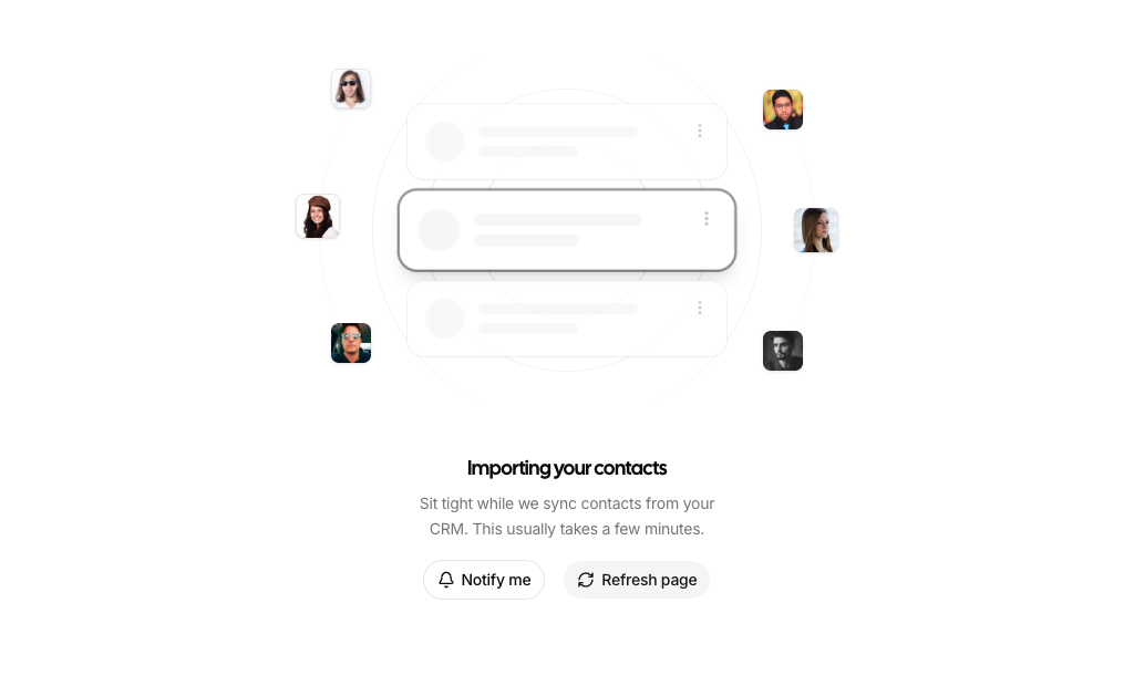
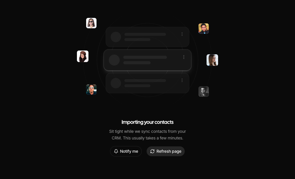
- Empty State 4: Shows that work is in progress during an import or sync, and lets the user ask for a notification instead of waiting.
- Empty State 7: A permission screen where users can request access without leaving the page.
- Empty State 8: Use it when an account needs verification or setup before a feature unlocks, with the remaining steps listed below.
- Empty State 17: An admin only page guard that hints at the hidden content behind a blurred preview.
- Empty State 18: A connection error screen with a retry button that shows progress while it reconnects.
Feature cards
- Empty State 19: Explains an automated workflow in one picture, useful before a user schedules their first job.
- Empty State 20: Presents an integrations hub before any app is connected.
- Empty State 21: A growth or upgrade card that uses a faded chart to hint at the results a feature can bring.
Similar Block Categories
- Tables: most data tables need a no rows state, and several table blocks already render one inside the table body.
- Onboarding Screens: guide new users through setup before they reach an empty dashboard.
- Stat Cards: pair a card level empty state with KPI cards that have no data yet.
- Modal Dialogs: open a create dialog from the primary action of an empty state.
- Page Layouts: place an empty state inside a full page with header and navigation.
Accessibility
The blocks rely on real buttons and visible text, so every action is reachable with the keyboard and has a readable label. Avatars in Empty State 2 carry the person’s name as alt text, decorative avatars in Empty State 4 use an empty alt, the search field in Empty State 14 has an aria-label, and the retry button in Empty State 18 is disabled while its Spinner, which has role=“status”, is shown. Empty State 7 also disables its button after a request so it cannot be sent twice.
A few improvements are worth considering. EmptyTitle renders a div, so you may want to render the title as a heading that fits your page outline. The search input in Empty State 3 relies on its placeholder and would benefit from an aria-label. The app icons in Empty State 20 put aria-label on plain divs, where a visually hidden text label is more reliable. For the ping animation in Empty State 19 and the cursor pulse in Empty State 22, consider the motion-safe variant so users who prefer reduced motion see a still version.
Empty State FAQ
toast from sonner and render the shadcn Toaster component. Empty State 21 draws its bar chart with recharts through the shadcn ChartContainer. Empty State 16 uses next/link for its template rows. Everything else needs only shadcn ui components and lucide-react icons.onClick that opens your create dialog, or use the Button with asChild around a Link. Empty State 16 already uses Link with a placeholder href for its template rows and Create blank project button, so you only replace the href.