About Shadcn UI Newsletter Sections Blocks
A newsletter section asks visitors for their email address in exchange for regular updates, tips or offers. These eight shadcn newsletter blocks cover the layouts you need most: a centered card, a benefits list with a labelled form, an inline row, a community layout with avatars, image backgrounds and a split photo layout.
Like the rest of our shadcn blocks, every section is built with React, TypeScript and Tailwind CSS on top of shadcn ui components such as Input, Button, Card, Badge, Avatar and InputGroup. They have no extra dependencies, follow your light and dark theme and are ready to connect to any email service, which makes them some of the simplest shadcn components to ship.
Key Elements of a Newsletter Section
- A specific promise: a headline that says what subscribers get and how often, such as weekly tips.
- One email field: ask only for the address, with a label or an aria-label so the field is named.
- A single subscribe button: one clear action placed right next to or below the field.
- A trust note: a short line about privacy or easy unsubscribing to lower hesitation.
- Social proof: a reader count or member avatars when you have an audience to show.
Where and Why to Use Newsletter Blocks
Few visitors are ready to buy on their first visit, but many will leave an email address if the value is clear. A newsletter block captures that interest and gives you a direct channel for launches, content and promotions. Because these are plain shadcn ui components styled with Tailwind CSS, you can place the same sign-up on a blog, a landing page and a footer area and it will look consistent everywhere.
- Blogs and content sites: place a sign-up at the end of each article, when readers are most engaged.
- Product launches: collect early access emails on a coming soon or waitlist page.
- SaaS landing pages: add a low commitment option for visitors who are not ready for a trial.
- Online stores: offer discounts or new arrival alerts in exchange for an email address.
- Creators and communities: grow a mailing list for tutorials, photography tips or weekly stories.
Newsletter Blocks in This Collection
- Newsletter 1: A free, centered starting point for a dedicated subscribe page or the end of a long landing page, with the form framed in a card.
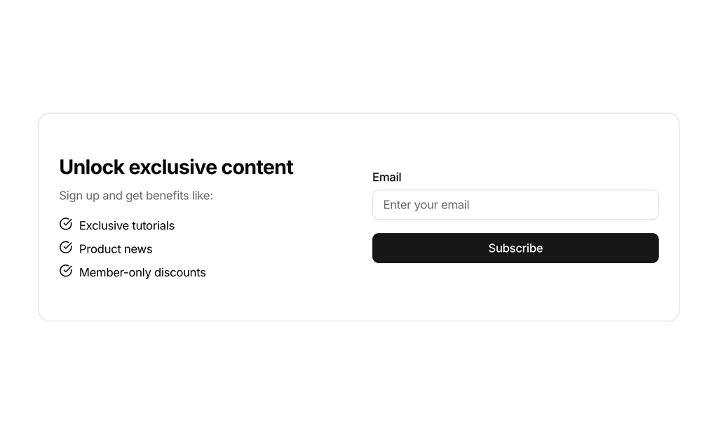
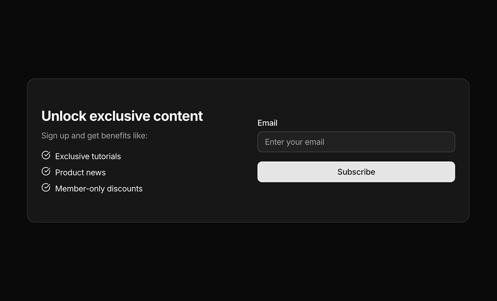
- Newsletter 2: Pick it when you need to sell the newsletter, since the benefit list sits beside a properly labelled form with a privacy note.
- Newsletter 3: A free, slim row that sits naturally above a footer or under a blog post without taking much height.
- Newsletter 4: Suits community driven newsletters, where faces of members around the form signal that many people already read it.
- Newsletter 5: A bold, photo backed banner for brands that want the sign-up to feel like a feature rather than a form.
- Newsletter 6: Works for niche or visual newsletters, with an image that shows the topic and a short list of what readers will get.
- Newsletter 7: A full width split layout for subscribe pages where a large photo and a privacy statement carry the message.
- Newsletter 8: Fits lifestyle and editorial brands, with one sentence of copy and a single input over a scenic background.
Similar Block Categories
- Footers: several footers include their own sign-up field if you want the newsletter inside the footer.
- Call to Action: use a CTA block when the goal is a trial or demo instead of an email.
- Contact Us: offer a full contact form when visitors need more than a subscription.
- Testimonials: show what readers say about the newsletter near the sign-up.
Accessibility
Newsletter 2 is the reference for a fully labelled form: the email field has a visible FieldLabel linked by htmlFor, a FieldDescription, autoComplete set to email and the required attribute, all inside a real form with a submit button. Newsletter 8 also uses a form and names its field with an aria-label of “Email address”.
The other blocks rely on placeholder text only. Placeholders disappear while typing and are not a reliable label, so consider adding a visible or screen reader only label and wrapping the field in a form so the Enter key submits it. On the image backgrounds of Newsletter 5 and Newsletter 8, check the contrast of the text against your own photo.
Newsletter Sections FAQ
npx shadcn@latest add @shadcnuikit/newsletter1 and npx shadcn@latest add @shadcnuikit/newsletter3. The other six blocks are part of All Access.action or an onSubmit handler that posts the address to Mailchimp, ConvertKit, Resend or your own API route. The other blocks render the Input and Button without a form, so wrap them in a form element first.benefits array next to the form, and Newsletter 6 shows three short topics with check marks from a features array under the button. Edit those arrays to describe your own content.backgroundImage style on the section. Replace the URL with your own file. Newsletter 5 also sets backgroundPosition to “center 30%”, which you can adjust to keep the subject of your image visible.