About Line Charts Examples
Line charts are foundational visualization components for displaying trends over time, making them a natural fit for analytics dashboards, growth reports, and monitoring tools. They excel at showing how values evolve across days, weeks, or releases, helping teams spot patterns, seasonality, and anomalies at a glance. When embedded inside shadcn ui layouts and styled with tailwindcss utilities, LineCharts integrate cleanly with surrounding stat cards, filters, and tables in a next.js application.
Under the hood, a LineCharts component is often a typed react wrapper around a charting library that renders the actual SVG or canvas while the shell handles data plumbing and controls. TypeScript interfaces define series, labels, and configuration options such as stacked vs. grouped lines, smoothing, and color palettes, which makes it easier to share presets across product areas. Shadcn ui components like cards, tabs, and dropdown menus provide the building blocks for switching time ranges, grouping dimensions, or comparison baselines without rewriting layout logic. Tailwindcss then refines responsive behavior so charts remain legible across different breakpoints.
In a next.js architecture, LineCharts typically appear in client components because of their interactive nature, but the surrounding description, headings, and contextual content can still be server‑rendered for SEO. This means documentation pages and marketing demos can use the same LineCharts component to illustrate capabilities while keeping the HTML crawlable. By standardizing this pattern as a reusable react and typescript module that composes shadcn ui components, teams gain a reliable way to communicate time‑based trends across the product.
Which Line Chart Example Should You Pick?
The four charts cover the most common time series layouts in dashboards.
- Single series with filters: Line Chart 1 plots one series by day and lets users switch between five time ranges. It fits price, rate and traffic widgets.
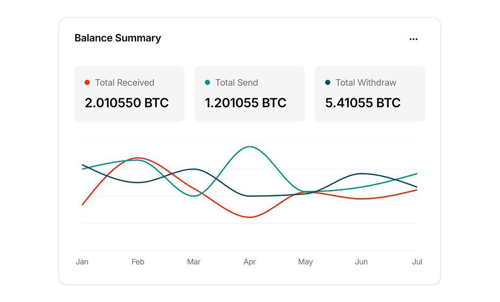
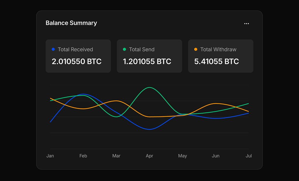
- Multiple series: Line Chart 2 draws three lines with a value legend above the chart, for finance and wallet dashboards.
- Comparison with a baseline: Line Chart 3 shows today against the average in a minimal chart without axes, for fitness and personal stats.
- Stacked area: Line Chart 4 fills two stacked series with gradients and adds a date picker and change badge in the header.