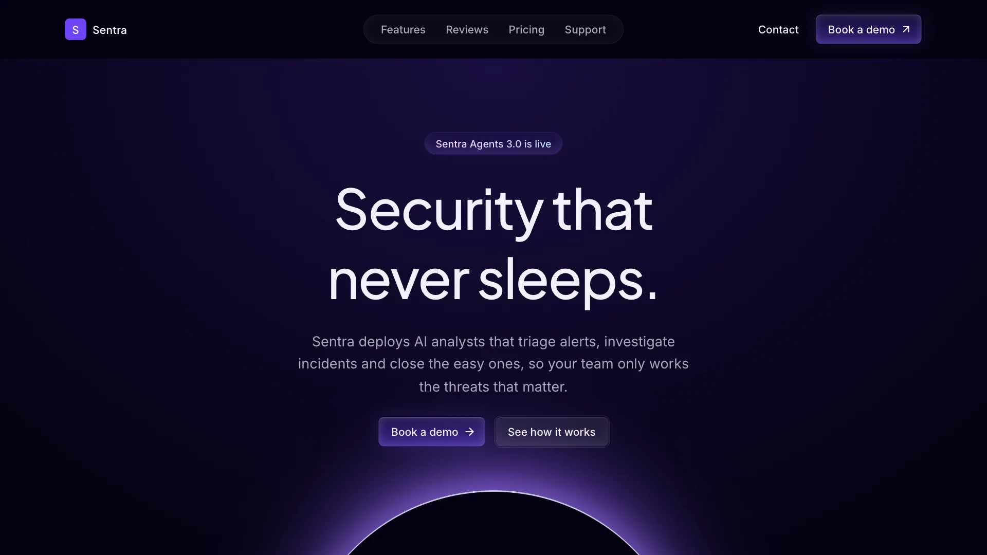
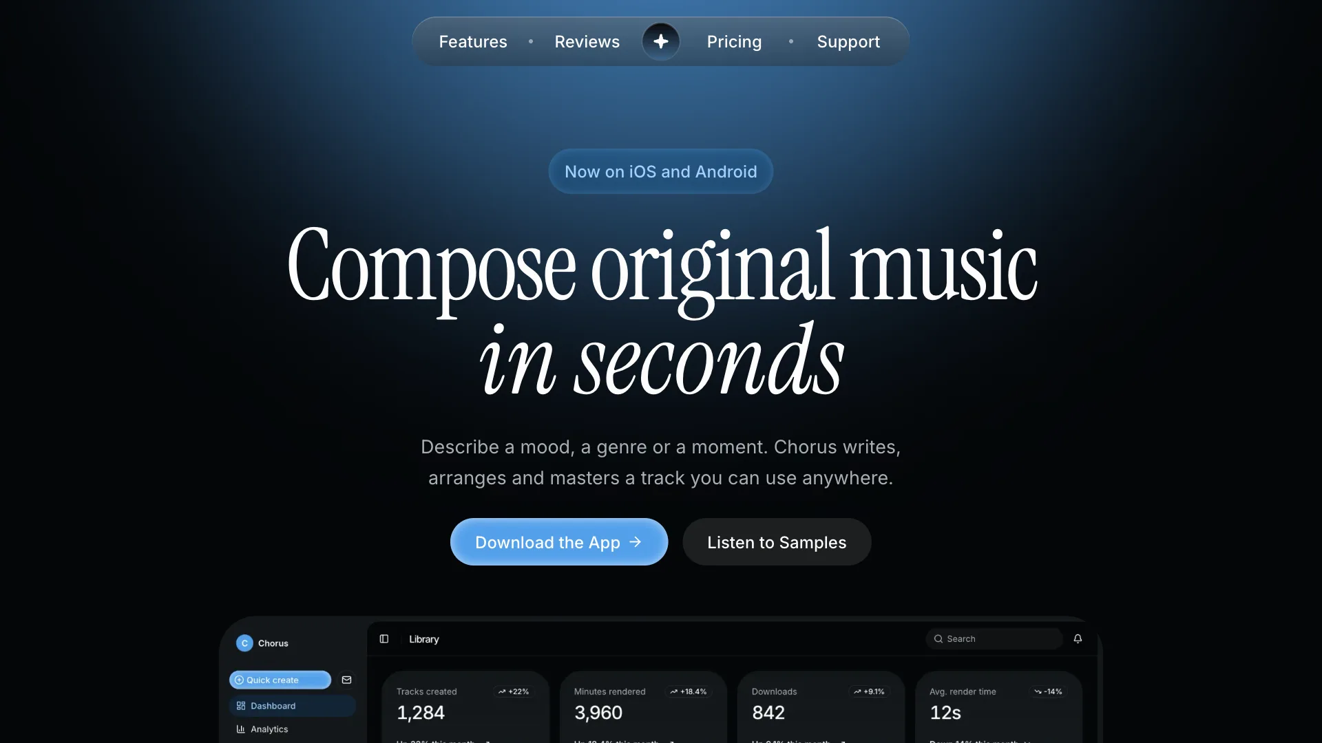
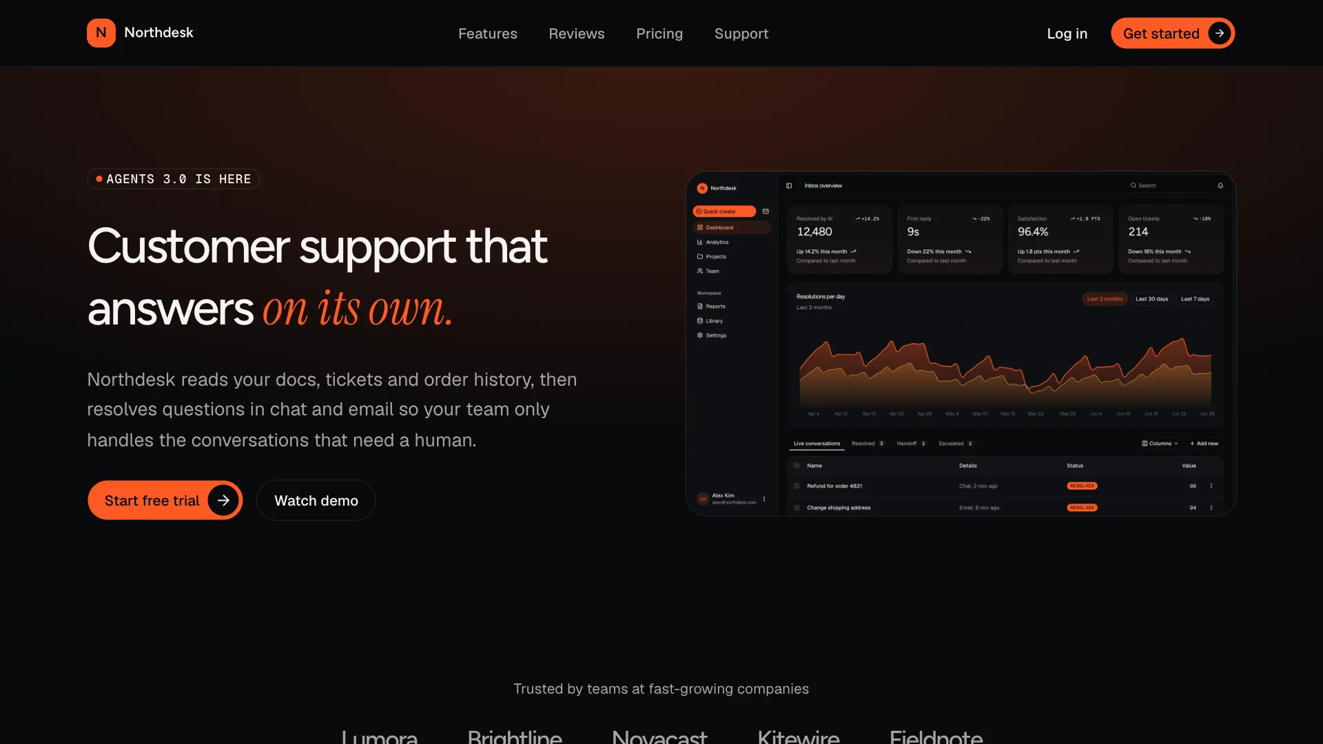
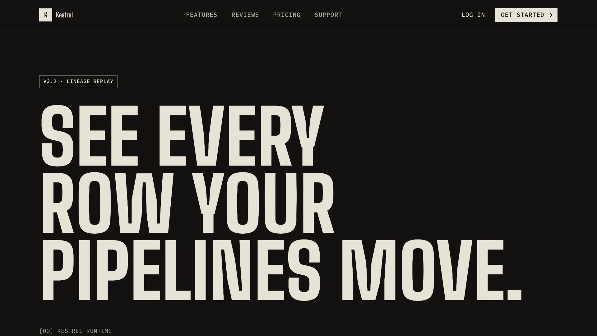
Clay design skill for AI agents
Clay gives your AI assistant a warm, human direction for products people use every day. Cream backgrounds replace pure white, corners are soft and generous, and a serif heading face adds personality to otherwise simple layouts.
Use it for apps that need to feel welcoming: health and wellness, learning, food, family and small marketplaces. The palette stays earthy and low contrast on surfaces, while text and actions keep strong contrast.
Visual language
- Color
- Cream and sand surfaces with terracotta as the single brand color. Use the accent token for soft highlighted areas such as selected cards and tips. Sage chart colors balance the warm palette.
- Shape
- Base radius is 1rem. Cards and dialogs use rounded-3xl, buttons, inputs and badges use rounded-full, and images always have rounded corners.
- Typography
- Fraunces for headings at regular or medium weight, never bold. DM Sans for body text at 16px with relaxed line height. Keep headings short and conversational.
- Depth
- Very soft shadows only on floating elements such as popovers and sticky bars. Cards on the page use a border and the card surface.
- Spacing
- Roomy layouts with large section padding. Prefer fewer, larger elements over dense grids. Mobile screens keep 20px side padding.
Component classes
Shadcn UI Kit components ship with large radii and soft shadows. The skill tells your assistant to pass these classes so every component matches Clay.
| Component | className |
|---|---|
| heading | font-medium tracking-tight |
| button | rounded-full |
| card | rounded-3xl shadow-none ring-border dark:ring-border |
| input | rounded-full |
| badge | rounded-full |
| tabs | rounded-full |
| menu | rounded-2xl |
Do
- Use the serif face for headings and large numbers.
- Keep copy warm, short and in the second person.
- Use photography or illustrations with rounded corners.
- Start from Shadcn UI Kit blocks and soften them with these tokens.
Don't
- Do not use pure white or pure black surfaces.
- Do not use bold serif headings or all caps text.
- Do not hardcode hex colors. Use the theme tokens.
- Do not edit files in components/ui.
Blocks it builds with
The skill points your assistant to these Shadcn UI Kit blocks first. It installs them with the shadcn CLI or the MCP server and restyles them to match.
- Top navigation
navbar1 - Friendly hero
hero5 - Feature list
feature1 - Testimonials
testimonial1 - Pricing
pricing1 - FAQ
faq1 - Call to action
cta1 - Footer
footer1