About Use Cases Examples
Use case sections for date pickers highlight the different scenarios in which users interact with calendars, such as booking reservations, scheduling meetings, or filtering analytics by custom ranges. Instead of treating the date picker as a single generic widget, these examples show how variations in layout, presets, and validation rules can be tuned to match the needs of each workflow. When built on top of shadcn ui components and styled with tailwindcss, date picker use cases feel visually integrated with the rest of your shadcn blocks, from form layouts to dashboard filters in a next.js application.
Technically, a UseCases component for date pickers often renders multiple configured instances of the same underlying react calendar primitive. TypeScript is used to describe the different value modes, such as single selection, ranges, and multi-date selection, as well as constraints like minimum and maximum dates. Each configuration can be exposed as a typed example that developers can copy into their own codebase, ensuring that behaviour remains predictable and easy to customize. Because the shared primitives come from shadcn ui, focus management, keyboard navigation, and accessible labeling are handled consistently across all use cases.
From an SEO and documentation perspective, showcasing date picker use cases as structured components within a next.js site makes it easier for search engines and users to understand when and why each pattern should be applied. Supporting text around the examples can explain design trade-offs, performance considerations, and integration details with other components, all while being rendered server-side for better discoverability. By composing these sections with shadcn ui elements and tailwindcss layout utilities, teams can maintain a single source of truth for date picker patterns that scales as new requirements emerge.
Which Date Picker Example Should You Pick?
The four examples go from a plain calendar to a full range picker for reports.
- Single date: Date Picker 1 is an inline calendar for picking one day, for forms and simple schedules.
- Date range: Date Picker 2 shows two months and selects a start and end date, for bookings and filters.
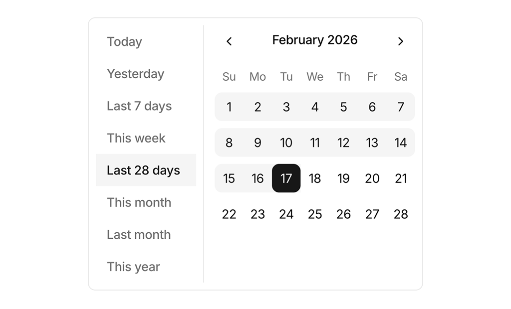
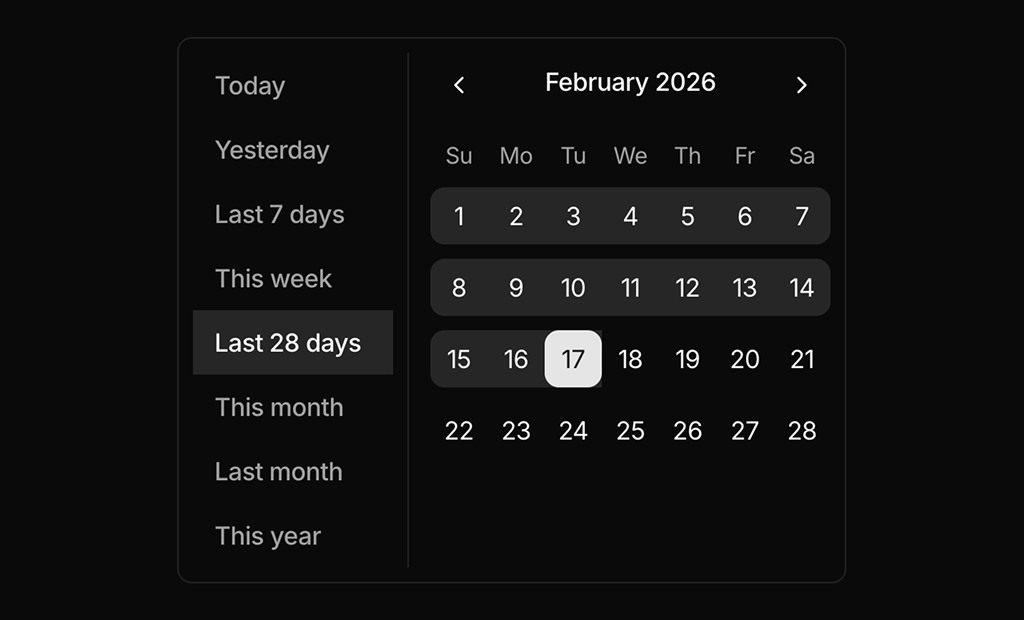
- Range with presets: Date Picker 3 adds a list of common ranges such as Last 7 days and This month next to the calendar, for analytics dashboards.
- Popover range picker: Date Picker 4 puts the presets and calendar in a popover opened from a button that shows the selected range, for toolbars and report headers.
Date Picker FAQ
npx shadcn@latest add @shadcnuikit/date-picker-example1 after adding the Shadcn UI Kit registry to your components.json, and change the number for the others.