About User Menus Examples
User menus are dropdown surfaces that centralize profile-related actions such as account settings, billing, and sign out, keeping the main navigation clean while still making critical paths easy to reach. Typically accessed from an avatar or initials badge in the header, these menus appear across dashboards, admin panels, and SaaS applications as a standard pattern for authenticated users. When built with shadcn ui components and styled using tailwindcss, UserMenus sections inherit the same tokens for spacing, typography, and motion as the rest of your shadcn blocks, giving the account area a polished, cohesive feel inside a next.js app.
Implementation-wise, a UserMenus component is usually a small react wrapper around a dropdown or popover primitive that manages focus and keyboard navigation for you. TypeScript types describe the available actions and their targets, profile, teams, billing portal, admin area, making it straightforward to conditionally render items based on role or feature flags. Because these menus rely on shadcn ui primitives, developers only need to supply content and configuration rather than reimplementing accessibility and positioning logic. Tailwindcss utilities can be layered onto the trigger and list items to align the menu with different header layouts or theme variants.
From an experience and SEO perspective, user menus mostly influence the authenticated side of the product, but the same components can also be showcased on marketing and documentation pages as interactive examples. In a next.js architecture, those examples are server-rendered with clear explanatory text around them, while the live implementation in the app runs as a client-side island. Standardizing UserMenus as a reusable react and typescript component backed by shadcn ui makes it easier to roll out new profile features, adjust information architecture, or introduce additional account-level actions without fragmenting the codebase.
Which User Menu Example Should You Pick?
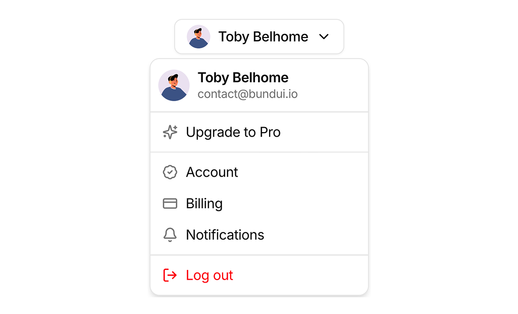
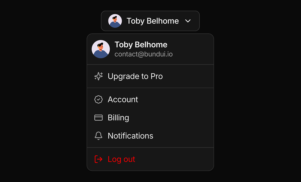
User Menu 1 is an account menu for the signed in user. Its trigger shows the avatar and name, and the menu lists the email, an upgrade item, Account, Billing, Notifications and Log out. Place it in the top bar or at the bottom of a sidebar.
User Menu 2 is an actions menu for managing other users. A three dot icon button opens View details, Edit, Assign and Delete. Use it at the end of a table row or on a user card.