Nebula design skill for AI agents
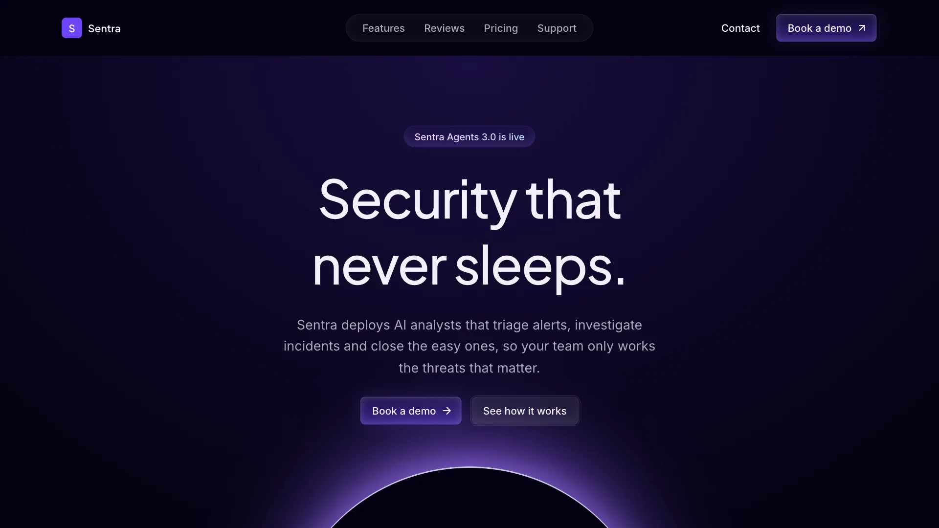
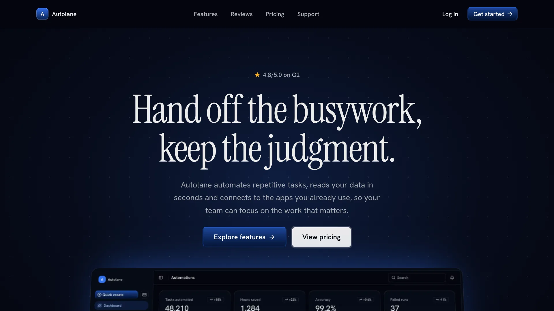
Nebula gives your AI assistant a cinematic, night-sky direction for creative and consumer products. Pages sit on blue-black surfaces, a single sky blue light glows from the top of the hero, and every interactive element is a soft, glossy pill.
Its signature is the contrast between a large serif display headline and clean Inter section titles. Use it for AI creative tools, mobile app landing pages and launches that should feel calm, premium and a little magical.
Visual language
- Color
- Blue-black background with two raised surfaces: card and muted. Sky blue is the only brand color and appears on primary buttons, links, eyebrow badges, focus rings and the hero light. Text uses white and white at 60 to 75 percent.
- Shape
- Buttons, inputs, badges, tabs and the navigation are full pills. Cards and panels use rounded-xl (about 24px) with a hairline border. Images inside cards keep the same radius.
- Typography
- Instrument Serif at regular weight for the hero headline and plan names, with the last phrase in italic. Inter medium with tight tracking for section titles. Inter regular for body text.
- Depth
- No drop shadows on cards. Primary buttons get a thin inner highlight on the top edge so they look glossy. One radial sky blue glow behind the hero is the only lighting effect.
- Layout
- Centered, generous sections. Navigation floats as a capsule at the top center with the logo in the middle. The footer ends with the brand name set huge in faded serif type.
Component classes
Shadcn UI Kit components ship with large radii and soft shadows. The skill tells your assistant to pass these classes so every component matches Nebula.
| Component | className |
|---|---|
| heading | font-medium tracking-tighter |
| button | rounded-full data-[size=lg]:h-12 data-[size=lg]:px-6 data-[size=lg]:text-base data-[variant=default]:shadow-[inset_0_0_10px_rgb(255_255_255/0.65)] data-[variant=secondary]:bg-foreground/10 data-[variant=secondary]:hover:bg-foreground/15 |
| card | bg-foreground/5 rounded-4xl shadow-none ring-0 dark:ring-0 |
| input | rounded-full |
| badge | rounded-full |
| tabs | rounded-full |
| menu | rounded-xl |
Do
- Default to the dark theme and keep one glow per page.
- Use the serif face only for display text and plan names.
- Make every interactive element a pill.
- Start from Shadcn UI Kit blocks and restyle them with these tokens.
Don't
- Do not add drop shadows or colored gradients on cards.
- Do not use square buttons or sharp corners.
- Do not hardcode hex colors. Use the theme tokens.
- Do not edit files in components/ui.
Blocks it builds with
The skill points your assistant to these Shadcn UI Kit blocks first. It installs them with the shadcn CLI or the MCP server and restyles them to match.
- Top navigation
navbar1 - AI hero
hero4 - Features
feature3 - Steps
how-it-works1 - Reviews
testimonial1 - Pricing
pricing1 - FAQ
faq1 - Footer
footer1