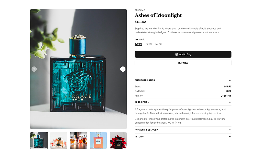
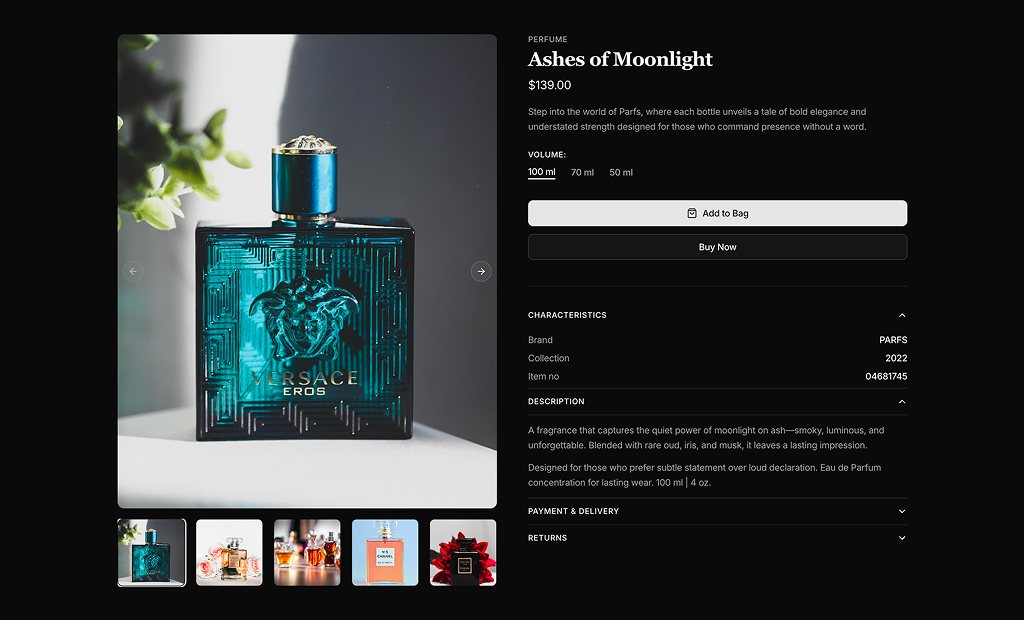
About Product Details Blocks
Product detail blocks are shadcn blocks for a single product page: image gallery, title, price, description, options (e.g. size, color), and add-to-cart or buy actions. Built with React and TypeScript, they use shadcn/ui components—Card, Button, Select, Tabs—and Tailwind CSS. Each block is a full product-page layout so you can focus on data and checkout logic instead of structure.
They are for ecommerce product pages in Next.js or React storefronts. Use one block per product route; you can add reviews, related products, or FAQs in separate sections. They support light and dark themes and integrate with the rest of your shadcn UI and design system.
All copy, images, variants, and prices are in your code or API. Tailwind controls layout, gallery style, and spacing. You can add zoom, thumbnails, or sticky CTA; the React and TypeScript base stays the same so you keep full control and can wire to your cart and checkout flow.