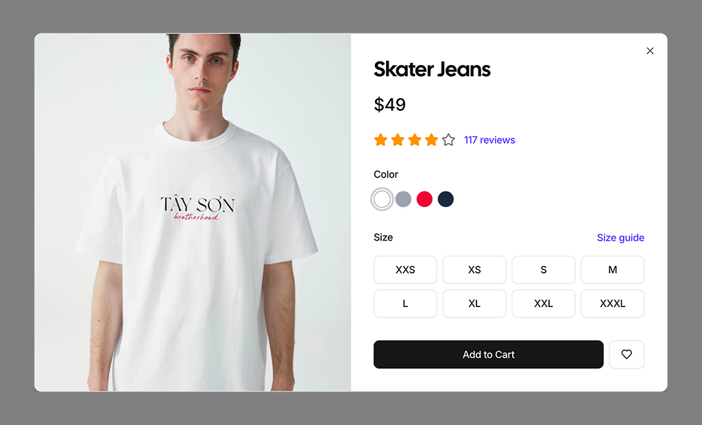
About Product Quickviews Blocks
Product quickview blocks are shadcn blocks that show a product summary in a modal or drawer: image, title, price, short description, and add-to-cart. Built with React and TypeScript, they use shadcn/ui Dialog or Sheet plus Card and Button, styled with Tailwind CSS. They let users peek at a product without leaving the list or category page.
Use them on product list or category pages when a user clicks “quick view” or a product card. They fit Next.js and React ecommerce apps and work with product list and product detail blocks. You keep the user in context while offering a fast path to add to cart or go to the full product page.
Content and product data live in your code. Tailwind controls modal size, spacing, and layout. You can add variant selectors, quantity, or a “view full details” link; the Dialog/Sheet and shadcn UI base stay the same so you keep full control and accessibility.