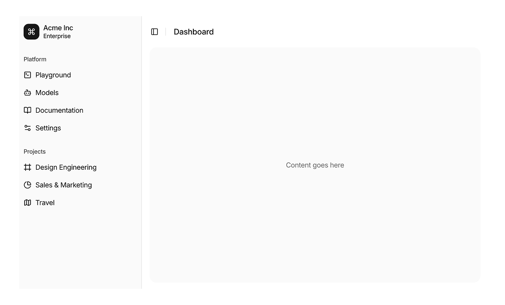
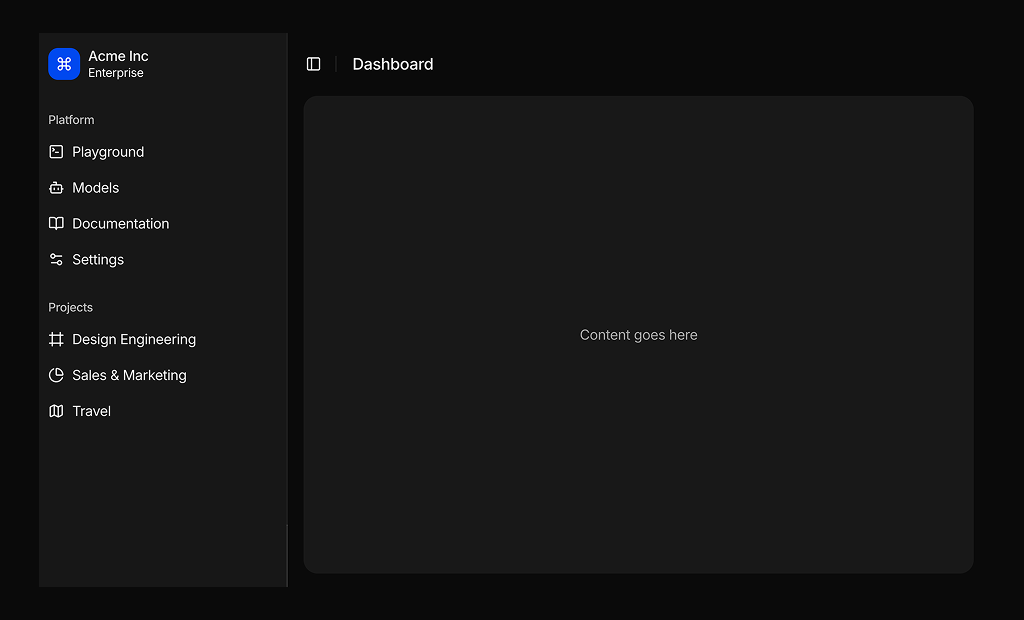
About Sidebar Layouts Blocks
Sidebar layout blocks are shadcn blocks that combine a collapsible or fixed sidebar with a main content area. Built with React and TypeScript, they use shadcn/ui sidebar and layout components styled with Tailwind CSS. Each block gives you a navigation-plus-content pattern so you can focus on nav items and page content instead of layout logic.
They suit dashboards, admin panels, docs, and multi-section apps. Use them in Next.js or React as the app shell; the sidebar holds links or nested nav, and the main area holds the current view. They work with page layout blocks and support responsive behavior (e.g. drawer on mobile) and light and dark themes.
Nav items and main content are in your code. Tailwind controls sidebar width, collapse state, and gaps. You can add a header inside the sidebar, change breakpoints, or restyle the toggle; the underlying shadcn UI structure stays the same so you keep full control.