About Product Cards Examples
Product cards are conversion‑focused components that condense the most important attributes of an item, name, imagery, price, and primary call to action, into a compact, scannable layout. They are used across category listings, recommendation carousels, and promotional sections on landing pages to give users just enough information to click through. When styled with shadcn ui primitives and tailwindcss utilities, ProductCards align visually with the rest of your shadcn blocks while remaining flexible enough to support different densities and emphasis levels in a next.js application.
Under the hood, a ProductCards component is usually composed from strongly typed react building blocks: a media area, content area, and actions row. TypeScript interfaces define the product slug, title, price, badges, and metadata, which makes it easy to plug the same card into search results, upsell sections, or email previews without rewriting logic. Shadcn ui components such as cards, buttons, and badges handle layout and interaction states, while tailwindcss classes refine spacing, hover transitions, and responsive breakpoints. This separation keeps presentational concerns distinct from business rules like inventory status or pricing tiers.
From an SEO and architecture perspective, ProductCards are most powerful when rendered server‑side in next.js category and discovery pages, ensuring that search engines see structured, consistent markup linking to each product detail route. Because these cards are shared react components with typescript‑backed APIs, teams can update messaging, hierarchy, or experimental elements from a single place without risking layout drift. Combined with analytics events attached to their actions, ProductCards become a central tool for measuring and improving how users move from browse to purchase.
Which Product Card Example Should You Pick?
The seven cards range from a plain image and price to a full variant picker. Pick by how much shoppers need to decide from the grid.
- Minimal grid cards: Product Card 4 shows an image, name, color and price with the whole card clickable. Product Card 1 adds a name, category and price row with a wishlist button and an add button in a button group. Product Card 2 wraps the same content in a card with the wishlist button on the image.
- Quick add to cart: Product Card 5 shows the image with a favorite button, the title, price and a full width Add to Cart button that shows a short loading state.
- Detailed cards: Product Card 3 adds a category badge, star rating, description and stock badge.
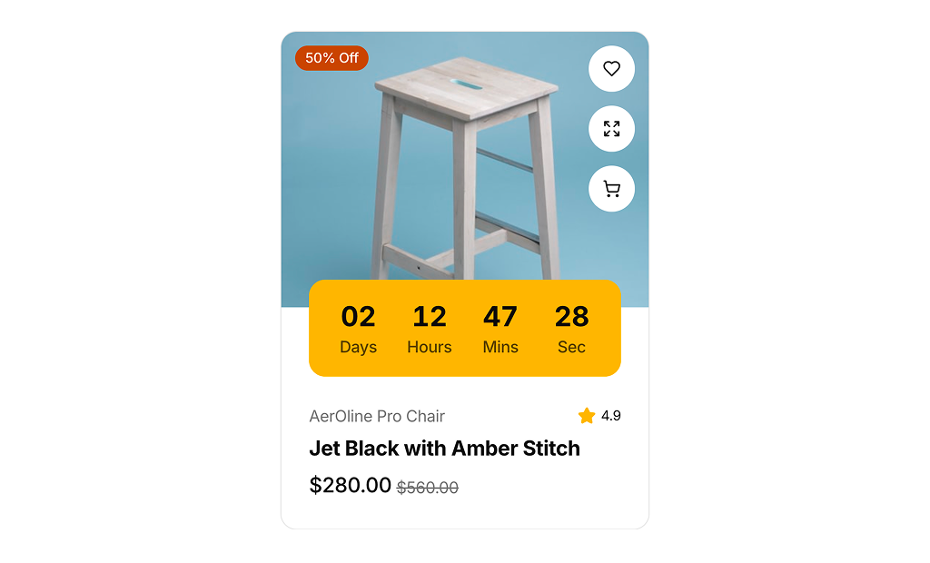
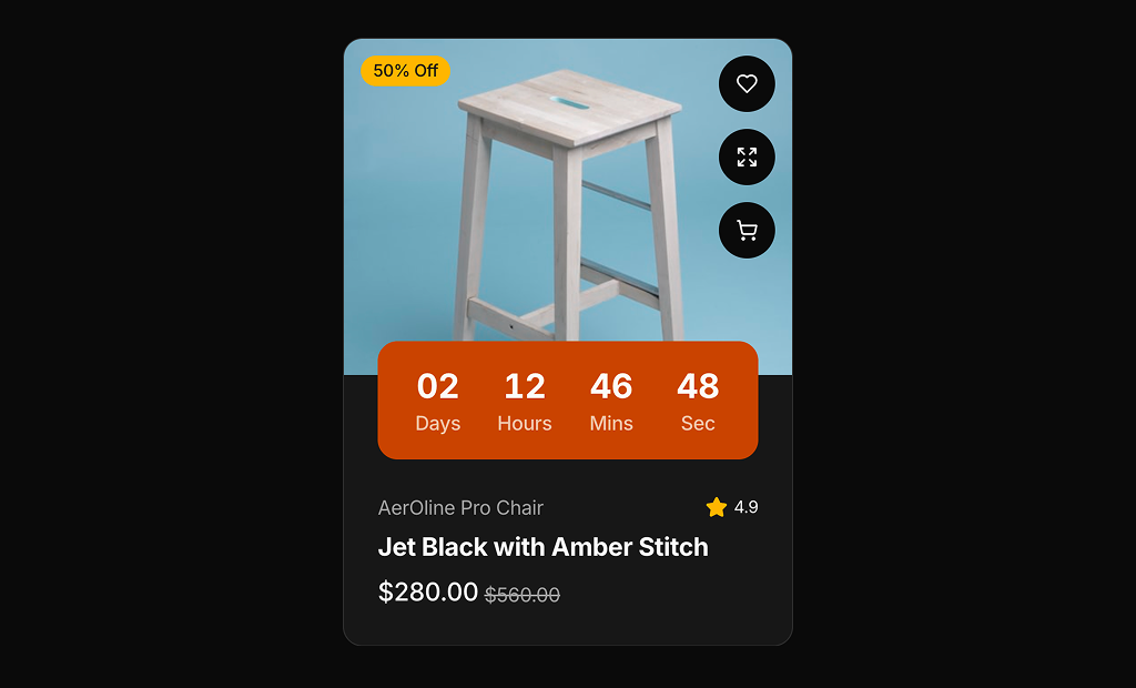
- Variants and promotions: Product Card 6 lets shoppers pick a color and size and shows a savings badge. Product Card 7 adds a live countdown and a discount badge for limited time deals.