Shadcn Cards Examples
Browse 44 Cards examples for shadcn/ui, including blog cards, chat bubbles, payment methods, product cards, product list, social media post and more. Preview each example live, then copy and paste the code or install it with the shadcn CLI. Built with shadcn/ui, Tailwind CSS and React.






Shadcn Card Examples for Real World Interfaces
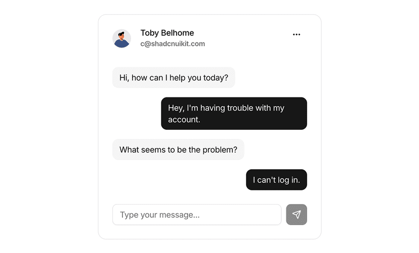
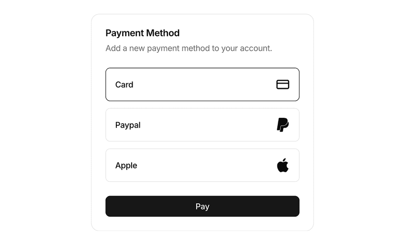
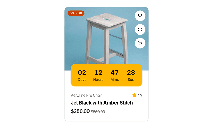
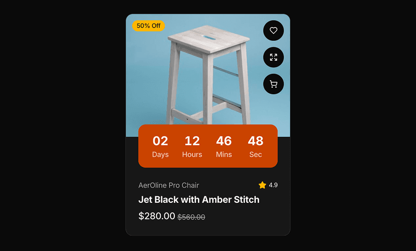
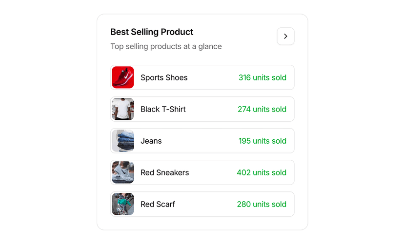
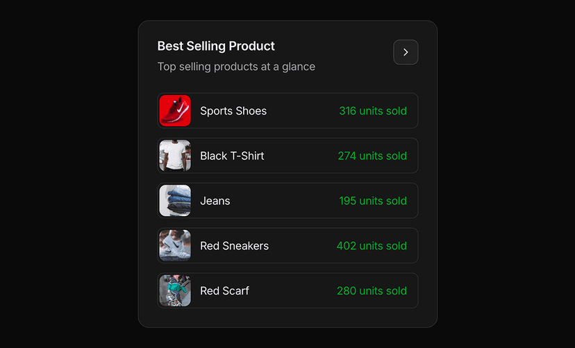
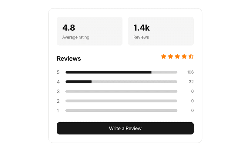
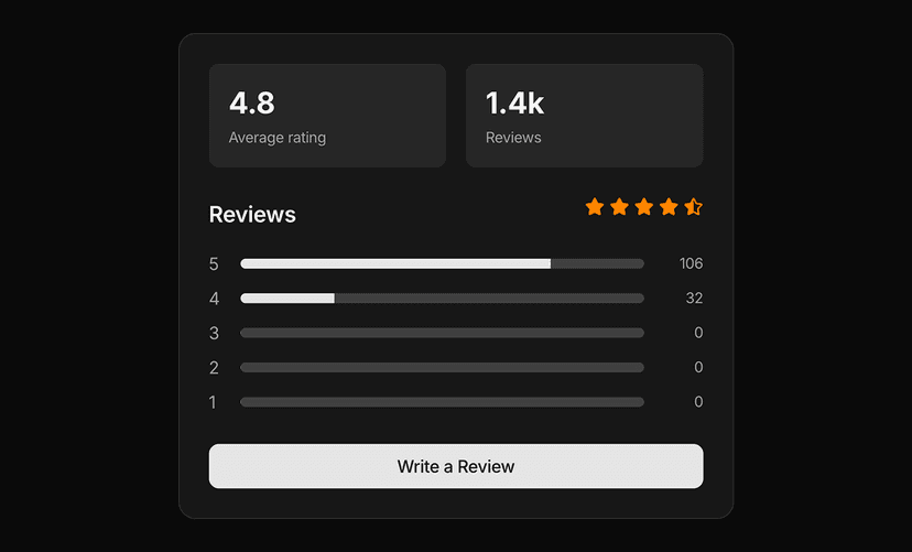
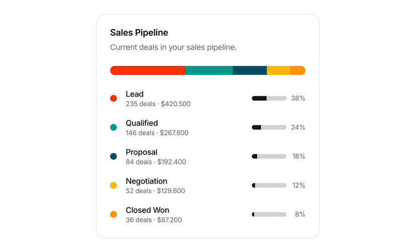
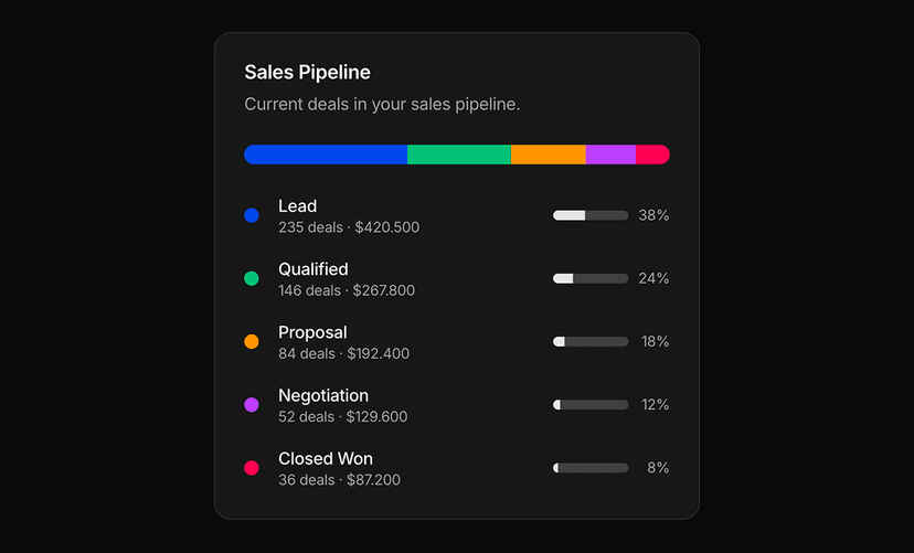
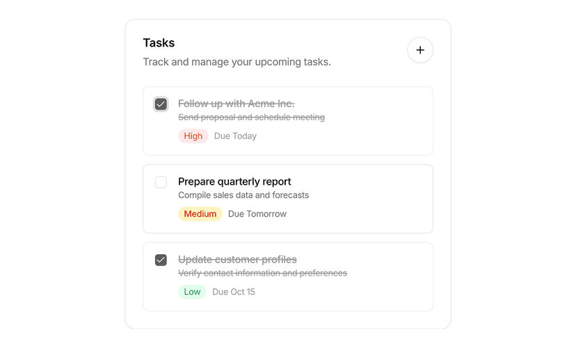
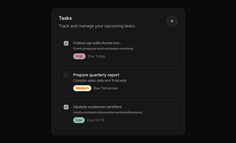
Card examples show how the shadcn/ui card component works in practice: blog cards, product cards, stat cards, review cards, task cards, chat bubbles and payment method cards. Each example is built with shadcn/ui, Tailwind CSS and React and is ready to copy into a dashboard, feed or product page.
What You Get With Card Examples
- Content cards: Blog and social media post cards with cover images, authors, excerpts and actions.
- Commerce cards: Product cards, product lists and payment method cards for storefronts and checkout.
- Dashboard cards: Stat, task and welcome cards for admin panels and onboarding.
- Conversation UI: Chat bubbles and review cards with avatars, timestamps and ratings.
- Copy and paste ready: Every card is a self contained component with sample data, so it drops into your grid or list without extra setup.
One Card Component, Many Use Cases
The shadcn/ui card is a simple container. These examples show how far it stretches once you combine it with avatars, badges, buttons, charts and images. Use them as starting points and adjust the content structure to your data.
Looking for full sections instead of single cards? Browse product card blocks and stat card blocks.