Shadcn Switch Examples
Browse 4 Switch examples for shadcn/ui, including switch cards, theme switchers. Preview each example live, then copy and paste the code or install it with the shadcn CLI. Built with shadcn/ui, Tailwind CSS and React.
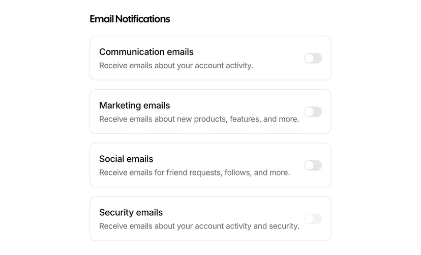
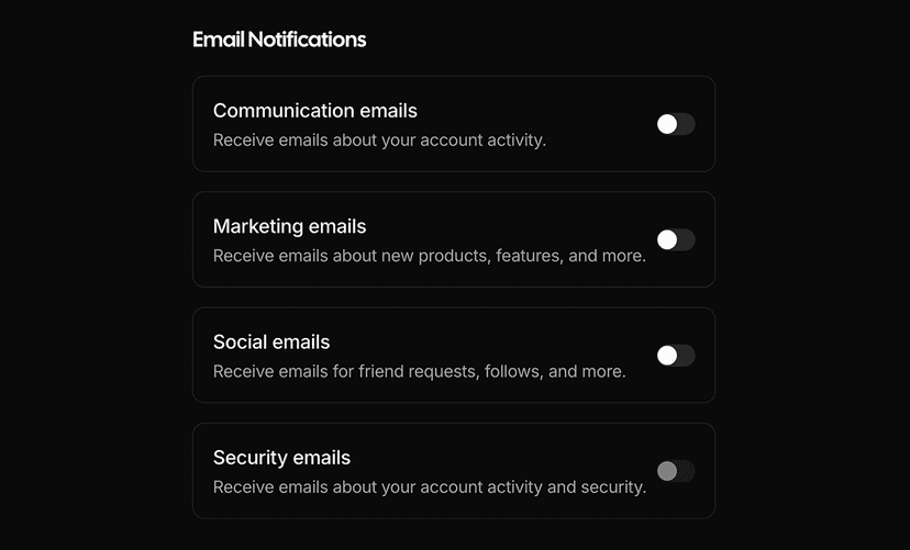
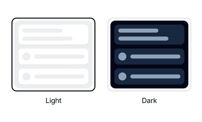
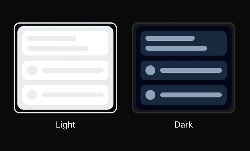
Shadcn Switch Examples for Settings and Themes
Switch examples show the shadcn/ui switch in context: switch cards for settings pages with titles, descriptions and icons, and theme switchers for toggling light, dark and system modes. Built with shadcn/ui, Tailwind CSS and React.
What You Get With Switch Examples
- Settings rows: Switch cards with label, helper text, icon and optional badge for preference screens.
- Theme toggles: Theme switchers as switches, segmented controls and icon buttons that work with next-themes.
- Grouped preferences: Lists of switches inside cards with separators for notification and privacy settings.
- Accessible states: Checked, unchecked, disabled and focus states follow the shadcn/ui switch primitive.
- Drop in components: Each example is a small, self contained component that works in forms or standalone.
Small Control, Big Impact
Switches appear on nearly every settings page. These examples pair the control with the surrounding label, description and layout so the whole row reads clearly, not just the toggle.
See the switch component for the base primitive and form layout blocks for full settings pages.
Frequently Asked Questions
Yes. The theme switcher examples call setTheme from next-themes and reflect the resolved theme in the control.
Yes. The switch is a controlled component, so it works with React Hook Form or plain state.
Yes. They are built on the shadcn/ui switch with proper roles, labels and keyboard support.