320+ Shadcn UI Blocks & Sections
A library of 323 ready-made shadcn/ui blocks and page sections: hero sections, feature grids, pricing tables, testimonials, contact forms, product listings, shopping carts and dashboard widgets. Preview any block live, then copy the code or install it in seconds with the shadcn CLI. Built with shadcn/ui, Tailwind CSS and React.
















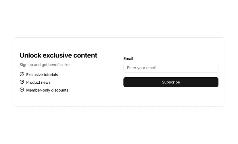
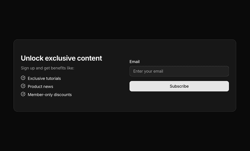
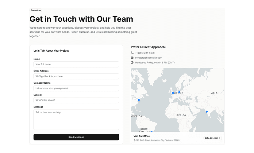
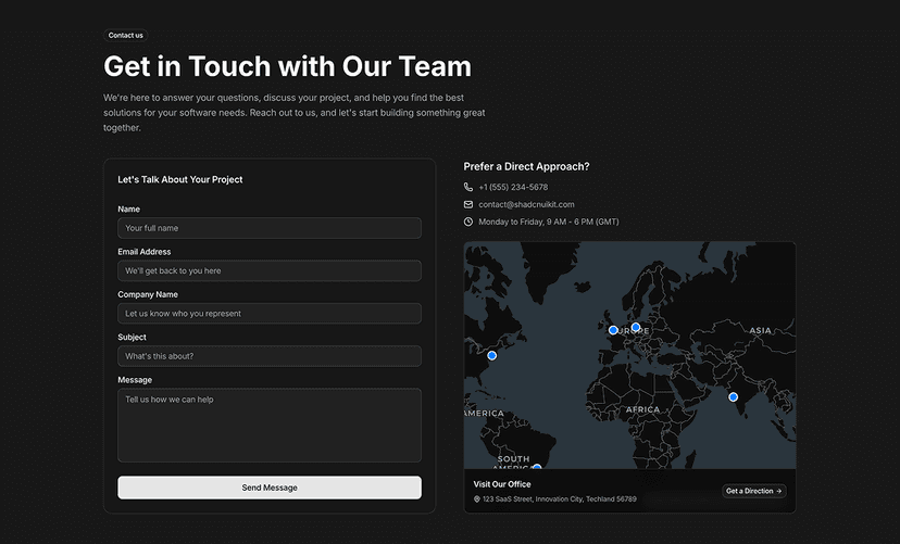
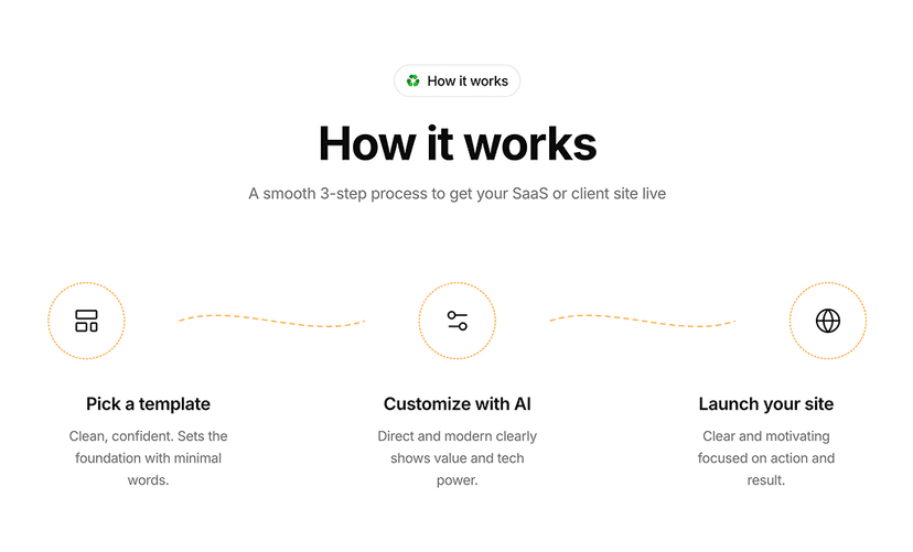
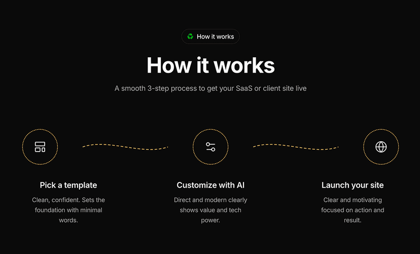
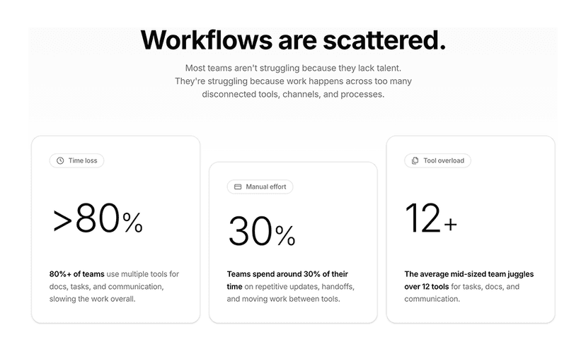
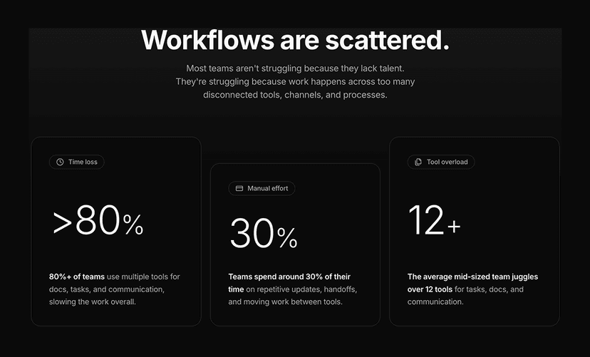
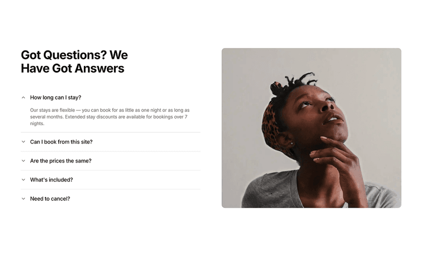
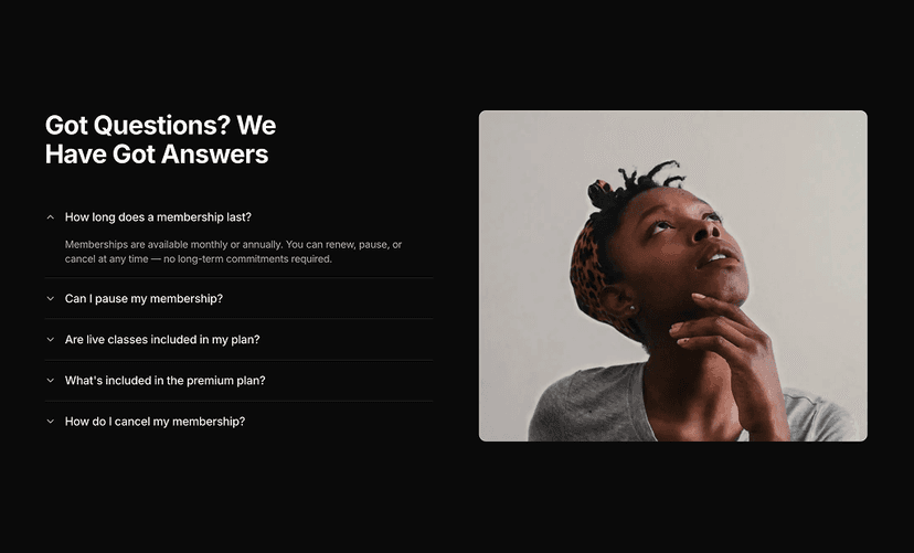
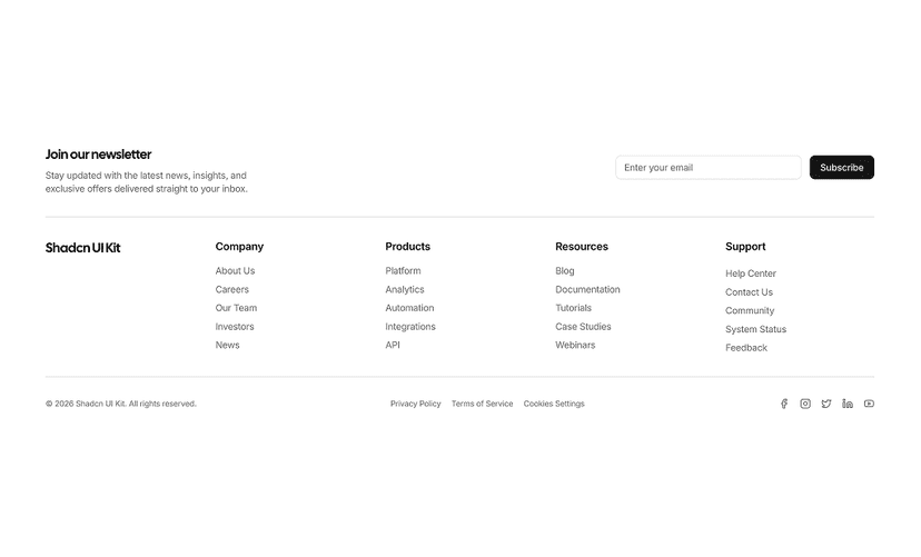
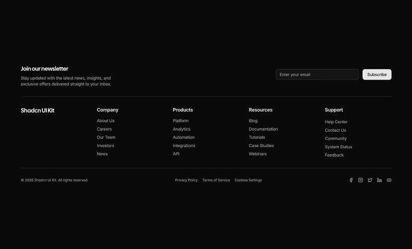
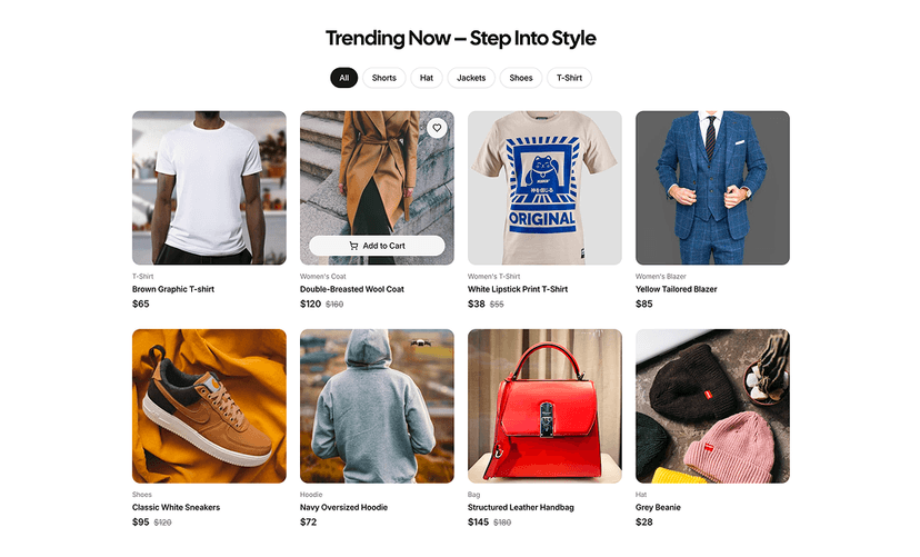
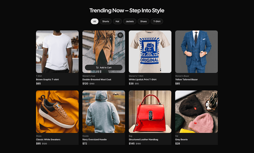


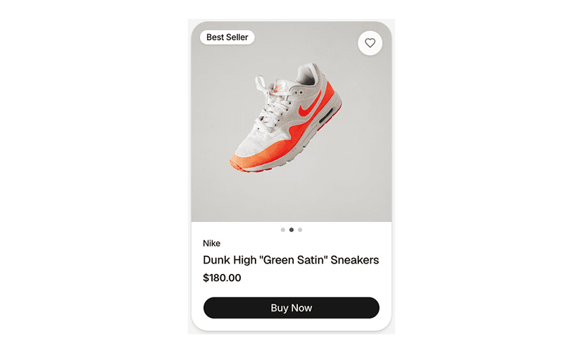
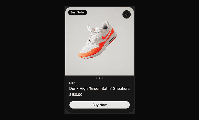
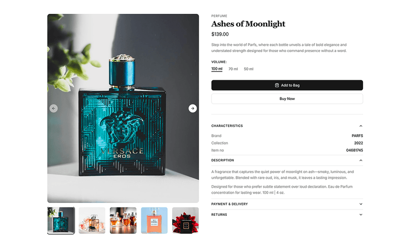
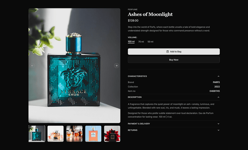
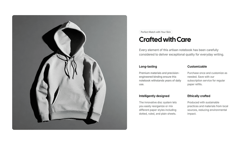
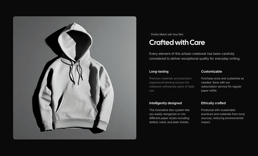
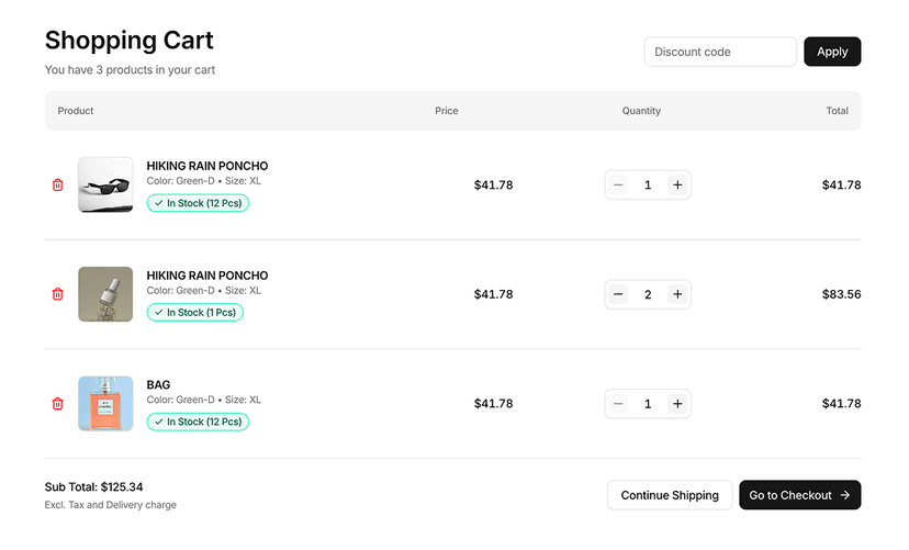
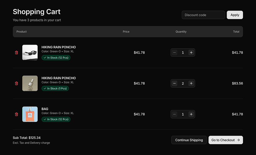
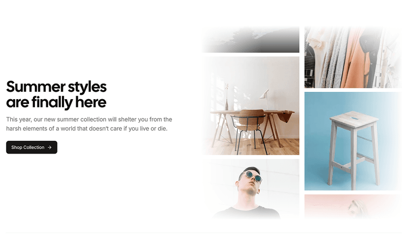
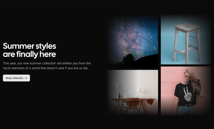
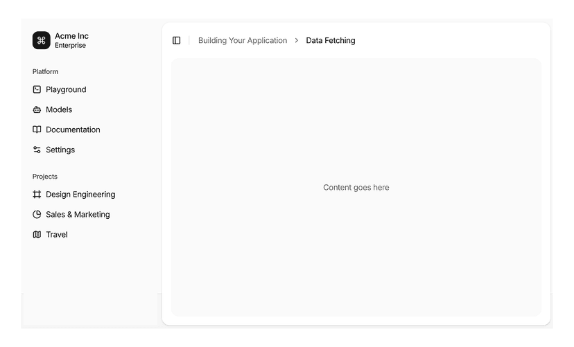
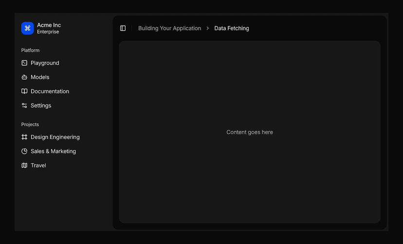
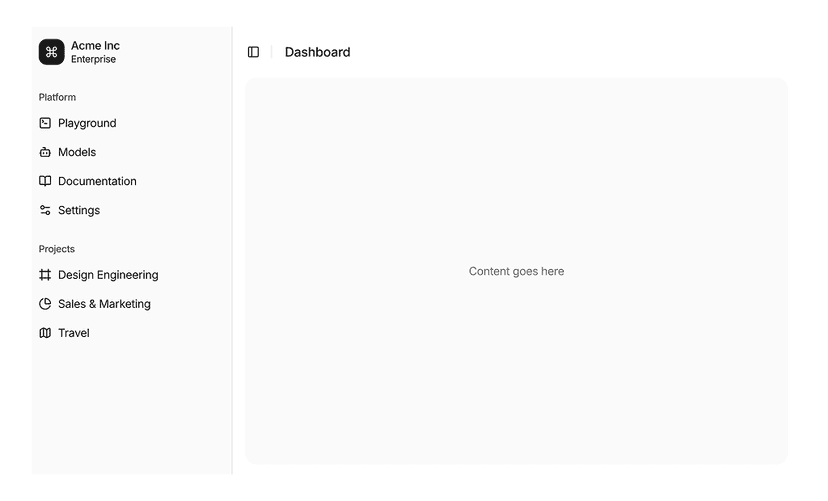
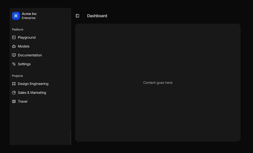
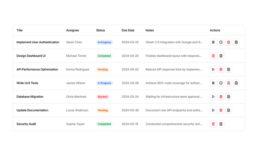
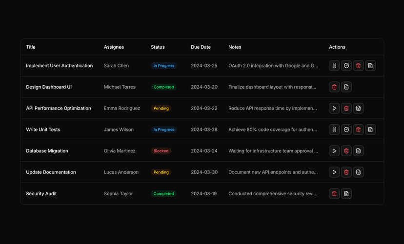
Shadcn UI Blocks and Sections for Faster Page Building
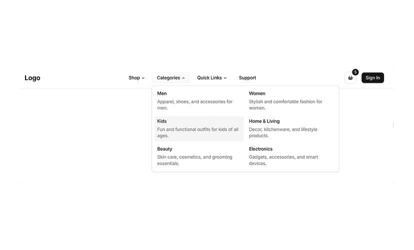
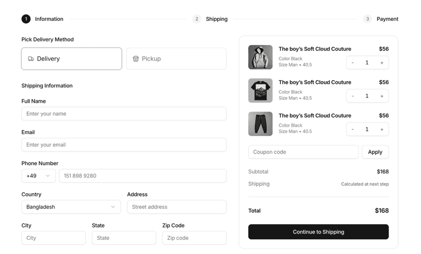
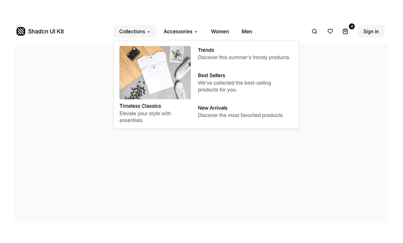
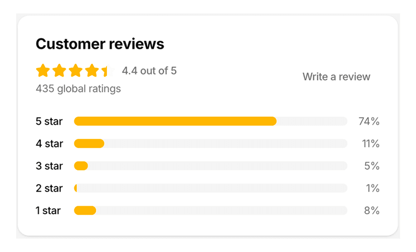
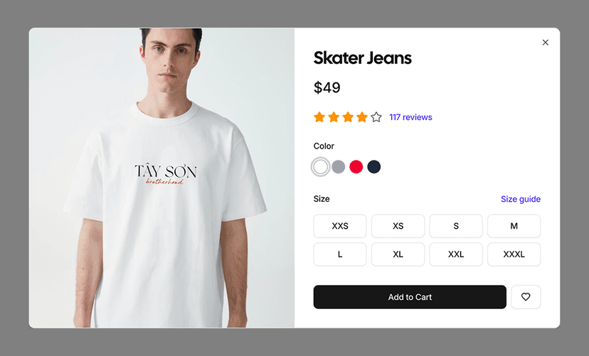
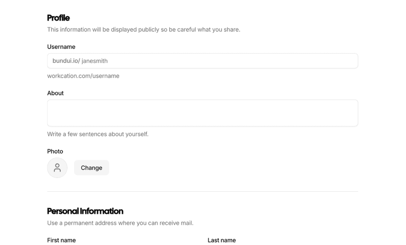
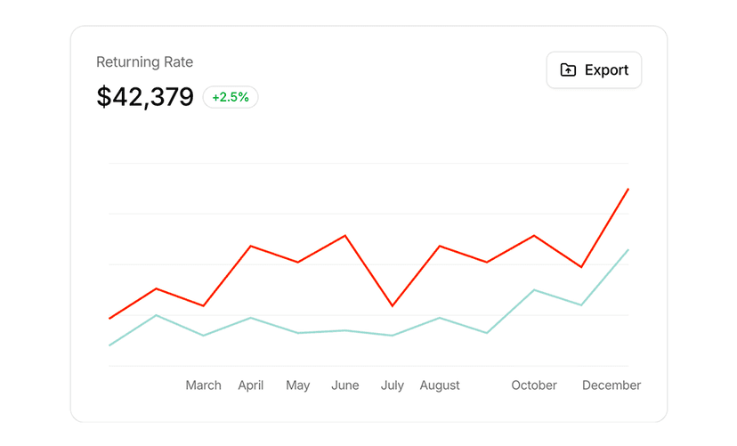
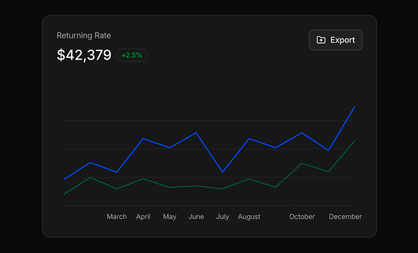
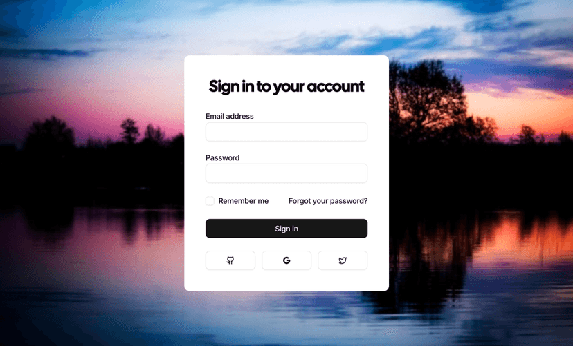
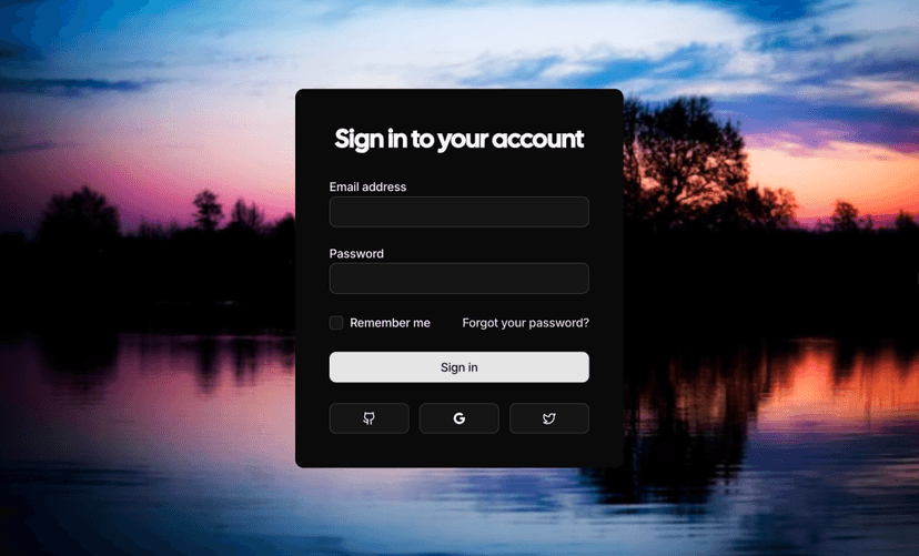
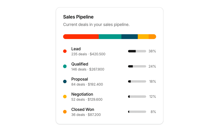
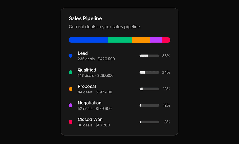
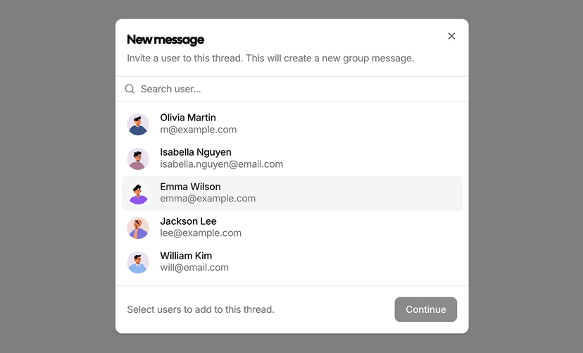
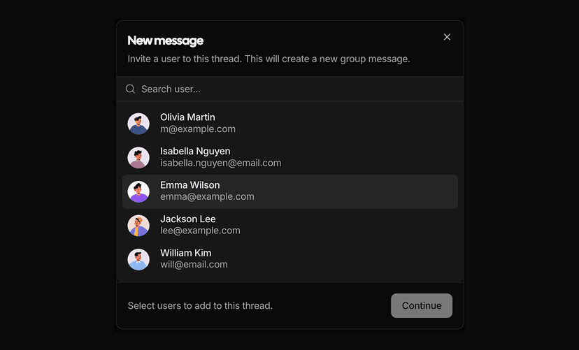
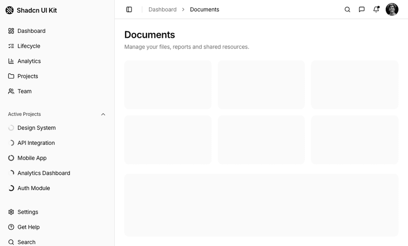
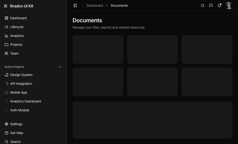
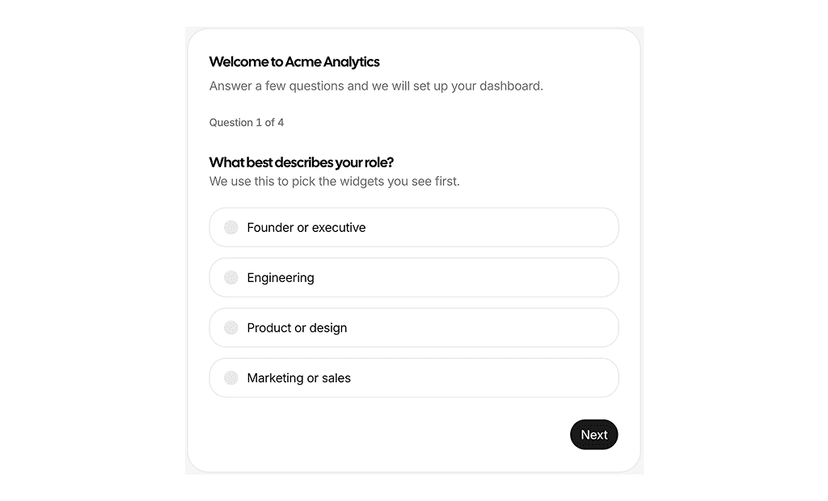
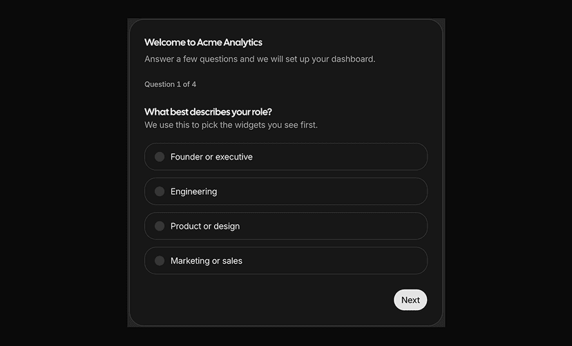
Production ready blocks and sections built with shadcn/ui, Tailwind CSS and React. Browse 300+ free and premium blocks in three areas: marketing sections for landing pages such as hero, pricing, testimonial, navbar and footer blocks; ecommerce blocks such as product cards, shopping carts and checkout pages; and dashboard UI blocks such as charts, tables, sign-in forms and sidebar layouts. Combine them to assemble complete pages in minutes instead of hours, all consistent with your design system. Start free or unlock every block with All Access.
Why Developers Choose Shadcn UI Kit Blocks
- Copy, paste or install: Grab the code of any block instantly or install it in your project through the shadcn CLI and our registry.
- Full page sections: Hero sections, pricing tables, feature sections, testimonials and FAQ sections designed to work together on real marketing and product pages.
- Composable by design: Blocks combine without layout, spacing or style conflicts, and pair naturally with our Shadcn UI components.
- Radix UI and Base UI support: Every block is compatible with both Radix UI and Base UI primitives.
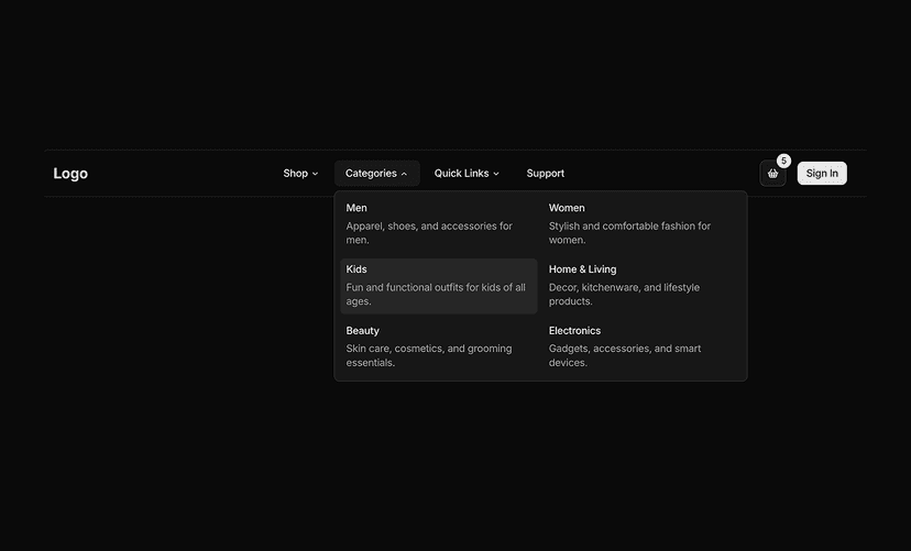
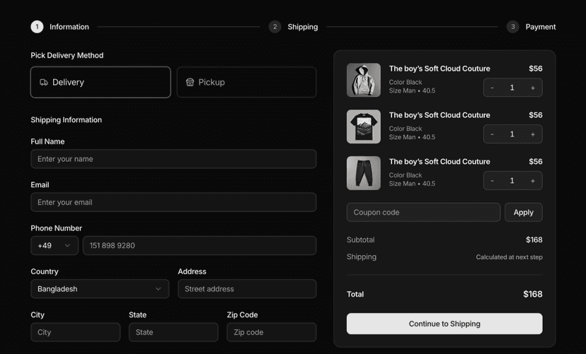
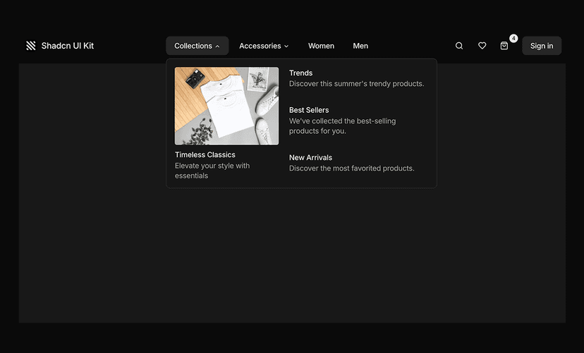
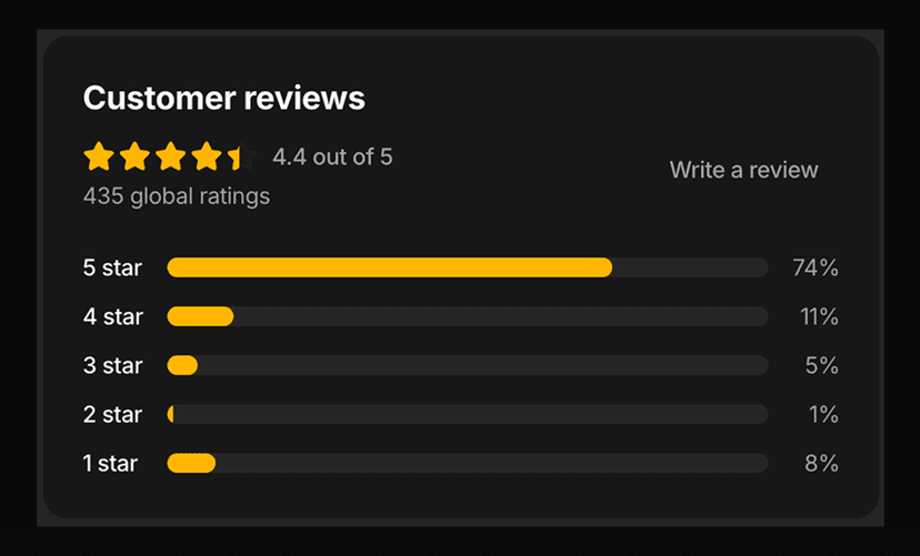
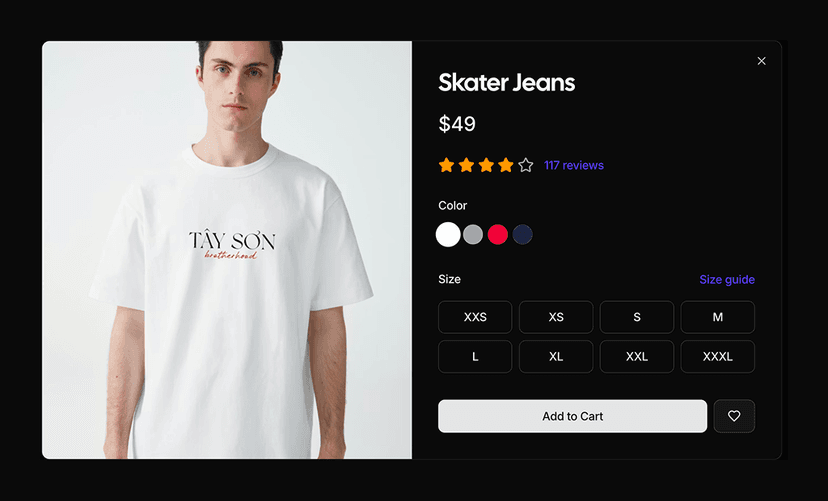
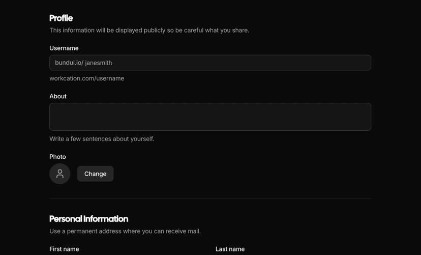
- Responsive and dark mode ready: Every section adapts from mobile to desktop and supports light and dark themes without extra configuration.
- Easy to customize: Adjust layout, colors and typography with Tailwind CSS utilities and CSS variables to match your brand.
- Works with Next.js: Fully compatible with Next.js App Router projects, SaaS products and landing pages.
From Single Sections to Complete Pages
Shadcn UI Kit blocks are full page sections you can drop into any shadcn/ui project. They share the same design language as our component library and website templates, so everything you build stays visually consistent from the first hero section to the final footer.
Each block ships as clean, typed React code. Install it with your favorite package manager, adjust the content and styling, and move on to the next section. No fighting with someone else's CSS and no vendor lock-in, the code lives in your repository.
Need more than sections? Explore admin dashboard templates, ready made examples and the free Theme Generator to take a project from idea to production with one consistent toolkit.